Table of Contents
- Getting Started
- EO.Pdf
- EO.Web
- Overview
- Installation & Deployement
- EO.Web ToolTip
- EO.Web Rating
- EO.Web Slider & RangeSlider
- EO.Web ListBox
- EO.Web ComboBox
- EO.Web Captcha
- EO.Web ASPX To PDF
- EO.Web Slide
- EO.Web Flyout
- EO.Web EditableLabel
- EO.Web ImageZoom
- EO.Web Floater
- EO.Web Downloader
- EO.Web ColorPicker
- EO.Web HTML Editor
- EO.Web File Explorer
- EO.Web SpellChecker
- EO.Web Grid
- EO.Web MaskedEdit
- EO.Web Splitter
- EO.Web Menu
- EO.Web Slide Menu
- EO.Web TabStrip
- EO.Web TreeView
- EO.Web TreeView
- Overview
- Using EO.Web TreeView
- TreeNode and TreeNodeGroup
- Look, Skin and Theme
- Style and Appearance
- Data Binding
- Handling Event
- EO.Web Calendar
- EO.Web Callback
- EO.Web MultiPage
- EO.Web Dialog
- EO.Web AJAXUploader
- EO.Web ProgressBar - Free!
- EO.Web ToolBar - Free!
- EO.WebBrowser
- EO.Wpf
- Common Topics
- Reference
| Navigation Item Styles |
Apply to
Overview
This section covers these topics:
 Tip: Always try to
use look item to specify
styles.
Tip: Always try to
use look item to specify
styles.
Navigation Item States and Styles
During run time, an item can be in several states, different styles can be defined for each state:
| State | Style | Remarks |
|---|---|---|
| Normal | NormalStyle | NormalStyle applies when item is in none of the other states. |
| Hover | HoverStyle | This style applies when mouse is positioned over the item. If not set, NormalStyle is used. |
| Expanded | ExpandedStyle | This style applies when item's sub group is expanded. If not set, HoverStyle is used. |
| Selected | SelectedStyle | This style applies when item's Selected property is set to true. If not set, HoverStyle is used. |
| SelectedHover | SelectedHoverStyle | This style applies when item's Selected property is set to true and mouse is positioned over the item. If not set, SelectedStyle is used. |
| SelectedExpanded | SelectedExpandedStyle | This style applies when item's Selected property is set to true and item's sub group is expanded. If not set, SelectedHoverStyle is used. |
| Disabled | DisabledStyle | This style applies when item's Disabled property is set to true. If not set, NormalStyle is used. |
It's very simple to configure styles via control builder, here's a screenshot for Menu Builder:
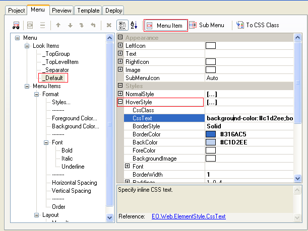
Configure Navigation Item Style
Each style property is an ElementStyle object which supports three ways to control appearance settings such as font, padding, border color, background etc:- Inline CSS text;
- CSS class name;
- Various ElementStyle properties;
To use inline CSS text, modify CssText
property. Control Builder integrated with Visual Studio.Net provides CSS text editor to
set the property and preview the result immediately.
To bring up CSS editor, click the edit button  next to the CssText
property:
next to the CssText
property: 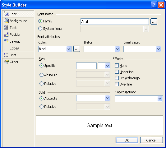
To use CSS Class, modify CssClass property. CSS classes are defined either in a css file specified by CssFile property, or a block of CSS text specified by CssBlock property.
To use various ElementStyle properties, such as Font and Paddings, directly change those properties from the property grid. Note that modifying these properties indirectly modifies CssText property.
Implement page theme by changing ControlSkinID property. Implement CSS style theme by changing CssFile property. See Look, Skin & Theme for more details.
Configure separator style
Unlike regular navigation item, a separator item only uses NormalStyle. Any other styles are ignored.
A typical separator style is:
"WIDTH: 1px; HEIGHT: 1px; BACKGROUND-COLOR: color"
Color is the color of the separator. At runtime, depending on containing group's orientation, the actual width or height of a separator is automatically adjusted to the width or height of the group's client area. For example, the above style results in 1 pixel wide vertical separators in a horizontal group and 1 pixel high horizontal separators in a vertical group.
Use MARGIN-xxxx CSS attribute to reserve space around a separator, for example, the Office2003 built-in skin menu uses this CSS style settings:
MARGIN-LEFT: 30px; WIDTH: 1px; HEIGHT: 1px; BACKGROUND-COLOR: #c5c2b8