Table of Contents
- Getting Started
- EO.Pdf
- EO.Web
- Overview
- Installation & Deployement
- EO.Web ToolTip
- EO.Web Rating
- EO.Web Slider & RangeSlider
- EO.Web ListBox
- EO.Web ComboBox
- EO.Web Captcha
- EO.Web ASPX To PDF
- EO.Web Slide
- EO.Web Flyout
- EO.Web EditableLabel
- EO.Web ImageZoom
- EO.Web Floater
- EO.Web Downloader
- EO.Web ColorPicker
- EO.Web HTML Editor
- EO.Web File Explorer
- EO.Web SpellChecker
- EO.Web Grid
- EO.Web MaskedEdit
- EO.Web Splitter
- EO.Web Menu
- EO.Web Slide Menu
- EO.Web TabStrip
- EO.Web TreeView
- EO.Web Calendar
- EO.Web Callback
- EO.Web MultiPage
- EO.Web Dialog
- EO.Web AJAXUploader
- EO.Web ProgressBar - Free!
- EO.Web ToolBar - Free!
- EO.WebBrowser
- EO.Wpf
- Common Topics
- Reference
| Customize ToolBar |
Overview
This section covers the following topics:
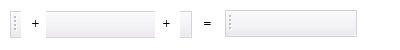
Customize toolbar background
Toolbar background is usually created by setting the toolbar's BackgroundImageLeft, BackgroundImage and BackgroundImageRight. These three images together create the toolbar background:
 .
.
BorderColor, BorderWidth and BorderStyle can also be used to create the toolbar background.
Customize toolbar item
EO.Web ToolBar supports several types of toolbar item: Button, DropDown, Custom and Separator. A separator item always displays a static image specified by the toolbar's SeparatorImage property. All items of other types support four states: Normal, Hover, Down and Disabled and can display different images and styles for different states. The following table listed properties used for each state:
| State | Style | Image |
|---|---|---|
| Normal | ToolBar.NormalStyle and ToolBarItem.NormalStyle | ToolBarItem.ImageUrl |
| Hover | ToolBar.HoverStyle and ToolBarItem.HoverStyle | ToolBarItem.HoverImageUrl |
| Down | ToolBar.DownStyle and ToolBarItem.DownStyle | ToolBarItem.DownImageUrl |
| Disabled | ToolBar.DisabledStyle and ToolBarItem.DisabledStyle | ToolBarItem.DisabledImageUrl |
Two styles, one on the ToolBar and the other on the ToolBarItem are applied for each state, with the one on the ToolBarItem takes precedence over the one on the ToolBar. This allows you to define a set of "base styles" on the toolbar level and then override it on the toolbar item level if necessary.
Using toolbar item template
One or more appearance templates can be specified through the toolbar's ItemTemplates property. At runtime, EO.Web ToolBar tries to locate an item template that is the same Type as the target item and copies any appearance settings defined on that template item to the target item. This allows you to define appearance settings on a few template items instead of repeating them on each target item. For example, if the toolbar includes four regular item and three drop down items and the style for the regular item and drop down items are different, you can define two template item in the toolbar's ItemTemplates collection, with one's Type set to Button and the other one's Type set to DropDownMenu, then define appearances settings on these two items instead of defining them on all seven items.
Using drop down item
To use a drop down item, you should:-
Create the drop down button image. Most built-in templates are already
configured to have a drop down button image for drop down item, so it
may not be necessary for you to create your own. A drop down button image
is created by using the following properties:
- DropDownButtonWidth. This property is used to specify the width of the drop down button. The default value is 12;
-
A background image specified in the item's style properties (NormalStyle, HoverStyle, DownStyle and DisabledStyle). The image must align to the right, as shown in the following image:
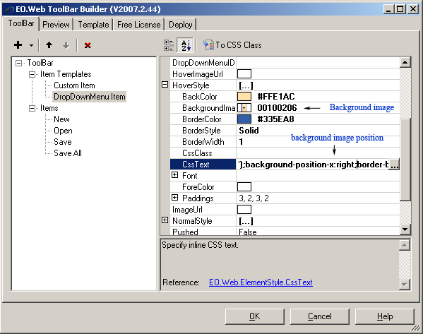
-
Provide the drop down menu. The drop down menu is not part of the toolbar, rather it is provided by an EO.Web ContextMenu or Menu control. A ContextMenu is often used over a Menu because a context menu is not visible by default.
Follow these steps to specify the drop down menu for a toolbar item:
- Place an EO.Web ContextMenu or Menu control in the form and configure its items and appearance to the desired result;
- Set the ItemID property of the parent item of the sub menu that you want to display for the toolbar item. For example, if you wish to displays a "New" sub menu with a number of different items such as "New File", "New Folder", create a parent menu item "New" and then create child menu item "New File" and "New Folder" below it, then set the ItemID of the parent item in this case the "New" menu item). For example, set its ItemID to "new";
- Set the toolbar item's DropDownMenuID in the form of Menu_ID:Menu_Item_ID, for example, Menu1:new. When the drop down button is pressed on the toolbar item, the toolbar first locates "Menu1", then locate item "new" within "Menu1" and then displays that item's sub menu.
- Handling any menu item click event on the menu, not the toolbar.
Using custom item
A toolbar item can have its Type set to Custom to indicate the item is a custom item. A custom toolbar item displays the content specified through its CustomItem property. Custom toolbar items are usually used to host drop down list box.
Like regular items, custom items also support four states: Normal, Hover, Down and Disabled. It is usually not necessary to visually distinguish these four states, in which case all four corresponding style property ( NormalStyle, HoverStyle, DownStyle and DisabledStyle) should be the same.