Table of Contents
- Getting Started
- EO.Pdf
- EO.Web
- EO.WebBrowser
- EO.Wpf
- Overview
- Installation & Deployement
- Skin & Theme
- Common Taskes and Services
- EO.Wpf Buttons
- EO.Wpf Calendar & DatePicker
- EO.Wpf ComboBox
- EO.Wpf DockView
- EO.Wpf Gauge
- EO.Wpf ListBox
- EO.Wpf Menu
- EO.Wpf MaskedEdit
- EO.Wpf ProgressBar
- EO.Wpf Slider
- EO.Wpf SpinEdit
- EO.Wpf SplitView
- EO.Wpf TabControl
- EO.Wpf TreeView
- EO.Wpf Utility Controls
- EO.Wpf WindowChrome
- Sample Data Objects
- Common Topics
- Reference
| Using RangeSlider |
EO.Wpf RangeSlider is very similar to EO.Wpf Slider except that it maintains two values: a start value and an end value. You can use many features such as increase/decrease buttons, tick template the same way as with the Slider control. This section covers the following topics:
Getting Started
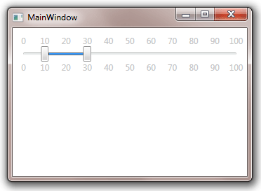
Using the EO.Wpf RangeSlider is very simple. The following XAML demonstrates how to use this control:
<Window x:Class="Test.MainWindow"
        xmlns="http://schemas.microsoft.com/winfx/2006/xaml/presentation"
        xmlns:x="http://schemas.microsoft.com/winfx/2006/xaml"
        xmlns:eo="http://schemas.essentialobjects.com/wpf/"
        xmlns:g="clr-namespace:System.Globalization;assembly=mscorlib"
        Title="MainWindow" Height="250" Width="350">
    <StackPanel Margin="10">
        <eo:RangeSlider Minimum="0" Maximum="100" RangeStart="10"
            RangeEnd="30" TickPlacement="Both" TickFrequency="10">
        </eo:RangeSlider>
    </StackPanel>
</Window>
The above code produces the following result:
Customizing Thumbs
An EO.Wpf RangeSlider has three thumbs, as shown in the following image:
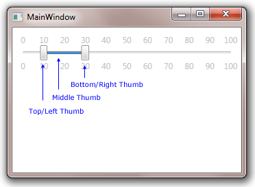
The top/left thumb is used to move the RangeStart value. The bottom/right thumb is used to move the RangeEnd value. The middle thumb, while visually much different than the start/end thumb, can also be dragged --- dragging the thumb will move both the start and end thumb together.
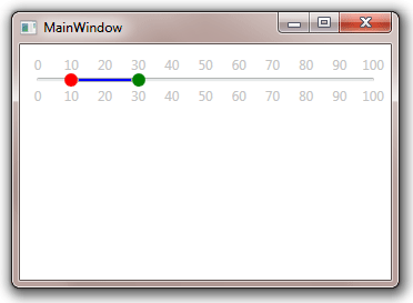
The top/left and bottom/right thumb can be customized through ThumbStyle, while the middle thumb can be customized through MiddleThumbStyle. The following sample demonstrates how to use these properties:
<Window x:Class="Test.MainWindow"
        xmlns="http://schemas.microsoft.com/winfx/2006/xaml/presentation"
        xmlns:x="http://schemas.microsoft.com/winfx/2006/xaml"
        xmlns:eo="http://schemas.essentialobjects.com/wpf/"
        xmlns:g="clr-namespace:System.Globalization;assembly=mscorlib"
        Title="MainWindow" Height="250" Width="350">
    <StackPanel Margin="10">
        <eo:RangeSlider Minimum="0" Maximum="100" RangeStart="10"
            RangeEnd="30" TickPlacement="Both" TickFrequency="10">
            <eo:RangeSlider.TopLeftThumbStyle>
                <Style TargetType="Thumb">
                    <Setter Property="Template">
                        <Setter.Value>
                            <ControlTemplate>
                                <Ellipse Width="12" Height="12" Fill="Red"></Ellipse>
                            </ControlTemplate>
                        </Setter.Value>
                    </Setter>
                </Style>
            </eo:RangeSlider.TopLeftThumbStyle>
            <eo:RangeSlider.BottomRightThumbStyle>
                <Style TargetType="Thumb">
                    <Setter Property="Template">
                        <Setter.Value>
                            <ControlTemplate>
                                <Ellipse Width="12" Height="12" Fill="Green"></Ellipse>
                            </ControlTemplate>
                        </Setter.Value>
                    </Setter>
                </Style>
            </eo:RangeSlider.BottomRightThumbStyle>
            <eo:RangeSlider.MiddleThumbStyle>
                <Style TargetType="Thumb">
                    <Setter Property="Template">
                        <Setter.Value>
                            <ControlTemplate>
                                <Grid>
                                    <Rectangle Height="4.0"
                                   HorizontalAlignment="Stretch"
                                   Fill="Blue"
                                   Stroke="DarkGray"
                                   StrokeThickness="1.0" />
                                </Grid>
                            </ControlTemplate>
                        </Setter.Value>
                    </Setter>
                </Style>
            </eo:RangeSlider.MiddleThumbStyle>
        </eo:RangeSlider>
    </StackPanel>
</Window>
The above code produces the following result:
Getting Values
Use RangeStart and RangeEnd to get a RangeSlider's start value and end value respectively.