Table of Contents
- Getting Started
- EO.Pdf
- EO.Web
- EO.WebBrowser
- EO.Wpf
- Overview
- Installation & Deployement
- Skin & Theme
- Common Taskes and Services
- EO.Wpf Buttons
- EO.Wpf Calendar & DatePicker
- EO.Wpf ComboBox
- EO.Wpf DockView
- EO.Wpf Gauge
- EO.Wpf ListBox
- EO.Wpf Menu
- EO.Wpf MaskedEdit
- EO.Wpf ProgressBar
- EO.Wpf Slider
- EO.Wpf SpinEdit
- EO.Wpf SplitView
- EO.Wpf TabControl
- EO.Wpf TreeView
- EO.Wpf Utility Controls
- EO.Wpf WindowChrome
- Sample Data Objects
- Common Topics
- Reference
| EO.Wpf DropDown |
EO.Wpf DropDown is a drop down window that you can associate to another control. A DropDown is usually associated to another control through DropDownService.DropDown attached property. This section covers the following topics:
Creating a DropDown
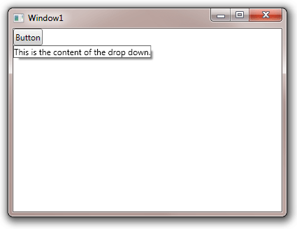
The following XAML demonstrates how to use create a DropDown:
<Window x:Class="Test.Window1"
        xmlns="http://schemas.microsoft.com/winfx/2006/xaml/presentation"
        xmlns:x="http://schemas.microsoft.com/winfx/2006/xaml"
        xmlns:eo="http://schemas.essentialobjects.com/wpf/"
        Title="Window1"
        Height="300"
        Width="400">
    <WrapPanel Orientation="Horizontal">
        <Button>
            <eo:DropDownService.DropDown>
                <eo:DropDown>
                    This is the content of the drop down.
                </eo:DropDown>
            </eo:DropDownService.DropDown>
            Button
        </Button>
    </WrapPanel>
</Window>
The above code associates a DropDown to a Button. Clicking the button opens the drop down:
Switching Style Based On DropDown Status
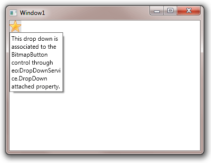
You can also use DropDownService.IsOpen attached property to switch styles for the control to which the DropDown is associated. The following code uses a different background color for the BitmapButton's when the DropDown is visible.
<Window x:Class="Test.Window1"
        xmlns="http://schemas.microsoft.com/winfx/2006/xaml/presentation"
        xmlns:x="http://schemas.microsoft.com/winfx/2006/xaml"
        xmlns:eo="http://schemas.essentialobjects.com/wpf/"
        Title="Window1"
        Height="300"
        Width="400">
    <Window.Resources>
        <eo:DropDown x:Key="SampleDropDown">
            <StackPanel Margin="3" Width="100">
                <TextBlock TextWrapping="Wrap">
                    This drop down is associated to the BitmapButton control through
                    eo:DropDownService.DropDown attached property.
                </TextBlock>
            </StackPanel>
        </eo:DropDown>
    </Window.Resources>
    <WrapPanel Orientation="Horizontal">
        <eo:BitmapButton>
            <eo:BitmapButton.Style>
                <Style TargetType="eo:BitmapButton">
                    <Setter Property="Source" Value="star.png"></Setter>
                    <Setter Property="eo:DropDownService.DropDown" Value="{StaticResource SampleDropDown}" />
                    <Style.Triggers>
                        <!-- Switch background color when the drop down is visible -->
                        <Trigger Property="eo:DropDownService.IsOpen" Value="True">
                            <Setter Property="Background" Value="#e0e0e0"></Setter>
                        </Trigger>
                    </Style.Triggers>
                </Style>
            </eo:BitmapButton.Style>
        </eo:BitmapButton>
    </WrapPanel>
</Window>
The above code produces the following image. Note the background color is light gray when the DropDown is visible. When the DropDown is not visible, the background of the image is transparent.
Note that in order to use DropDownService.DropDown attached property in style, the DropDown must be declared in the resource instead of being directly declared in place as in the first example.
Closing DropDown
By default, the DropDown automatically closes itself if you click anywhere outside of the DropDown. You can disable this behavior by setting either DropDownService.StaysOpen attached property or DropDown.StaysOpen to true. The following sample sets DropDown.StaysOpen to True:
<Window x:Class="Test.Window1"
        xmlns="http://schemas.microsoft.com/winfx/2006/xaml/presentation"
        xmlns:x="http://schemas.microsoft.com/winfx/2006/xaml"
        xmlns:eo="http://schemas.essentialobjects.com/wpf/"
        Title="Window1"
        Height="300"
        Width="400">
    <WrapPanel Orientation="Horizontal">
        <Button>
            <eo:DropDownService.DropDown>
                <eo:DropDown StaysOpen="True">
                    This is the content of the drop down.
                </eo:DropDown>
            </eo:DropDownService.DropDown>
            Button
        </Button>
    </WrapPanel>
</Window>
Once StaysOpen is set to true, you must have code to explicitly close the DropDown because it no longer automatically closes itself. The following code demonstrates how to close the DropDown:
<Window x:Class="Test.Window1"
        xmlns="http://schemas.microsoft.com/winfx/2006/xaml/presentation"
        xmlns:x="http://schemas.microsoft.com/winfx/2006/xaml"
        xmlns:eo="http://schemas.essentialobjects.com/wpf/"
        Title="Window1"
        Height="300"
        Width="400">
    <WrapPanel Orientation="Horizontal">
        <Button x:Name="Button1">
            <eo:DropDownService.DropDown>
                <eo:DropDown StaysOpen="True">
                    <StackPanel>
                        <TextBlock>This is the content of the drop down.</TextBlock>
                        <Button Click="Button_Click">Close</Button>
                    </StackPanel>
                </eo:DropDown>
            </eo:DropDownService.DropDown>
            Button
        </Button>
    </WrapPanel>
</Window>
Note that in order to close the DropDown programatically, you must specify the "x:Name" property of the control that the DropDown is associated with. This name is passed to the SetIsOpen method.