Table of Contents
- Getting Started
- EO.Pdf
- EO.Web
- Overview
- Installation & Deployement
- EO.Web ToolTip
- EO.Web Rating
- EO.Web Slider & RangeSlider
- EO.Web ListBox
- EO.Web ComboBox
- EO.Web Captcha
- EO.Web ASPX To PDF
- EO.Web Slide
- EO.Web Flyout
- EO.Web EditableLabel
- EO.Web ImageZoom
- EO.Web Floater
- EO.Web Downloader
- EO.Web ColorPicker
- EO.Web HTML Editor
- EO.Web File Explorer
- EO.Web SpellChecker
- EO.Web Grid
- EO.Web MaskedEdit
- EO.Web Splitter
- EO.Web Menu
- EO.Web Slide Menu
- EO.Web TabStrip
- EO.Web TabStrip
- TabStrip Overview
- Quick Start Guide
- Using EO.Web TabStrip
- Understanding built-in skins
- EO.Web TreeView
- EO.Web Calendar
- EO.Web Callback
- EO.Web MultiPage
- EO.Web Dialog
- EO.Web AJAXUploader
- EO.Web ProgressBar - Free!
- EO.Web ToolBar - Free!
- EO.WebBrowser
- EO.Wpf
- Common Topics
- Reference
| Design a TabStrip using Images |
Overview
To create a professional look TabStrip, CSS style may not meet the requirement. EO.Web TabStrip offers two flexible ways to create such a TabStrip:
-
A tab item with LeftIcon, Text and RightIcon
This kind of tab item offers the most flexibility and it is most commonly used. -
An image-only tab item
This kind of tab item requires creating image for every tab item. It is easy to configure and good for a TabStrip with not-too-many tab items and a fix structure.
One of the built-in skin - Windows_XP uses LeftIcon, Text and RightIcon:

Similar to a MenuItem, you can also include any ASP.NET control in the tab item.
Refer to Menu's document for details on LeftIcon, RightIcon and Images. This section uses the Windows_XP skin as an example to demonstrate how to design a tab strip using images. The design also utilizes some CSS attributes, thus it is recommended that you also read Designing a TabStrip using CSS.
LeftIcon and RightIcon
You can specify different Urls for LeftIcon and RightIcon in different states:- Url - The url when tab item in normal state
- HoverUrl - The style when mouse is positioned over the tab item
- DownUrl - The style when mouse is pressed down on the tab item
- SelectedUrl - The style when tab item is selected.
- DisabledUrl - The style when tab item's Disabled property is true
Background image
You can use one of the following properties to specify background for a tab item:
-
NormalStyle.CssText
When defining background Url in Css, the image applies to the whole tab item include the region of LeftIcon and RightIcon. The images of LeftIcon, Text and the image of RightIcon will show on top of the specified background image. -
Image
By default, the specified Url will cover the whole item, including LeftIcon and RightIcon's image. But this property can be configured to use in one of the following modes:
- The Url for image-only item
- The Url for Text region's background. It will not cover region of LeftIcon and RightIcon.
- The Url for whole item's background. This has the same effect as defining the background in CSS.
Steps
1. Specifies the image of the group.
The tab group of the above TabStrip control features a gray bottom border.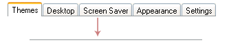
This is implemented as a CSS background image in _Default.SubMenu.Style.CssText:
background-image:url("00010000");
background-position-y:bottom;
background-repeat:repeat-x;
"00010000" is ID of the built-in image  .
The image forms a bottom border when background-position-y
is set to bottom and background-repeat
is set to repeat-x.
.
The image forms a bottom border when background-position-y
is set to bottom and background-repeat
is set to repeat-x.
2. Specifies LeftIcon, background image and RightIcon for normal state.
| LeftIcon | Background | RightIcon |

|
 |
 |
The Url of the LeftIcon and RightIcon are defined in _Default.LeftIcon.Url and _Default.RightIcon.Url.
You can use one of the following properties to specify a background:
When using Css text, the background applies to the whole tab item including region of LeftIcon and RightIcon.background-image: url(00010001); background-repeat: repeat-x;
3. Specifies LeftIcon, background image and RightIcon for hover state.
| LeftIcon | Background | RightIcon |

|
 |
 |
The Url of the LeftIcon and RightIcon are defined in
_Default.LeftIcon.HoverUrl and
_Default.RightIcon.HoverUrl.
The background image is specified in
_Default.HoverStyle.CssText:
background-image: url(00010001);
background-repeat: repeat-x;
4. Specifies LeftIcon, background image and RightIcon for selected state.
| LeftIcon | Background | RightIcon |

|
 |
 |
The Url of the LeftIcon and RightIcon are defined in
_Default.LeftIcon.SelectedUrl and
_Default.RightIcon.SelectedUrl.
The background image is specified in
_Default.SelectedStyle.CssText:
background-image: url(00010001);
background-repeat: repeat-x;
5. Raises the selected tab item.
The selected item is raised up by 2 pixels. This is implemented via CSS relative positioning attributes. The following attributes are included in the styles:
| State | Property | Value |
| normal state | _Default.NormalStyle.CssText | position: relative; top: 2px; |
| hover state | _Default.HoverStyle.CssText | position: relative; top: 2px; |
| selected state | _Default.SelectedStyle.CssText | None. |
Since normal state is placed 2 pixels below its original position, images used by normal state actually exceed the bottom of the tab group by 2 pixels. This excess region must be set to transparent in the images.
6. Specifies the other properties.
A few other properties are also being used by this tab strip:| Property | Value | Remarks |
| _Default.Text.Padding.Top | 3 | Reserve extra space for on top of the item text |
| _Default.SubMenu.ItemSpacing | 1 | Reserve 1 pixel between tab items |
| _Default.SubMenu.Style.CssText | cursor:default;
font-family:'Microsoft Sans Serif', Verdana; font-size:8.25pt; |
Use the default arrow cursor and specify font. |