Table of Contents
- Getting Started
- EO.Pdf
- EO.Web
- Overview
- Installation & Deployement
- EO.Web ToolTip
- EO.Web Rating
- EO.Web Slider & RangeSlider
- EO.Web ListBox
- EO.Web ComboBox
- EO.Web Captcha
- EO.Web ASPX To PDF
- EO.Web Slide
- EO.Web Flyout
- EO.Web EditableLabel
- EO.Web ImageZoom
- EO.Web Floater
- EO.Web Downloader
- EO.Web ColorPicker
- EO.Web HTML Editor
- EO.Web File Explorer
- EO.Web SpellChecker
- EO.Web Grid
- EO.Web MaskedEdit
- EO.Web Splitter
- EO.Web Menu
- EO.Web Slide Menu
- EO.Web TabStrip
- EO.Web TreeView
- EO.Web Calendar
- EO.Web Callback
- EO.Web MultiPage
- EO.Web Dialog
- EO.Web AJAXUploader
- EO.Web ProgressBar - Free!
- EO.Web ToolBar - Free!
- EO.WebBrowser
- EO.Wpf
- Common Topics
- Reference
| Customize Styles |
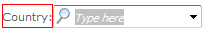
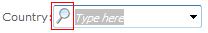
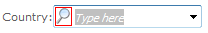
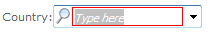
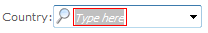
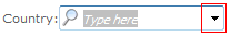
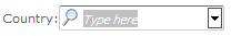
EO.Web ComboBox provides a number of style properties. Each style property applies to a specific section of the ComboBox. Customize these style properties to create a unique ComboBox design.
| Section | Property Name | Remarks |
|---|---|---|
|
LabelStyle | This property applies to the optional label section of the ComboBox. You can use this property to control the font or color of the ComboBox label. |
|
IconAreaStyle, IconAreaHoverStyle |
These two properties apply to the icon area. The icon area is the left most area in the ComboBox that can be used to display item icon. These two properties often use background-image CSS property to create the left end border of the ComboBox (especially for round corner borders). IconAreaHoverStyle is applied when mouse is over the control. This often uses a slightly different border color to produce the highlight effect. |
|
IconStyle |
This property applies to the element that is used to
display the item icon. It is usually used to reserve
space for the icon. For example, if the icon's size
is 16 pixels by 16 pixels, then IconStyle is usually
set to:
HTML <IconStyle CssText="width:16px;height:16px;" /> To hide the icon altogether, use display:none; CSS attribute in IconStyle: HTML <IconStyle CssText="display:none;" /> See using item icon for more details about item icons. |
|
|
TextAreaStyle, TextAreaHoverStyle | These two properties apply to the middle section of the ComboBox control. It is often used to create borders for the middle section. It can also be used to set the font and paddings for the ComboBox text. |
|
TextStyle | Style applied to the ComboBox text. This is the text that user entered or selected from the list. |
|
HintTextStyle | Style applied to the ComboBox hint text. Hint text is the text displayed when the ComboBox is empty. |
|
ButtonAreaStyle, ButtonAreaHoverStyle | These two styles apply to the drop down button area. It is often used to create the right end border of the ComboBox. |
|
ButtonStyle, ButtonHoverStyle | These two styles apply to the drop down button. You can use background-image CSS attribute in these two styles to create the drop down button. ButtonHoverStyle is used when mouse is over the control or the drop down list is active. It usually has a different background-image than ButtonStyle to produce the highlight effect. |