Table of Contents
- Getting Started
- EO.Pdf
- EO.Web
- EO.WebBrowser
- EO.Wpf
- Overview
- Installation & Deployement
- Skin & Theme
- Common Taskes and Services
- EO.Wpf Buttons
- EO.Wpf Calendar & DatePicker
- EO.Wpf ComboBox
- EO.Wpf DockView
- EO.Wpf Gauge
- EO.Wpf ListBox
- EO.Wpf Menu
- EO.Wpf MaskedEdit
- EO.Wpf ProgressBar
- EO.Wpf Slider
- EO.Wpf SpinEdit
- EO.Wpf SplitView
- EO.Wpf TabControl
- EO.Wpf TreeView
- EO.Wpf Utility Controls
- EO.Wpf WindowChrome
- Sample Data Objects
- Common Topics
- Reference
| BareButton |
EO.Wpf BareButton is a button that does not have any built-in background or border. This control is useful when you only need the click event of the button, but does not want any of the built-in looks of a button.
Because a BareButton does not have any built-in style, it is usually necessary for you to style it. For example, the following code creates a gray button. It also changes styles slightly when mouse moves over to the button.
XAML
<eo:BareButton Width="100" HorizontalAlignment="Left" BorderThickness="1" Padding="2" Content="Hello">
    <eo:BareButton.Style>
        <Style TargetType="{x:Type eo:BareButton}">
            <Setter Property="Cursor" Value="Hand"></Setter>
            <Setter Property="BorderBrush" Value="DarkGray"></Setter>
            <Setter Property="Background" Value="#f0f0f0"></Setter>
            <Style.Triggers>
                <!-- Change background and border color when mouse is over the button -->
                <Trigger Property="IsMouseOver" Value="True">
                    <Setter Property="BorderBrush" Value="#606060"></Setter>
                    <Setter Property="Background" Value="#f8f8f8"></Setter>
                </Trigger>
            </Style.Triggers>
        </Style>
    </eo:BareButton.Style>
</eo:BareButton>
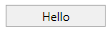
The above code produces the following result:
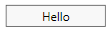
The following image shows the button when mouse is over the button: