Table of Contents
- Getting Started
- EO.Pdf
- EO.Web
- EO.WebBrowser
- EO.Wpf
- Overview
- Installation & Deployement
- Skin & Theme
- Common Taskes and Services
- EO.Wpf Buttons
- EO.Wpf Calendar & DatePicker
- EO.Wpf ComboBox
- EO.Wpf DockView
- EO.Wpf Gauge
- EO.Wpf ListBox
- EO.Wpf Menu
- EO.Wpf MaskedEdit
- EO.Wpf ProgressBar
- EO.Wpf Slider
- EO.Wpf SpinEdit
- EO.Wpf SplitView
- EO.Wpf TabControl
- EO.Wpf TreeView
- EO.Wpf Utility Controls
- EO.Wpf WindowChrome
- Sample Data Objects
- Common Topics
- Reference
| Drop Down Button |
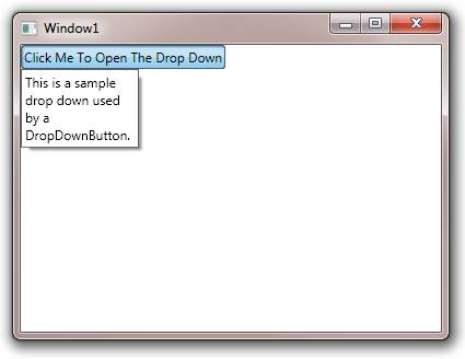
EO.Wpf DropDownButton offers a single control that combines a button and a DropDown control. The following sample demonstrates how to use the DropDownButton control:
XAML
<Window x:Class="Test.Window1"
        xmlns="http://schemas.microsoft.com/winfx/2006/xaml/presentation"
        xmlns:x="http://schemas.microsoft.com/winfx/2006/xaml"
        xmlns:eo="http://schemas.essentialobjects.com/wpf/"
        Title="Window1"
        Height="300"
        Width="400">
    <StackPanel>
        <eo:DropDownButton Width="200" HorizontalAlignment="Left">
            <eo:DropDownButton.DropDown>
                <eo:DropDown>
                    <StackPanel Margin="3" Width="100">
                        <TextBlock TextWrapping="Wrap">
                    This is a sample drop down used by a DropDownButton.
                        </TextBlock>
                    </StackPanel>
                </eo:DropDown>
            </eo:DropDownButton.DropDown>
            Click Me To Open The Drop Down
        </eo:DropDownButton>
    </StackPanel>
</Window>
The above code produces the following result:
You can also use EO.Wpf DropDownService to achieve similar result. There are a few key differences between using DropDownService and DropDownButton:
- DropDownButton automatically render itself as pressed when the drop down is open;
- DropDownButton provides a set of "short cut" properties for the DropDown control that it uses. For example, DropDownButton provides IsDropDownOpen property for you to open or close the drop down;
- DropDownButton allows you to use a child element, instead of the whole control as the triggering element for the drop down. The element that triggers the drop down is marked by name PART_DropDownTarget in the DropDownButton's control template. SplitButton uses this feature to "split" button so that the drop down opens only when user clicks the drop down arrow on the button.