Table of Contents
- Getting Started
- EO.Pdf
- EO.Web
- EO.WebBrowser
- EO.Wpf
- Overview
- Installation & Deployement
- Skin & Theme
- Common Taskes and Services
- EO.Wpf Buttons
- EO.Wpf Calendar & DatePicker
- EO.Wpf ComboBox
- EO.Wpf DockView
- EO.Wpf Gauge
- EO.Wpf ListBox
- EO.Wpf Menu
- EO.Wpf MaskedEdit
- EO.Wpf ProgressBar
- EO.Wpf Slider
- EO.Wpf SpinEdit
- EO.Wpf SplitView
- EO.Wpf TabControl
- EO.Wpf TreeView
- EO.Wpf Utility Controls
- EO.Wpf WindowChrome
- Sample Data Objects
- Common Topics
- Reference
| EO.Wpf LinkButton |
EO.Wpf LinkButton can automatically switch styles for TextBlock controls inside the button when mouse is over the button. The following sample demonstrates how to use a LinkButton:
XAML
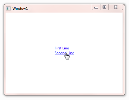
<Window x:Class="Test.Window1"
        xmlns="http://schemas.microsoft.com/winfx/2006/xaml/presentation"
        xmlns:x="http://schemas.microsoft.com/winfx/2006/xaml"
        xmlns:eo="http://schemas.essentialobjects.com/wpf/"
        xmlns:diag="clr-namespace:System.Diagnostics;assembly=WindowsBase"
        Title="Window1"
        Height="300"
        Width="400">
    <Grid>
        <eo:LinkButton x:Name="LinkButton1" Width="200" Height="50">
            <StackPanel>
                <TextBlock>First Line</TextBlock>
                <TextBlock>Second Line</TextBlock>
            </StackPanel>
        </eo:LinkButton>
    </Grid>
</Window>
The above code creates a two line link button. It automatically sets the TextBlock's foreground color to blue. Also when user moves the mouse over the button, it automatically applies underline text effect.
You can further customize the TextBlock styles with TextStyle and TextHoverStyle. The following sample demonstrates how to uses these two properties:
XAML
<Window x:Class="Test.Window1"
        xmlns="http://schemas.microsoft.com/winfx/2006/xaml/presentation"
        xmlns:x="http://schemas.microsoft.com/winfx/2006/xaml"
        xmlns:eo="http://schemas.essentialobjects.com/wpf/"
        xmlns:diag="clr-namespace:System.Diagnostics;assembly=WindowsBase"
        Title="Window1"
        Height="300"
        Width="400">
    <Window.Resources>
        <Style TargetType="{x:Type eo:LinkButton}">
            <Setter Property="TextStyle">
                <Setter.Value>
                    <Style TargetType="{x:Type TextBlock}">
                        <Setter Property="Foreground" Value="Red"></Setter>
                    </Style>
                </Setter.Value>
            </Setter>
            <Setter Property="TextHoverStyle">
                <Setter.Value>
                    <Style TargetType="{x:Type TextBlock}">
                        <Setter Property="Foreground" Value="Yellow"></Setter>
                    </Style>
                </Setter.Value>
            </Setter>
        </Style>
    </Window.Resources>
    <Grid>
        <eo:LinkButton x:Name="LinkButton1" Width="200" Height="50">
            <StackPanel>
                <TextBlock>First Line</TextBlock>
                <TextBlock>Second Line</TextBlock>
            </StackPanel>
        </eo:LinkButton>
    </Grid>
</Window>