Table of Contents
- Getting Started
- EO.Pdf
- EO.Web
- Overview
- Installation & Deployement
- EO.Web ToolTip
- EO.Web Rating
- EO.Web Slider & RangeSlider
- EO.Web ListBox
- EO.Web ComboBox
- EO.Web Captcha
- EO.Web ASPX To PDF
- EO.Web Slide
- EO.Web Flyout
- EO.Web EditableLabel
- EO.Web ImageZoom
- EO.Web Floater
- EO.Web Downloader
- EO.Web ColorPicker
- EO.Web HTML Editor
- EO.Web File Explorer
- EO.Web SpellChecker
- EO.Web Grid
- EO.Web MaskedEdit
- EO.Web Splitter
- EO.Web Menu
- EO.Web Slide Menu
- EO.Web TabStrip
- EO.Web TreeView
- EO.Web Calendar
- EO.Web Callback
- EO.Web MultiPage
- EO.Web Dialog
- EO.Web AJAXUploader
- EO.Web ProgressBar - Free!
- EO.Web ToolBar - Free!
- EO.WebBrowser
- EO.Wpf
- Common Topics
- Reference
| Customize Styles |
EO.Web ListBox provides the following style properties for you to customize the style for different sections with CSS:
| Section | Property Name | Remarks |
|---|---|---|
|
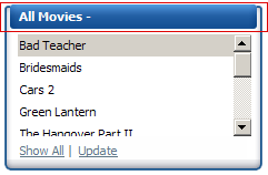
ListBoxStyle | This property applies to the whole ListBox control. For example, you can specify font, border or background color for the whole ListBox. |
|
HeaderStyle | Customize the style for the header section. This property works together with HeaderTemplate. The HeaderTemplate provides the contents for the header. This property sets the style applied to the header content. For example, you can use CSS background-image attribute to specify a round shaped header background image; or use CSS padding attribute to control the padding of the header section thus control the text position in the header. |
|
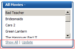
FooterStyle | Similar to HeaderStyle, but is for the footer section. |
|
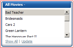
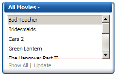
BodyStyle | Applies to the body section of the ListBox. This property usually works together with HeaderStyle and FooterStyle to offer a unique appearance of the control. For example, the VS_2008 skin (shown left) uses background-image CSS property in all these three properties to create the blue frame around the list items. It also uses padding CSS properties to reserve spaces around the list items (without padding there would not be any space between the vertical scrollbar and the blue right border). |
|
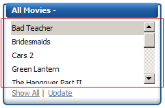
ItemListStyle | This property applies to the UI element that holds all list items. This element is the direct child element of the body section. You can use this property to set the font or padding. For example, the built-in VS_2008 uses this property to set the padding between list and the items. |
|
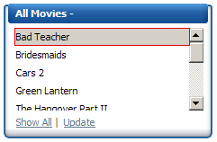
ItemStyle, AlternateItemStyle, DisabledItemStyle, SelectedItemStyle, ItemHoverStyle |
These styles apply to each item for different state. For example, ItemHoverStyle is applied when mouse is over the item. Once mouse leaves the item, ItemStyle (or another style such as AlternateItemStyle) is applied. Special consideration must be taken when customizing borders and paddings for these styles. One general rule is the sum of all borders and paddings must be the same for all these styles. Failing to do so would cause the item size changes while switching styles thus cause other items to shift up/down. For example, the following settings would violate this rule thus causing items to shift up/down when mouse is over an item: HTML <ItemStyle CssText="border: solid 1 gray;padding: 1px;" /> <ItemHoverStyle CssText="padding: 1px;" /> The above setting can cause problem because the sum of the border and padding for ItemStyle is 2 but is 1 for ItemHoverStyle. The following settings correct this problem: HTML <ItemStyle CssText="border: solid 1 gray;padding: 1px;" /> <ItemHoverStyle CssText="padding: 2px;" /> |