Table of Contents
- Getting Started
- EO.Pdf
- EO.Web
- Overview
- Installation & Deployement
- EO.Web ToolTip
- EO.Web Rating
- EO.Web Slider & RangeSlider
- EO.Web ListBox
- EO.Web ComboBox
- EO.Web Captcha
- EO.Web ASPX To PDF
- EO.Web Slide
- EO.Web Flyout
- EO.Web EditableLabel
- EO.Web ImageZoom
- EO.Web Floater
- EO.Web Downloader
- EO.Web ColorPicker
- EO.Web HTML Editor
- EO.Web File Explorer
- EO.Web SpellChecker
- EO.Web Grid
- EO.Web MaskedEdit
- EO.Web Splitter
- EO.Web Menu
- EO.Web Slide Menu
- EO.Web TabStrip
- EO.Web TreeView
- EO.Web TreeView
- Overview
- Using EO.Web TreeView
- EO.Web Calendar
- EO.Web Callback
- EO.Web MultiPage
- EO.Web Dialog
- EO.Web AJAXUploader
- EO.Web ProgressBar - Free!
- EO.Web ToolBar - Free!
- EO.WebBrowser
- EO.Wpf
- Common Topics
- Reference
| Navigation Item Look |
Apply to
Overview
Look item is special navigation item which solely purpose is to define common appearance settings for a group of items. Navigation items that use the same look item have the same appearance. For example, you can define a look item for 1st level items, 2nd level items, or some special items such as first item or the last item.
Each EO.Web navigation control maintains a collection of item looks, navigation item uses LookID property to specify which look to use as its appearance.
Look item can be easily defined by using Control Builders such as Menu Builder, saved as part of skin and can be accessed during run time.
When a skin is applied to a navigation control, the skin's item look collection will be merged with the target control's look collection at run time.
Built-in Look Items
Each navigation control has several built-in look items. You can update any built-in look items or create new look items and apply to any navigation items. The following table lists built-in looks:
| Built-in look ID | Description |
|---|---|
| _TopGroup |
Use this look to set top level group's appearance setting. Note, cannot use this property to set top level item's appearance setting. |
| _TopLevelItem |
Use this look to set top level item and its child group's appearance setting. |
| _Default |
Use this look for items as well as child groups when _TopGroup and _TopLevelItem are not specified or do not apply. If the appearance of all items is the same, you can use this look item. |
| _Separator | Use this look to set separator item's appearance setting. Some properties, for example, LeftIcon and RightIcon, do not apply to a separator item. |
Above built-in looks are used by default. You can create new look items and apply its ID to an item's LookID property or an item group's DefaultItemLookID property.
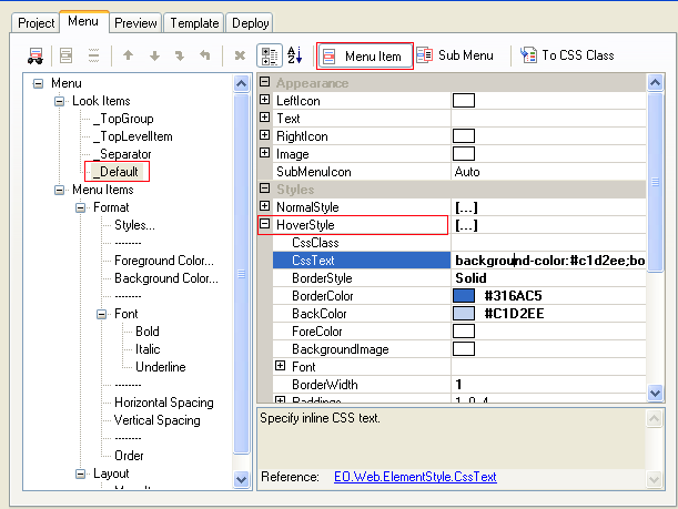
Create new look item
Control Builders (such as Menu Builder) provide an easy way to create new look and preview the appearance.- Right click an EO.Web navigation control on a web form and launch the control builder from the context menu.
-
Click the New Item Look
 button to create a new look item.
- Use the property grid on the right to edit look item's appearance style properties.
- If you want an item to use this look, just set its LookID property to the ID of the look item you just created;
- Switch to the Preview tab to preview the result.
Apply look item
| To... | Use... |
|---|---|
| Apply look to a single navigation item | Use item's LookID property. |
| Apply look to all navigation items in a group | Use item group's DefaultItemLookID property. |