Table of Contents
- Getting Started
- EO.Pdf
- EO.Web
- Overview
- Installation & Deployement
- EO.Web ToolTip
- EO.Web Rating
- EO.Web Slider & RangeSlider
- EO.Web ListBox
- EO.Web ComboBox
- EO.Web Captcha
- EO.Web ASPX To PDF
- EO.Web Slide
- EO.Web Flyout
- EO.Web EditableLabel
- EO.Web ImageZoom
- EO.Web Floater
- EO.Web Downloader
- EO.Web ColorPicker
- EO.Web HTML Editor
- EO.Web File Explorer
- EO.Web SpellChecker
- EO.Web Grid
- EO.Web MaskedEdit
- EO.Web Splitter
- EO.Web Menu
- EO.Web Slide Menu
- EO.Web TabStrip
- EO.Web TreeView
- EO.Web Calendar
- EO.Web Callback
- EO.Web MultiPage
- EO.Web Dialog
- EO.Web AJAXUploader
- EO.Web ProgressBar - Free!
- EO.Web ToolBar - Free!
- EO.WebBrowser
- EO.Wpf
- Common Topics
- Reference
| EO.Web Splitter Documentation |
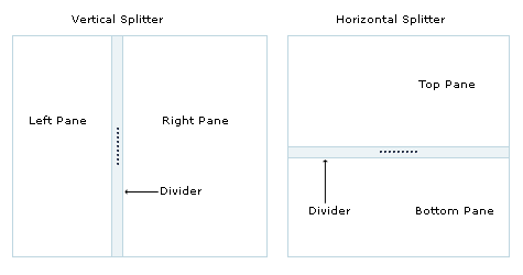
Splitter & Splitter Pane
EO.Web Splitter offers a simple two pane layout. Each Splitter contains exactly two SplitterPane controls. The first would be its LeftPane and the second would be its RightPane. When Orientation is set to Horizontal, the LeftPane is actually the top pane and the RightPane is actually the bottom pane.
SplitterPane themselves are container controls. You should place your contents into the left/top and right/bottom splitter pane respectively.
Complex layout can be achieved by nesting multiple splitters together.
Border & Divider Image
The most important properties for a Splitter are DividerImage and DividerSize. These two properties control the appearance and the width or height of the divider. Without a DividerImage, a splitter would function but user will not be able to see the divider, causing it practically unusable.
Optionally, you can set BorderStyle, BorderWidth or BorderSize on the splitter control to create a border that matches the divider.
Divider Center Image & Expand/Collpase Buttons
Optionally, you can have a DividerCenterImage or Expand/Collpase Buttons overlayed on top of the splitter image. The following diagram demonstrated how they are overlayed together:
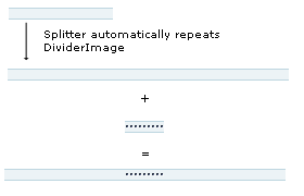
DividerCenterImage always appears at the center of the divider. Expand/collpase buttons can appear at either end or the center of the divider. DividerCenterImage and expand/collapse buttons can not be used at the same time.