Table of Contents
- Getting Started
- EO.Pdf
- EO.Web
- Overview
- Installation & Deployement
- EO.Web ToolTip
- EO.Web Rating
- EO.Web Slider & RangeSlider
- EO.Web ListBox
- EO.Web ComboBox
- EO.Web Captcha
- EO.Web ASPX To PDF
- EO.Web Slide
- EO.Web Flyout
- EO.Web EditableLabel
- EO.Web ImageZoom
- EO.Web Floater
- EO.Web Downloader
- EO.Web ColorPicker
- EO.Web HTML Editor
- EO.Web File Explorer
- EO.Web SpellChecker
- EO.Web Grid
- EO.Web MaskedEdit
- EO.Web Splitter
- EO.Web Menu
- EO.Web Slide Menu
- EO.Web TabStrip
- EO.Web TreeView
- EO.Web Calendar
- EO.Web Callback
- EO.Web MultiPage
- EO.Web Dialog
- EO.Web AJAXUploader
- EO.Web ProgressBar - Free!
- EO.Web ToolBar - Free!
- EO.WebBrowser
- EO.Wpf
- Common Topics
- Reference
| Using Server Side Interface |
Overview
EO.Web ToolBar provides both server side interface and client side (JavaScript) interface. Some features can be accessed through both interfaces. This section covers how to accomplish the following tasks through server side interface:
Note: Sometimes it is more convenient to customize ToolTip content from client side. See here for more information on how to customize ToolTip content from client side.
Customizing ToolTip Contents and Style
To customize the content of an EO.Web ToolTip control, please follow these steps:
- Set the ToolTip's PopupStyle to set the overall border, background color and padding of the ToolTip control;
-
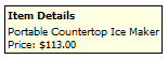
Optionally, you can display a "header" in the ToolTip. If specified, the "header" is displayed above the "body" area of the ToolTip. The following image demonstrates a ToolTip with a header:
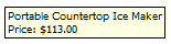
The following image demonstrates a ToolTip without a header:
Use HeaderHtml and HeaderStyle to specify the contents and the style of the ToolTip respectively.
-
To customize the ToolTip's "body" section, set the ToolTip's
BodyHtml and
BoodyStyle or use
the ToolTip's
ContentTemplate property.
For example, the following syntax uses ContentTemplate to place a Label control
inside the ToolTip:
ASPX
<eo:ToolTip .....>
    <ContentTemplate>
        <asp:Labe runat="server" ID="Label1" Text="ToolTip Contents"></asp:Labe>
    </ContentTemplate>
</eo:ToolTip>
For the above declaration, you can use the following code to set the Label's Text property:
//Get the label control
Label label = (Label)ToolTip1.ContentContainer.FindControl("Label1");

//Set the label text
label.Text = "ToolTip Contents";
Customzing ToolTip Location
Use the ToolTip's For property to set the ToolTip's "trigger" control. The ToolTip is displayed once user points the mouse over the "trigger" control for a certain period of time. Use ShowDelay to specify the amount of time before the ToolTip is displayed.
By default, the ToolTip is automatically positioned based on the mouse position. You can use ExpandDirection, OffsetX and OffsetY to customize the expanding direction and offset of the ToolTip.