Table of Contents
- Getting Started
- EO.Pdf
- EO.Web
- EO.WebBrowser
- EO.Wpf
- Common Topics
- Reference
- .NET API Reference
- EO.Base
- EO.Base.UI
- EO.Extensions
- EO.Pdf
- EO.Pdf.Acm
- EO.Pdf.Contents
- EO.Pdf.Drawing
- EO.Pdf.Mvc
- EO.Web
- EO.WebBrowser
- EO.WebBrowser.DOM
- EO.WebEngine
- EO.WinForm
- EO.Wpf
- EO.Wpf
- Classes
- BareButton Class
- Bitmap Class
- BitmapButton Class
- BooleanDependencyPropertyRoutedEventArgs Class
- Button Class
- Calendar Class
- CalendarDayButton Class
- CalendarMonth Class
- CancelEventArgs Class
- CheckBox Class
- ChoiceMaskedEditSegment Class
- ComboBox Class
- ComboBoxItem Class
- DatePicker Class
- DateRangeCollection Class
- DateRangeCollectionConverter Class
- DockContainer Class
- DockItem Class
- DockItemClosingEventArgs Class
- DockItemCollection Class
- DockItemEventArgs Class
- DockItemNeededEventArgs Class
- DockView Class
- DockViewCollection Class
- DockViewCommands Class
- DockViewEventArgs Class
- DockViewNeededEventArgs Class
- DocumentItem Class
- DropDown Class
- DropDownButton Class
- DropDownService Class
- EditItemEventArgs Class
- Effect Class
- EffectManager Class
- Expander Class
- ItemDragEventArgs Class
- ItemDragOverEventArgs Class
- ItemDropEventArgs Class
- ItemsControlHelper Class
- LinkButton Class
- ListBox Class
- ListBoxItem Class
- MaskedEdit Class
- MaskedEditSegment Class
- MaskMaskedEditSegment Class
- Menu Class
- MenuBase Class
- MenuItem Class
- MonthPicker Class
- MultiplyConverter Class
- NamedResourceKey Class
- NegationConverter Class
- NewItemRequestedEventArgs Class
- NumericMaskedEditSegment Class
- OpacityConverter Class
- PatternMaskedEditSegment Class
- PdfViewer Class
- ProgressBar Class
- RadialPanel Class
- RadioButton Class
- RangeSlider Class
- RegexMaskedEditSegment Class
- RingDefinition Class
- RingDefinitionCollection Class
- Runtime Class
- SkinStyleInfo Class
- Slider Class
- SliderBase Class
- SpinEdit Class
- SplitButton Class
- SplitLineHeightConverter Class
- SplitView Class
- StaticMaskedEditSegment Class
- TabControl Class
- TabControl Class
- TabControl Members
- TabControl Constructor
- Fields
- Properties
- Properties
- AutoRotate Property
- BottomRightScrollButtonStyle Property
- CloseTabButtonStyle Property
- ContentStringFormat Property
- ContentTemplate Property
- ContentTemplateSelector Property
- CornerRadius Property
- DropDownMenuMode Property
- FixedContentTemplate Property
- HeaderElement Property
- HeaderPadding Property
- HeaderTemplate Property
- ItemsDropDownButtonStyle Property
- NewTabButtonStyle Property
- OverlapDepth Property
- SelectedContent Property
- SelectedContentStringFormat Property
- SelectedContentTemplate Property
- SelectedContentTemplateSelector Property
- ShowCloseTabButton Property
- ShowNewTabButton Property
- TabItemOverflowStrategy Property
- TabStripPlacement Property
- TopLeftScrollButtonStyle Property
- Methods
- Events
- TabItem Class
- TabItemCloseEventArgs Class
- TabItemEventArgs Class
- TemplatePresenter Class
- ThemeManager Class
- ThemeNames Class
- ThemeStyleInfo Class
- TreeView Class
- TreeViewItem Class
- UIElementHelper Class
- UnitConverter Class
- WebControl Class
- WebView Class
- WebViewHost Class
- WeekDaysCollection Class
- WindowChrome Class
- WindowCommands Class
- YearPicker Class
- Structures
- Enumerations
- Delegates
- EO.Wpf.Gauge
- EO.Wpf.Gauge.Shapes
- EO.Wpf.Primitives
- EO.Wpf.Themes.Aero
- EO.Wpf.Themes.Classic
- EO.Wpf.Themes.Luna
- EO.Wpf.Themes.Metro
- EO.Wpf.Themes.Royale
- JavaScript API Reference
- .NET API Reference
| HeaderTemplate Property |
Gets or sets the HeaderTemplate property. This is a dependency property.
 Syntax
Property Value
The default value is null.
Remarks
The HeaderTemplate property represents a shortcut for not individually defining the HeaderTemplate of each TabItem contained in this TabControl instance.
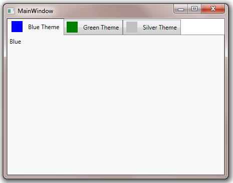
The following example uses an array of color strings as the items source of the TabControl, and then the HeaderTemplate property is used to provide a common template with color preview at the header.
XAML
<Window x:Class="Test.MainWindow"
        xmlns="http://schemas.microsoft.com/winfx/2006/xaml/presentation"
        xmlns:x="http://schemas.microsoft.com/winfx/2006/xaml"
        xmlns:eo="http://schemas.essentialobjects.com/wpf/"
        xmlns:sys="clr-namespace:System;assembly=mscorlib"
        Title="MainWindow" Height="350" Width="450">
    <Grid>
        <Grid.Resources>
            <x:Array x:Key="Themes" Type="sys:String">
                <sys:String>Blue</sys:String>
                <sys:String>Green</sys:String>
                <sys:String>Silver</sys:String>
            </x:Array>
        </Grid.Resources>

        <eo:TabControl ItemsSource="{StaticResource Themes}">
            <eo:TabControl.HeaderTemplate>
                <DataTemplate>
                    <StackPanel Orientation="Horizontal">
                        <Rectangle Width="22" Height="22" Fill="{Binding}" Margin="0,0,6,0" />
                        <Label Content="{Binding}" ContentStringFormat="{}{0} Theme" VerticalAlignment="Center" />
                    </StackPanel>
                </DataTemplate>
            </eo:TabControl.HeaderTemplate>
        </eo:TabControl>
    </Grid>
</Window>
The following image shows the result:
See Also