Table of Contents
- Getting Started
- EO.Pdf
- EO.Web
- Overview
- Installation & Deployement
- EO.Web ToolTip
- EO.Web Rating
- EO.Web Slider & RangeSlider
- EO.Web ListBox
- EO.Web ComboBox
- EO.Web Captcha
- EO.Web ASPX To PDF
- EO.Web Slide
- EO.Web Flyout
- EO.Web EditableLabel
- EO.Web ImageZoom
- EO.Web Floater
- EO.Web Downloader
- EO.Web ColorPicker
- EO.Web HTML Editor
- EO.Web File Explorer
- EO.Web SpellChecker
- EO.Web Grid
- EO.Web MaskedEdit
- EO.Web Splitter
- EO.Web Menu
- EO.Web Slide Menu
- EO.Web TabStrip
- EO.Web TreeView
- EO.Web TreeView
- Overview
- Using EO.Web TreeView
- TreeNode and TreeNodeGroup
- Look, Skin and Theme
- Style and Appearance
- Data Binding
- Handling Event
- EO.Web Calendar
- EO.Web Callback
- EO.Web MultiPage
- EO.Web Dialog
- EO.Web AJAXUploader
- EO.Web ProgressBar - Free!
- EO.Web ToolBar - Free!
- EO.WebBrowser
- EO.Wpf
- Common Topics
- Reference
| Images & Icons |
Apply to
Overview
EO.Web navigation controls provide a variety of properties to specify different images or icons to be used in different states. This section covers the following topic:
LeftIcon & RightIcon
Use LeftIcon and RightIcon to specify the icons displayed left to the text and right to the text. Here is an item screenshot that uses LeftIcon and RightIcon:

 Normally you only need to use left icon. Use
SubMenuIconUrl to indicate if the item contains sub group.
Normally you only need to use left icon. Use
SubMenuIconUrl to indicate if the item contains sub group.
EO.Web navigation controls support using different icons/images for different states. For example, you may want to use one left icon for normal state and another for hover state. Use the NavigationItemImages object returned by LeftIcon and RightIcon to specifies different Urls for different states. You can use the following properties to specify different Urls for different states:
| State | Style | Remarks |
|---|---|---|
| Normal | Url | Used when item is in none of the other states. |
| Hover | HoverUrl | Used when mouse is positioned over the item. If not set, Url is used. |
| Expanded | ExpandedUrl | Used when item's sub group is expanded. If not set, HoverUrl is used. |
| Selected | SelectedUrl | Used when item's Selected property is set to true. If not set, HoverUrl is used. |
| SelectedHover | SelectedHoverUrl | Used when item's Selected property is set to true and mouse is positioned over the item. If not set, SelectedUrl is used. |
| SelectedExpanded | SelectedExpandedUrl | Used when item's Selected property is set to true and item's sub group is expanded. If not set, SelectedHoverUrl is used. |
| Disabled | DisabledUrl | Used when item's Disabled property is set to true. If not set, Url is used. |
Image-only item
Use Image property to define an image-only item. When Image property is set, LeftIcon, Text, RightIcon and CustomItem properties are ignored. Image property is NavigationItemImages object through which you can set different images for different states.
 Even though you can change the image
Urls through client side script interface,
you cannot change a regular item into an image-only item or vice versa. Whether
a navigation item is an image only item is determined at render time and cannot
be changed there after.
Even though you can change the image
Urls through client side script interface,
you cannot change a regular item into an image-only item or vice versa. Whether
a navigation item is an image only item is determined at render time and cannot
be changed there after.
SideImage in a group
EO.Web navigation controls support using a side image in a group to achieve a side bar similar to Office style menu. See menu group appearance settings for more details.
CheckIconUrl
An item is in checked state when its
Checked property is set to true. Use
CheckIconUrl property to specify the check icon to be displayed. By
default, check icon is  if not
specified.
if not
specified.
Here's a screenshot of Menu Builder on how to set CheckIconUrl for a menu: 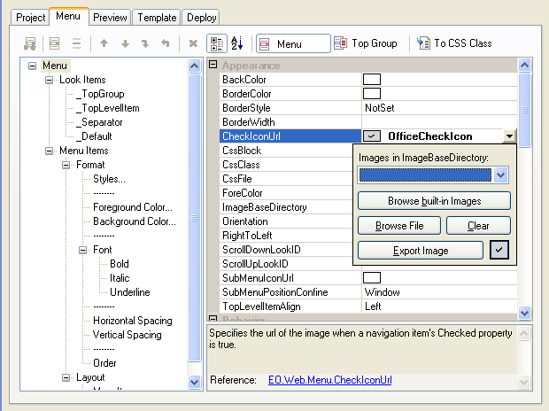
SubMenuIcon
SubMenuIcon indicates if an item has sub group. By default, the SubMenuIcon is  .
.
You can override the default icon by setting SubMenuIconUrl
The item's LeftIcon or RightIcon can be used as sub menu icon by specifying the item's SubMenuIcon property from its default value Auto to LeftIcon or RightIcon. If set to LeftIcon or RightIcon, the icon will be displayed only when the item has sub group. Specify this property for a look item to apply to a group of items.
Using built-in images
EO.Web navigation controls support a few built-in images which are compiled into EO.Web.dll and can be used at run time.
STo use a built-in image, assign the built-in image's name to a property that expects an Url, for example:
[C#]
Menu1.CheckIconUrl = "DefaultCheckIcon";

[Visual Basic]
Menu1.CheckIconUrl = "DefaultCheckIcon"
"DefaultCheckIcon" will be automatically replaced with the Url of the default
check icon when control is
rendered.