Table of Contents
- Getting Started
- EO.Pdf
- EO.Web
- Overview
- Installation & Deployement
- EO.Web ToolTip
- EO.Web Rating
- EO.Web Slider & RangeSlider
- EO.Web ListBox
- EO.Web ComboBox
- EO.Web Captcha
- EO.Web ASPX To PDF
- EO.Web Slide
- EO.Web Flyout
- EO.Web EditableLabel
- EO.Web ImageZoom
- EO.Web Floater
- EO.Web Downloader
- EO.Web ColorPicker
- EO.Web HTML Editor
- EO.Web File Explorer
- EO.Web SpellChecker
- EO.Web Grid
- EO.Web MaskedEdit
- EO.Web Splitter
- EO.Web Menu
- EO.Web Slide Menu
- EO.Web TabStrip
- EO.Web TreeView
- EO.Web TreeView
- Overview
- Using EO.Web TreeView
- TreeNode and TreeNodeGroup
- Look, Skin and Theme
- Style and Appearance
- Data Binding
- Handling Event
- EO.Web Calendar
- EO.Web Callback
- EO.Web MultiPage
- EO.Web Dialog
- EO.Web AJAXUploader
- EO.Web ProgressBar - Free!
- EO.Web ToolBar - Free!
- EO.WebBrowser
- EO.Wpf
- Common Topics
- Reference
| Item Group Appearance Settings |
Apply to
Overview
EO.Web navigation controls provide a rich set of appearance settings to configure group. This section covers the following topics:
The following topics are for Menu and SlideMenu only as they are related to popup submenu's style and TabStrip does not have popup submenu.Configure group's orientation, offset and shadow;
 Tip: Always
try to use look item to specify
styles.
Tip: Always
try to use look item to specify
styles.
Configure group's properties in Control Builder
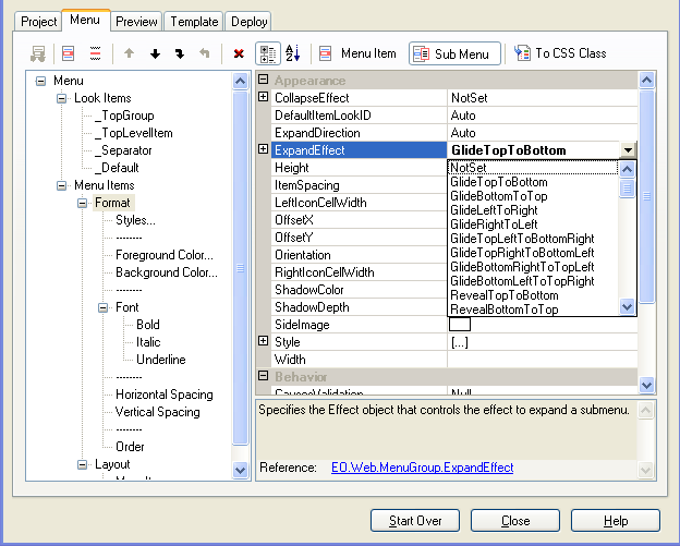
Here's an example of using Menu Builder to configure menu group's properties:- Select the parent item the group belongs to.
-
On the toolbar, click Sub Menu
 to display properties of child group of the selected item;
- Modify the group's property in the property grid.
Configure group's style
Use Style property to specify border, font, cursor and paddings of a group. For example, the following code set the top menu group's border color to blue:
[C#]
Menu1.TopGroup.Style.BorderColor = Color.Blue;

[Visual Basic]
Menu1.TopGroup.Style.BorderColor = Color.Blue
MenuGroup.Style is also the natural place to set menu cursor. The following code set the top menu group's cursor to "hand":
[C#]
Menu1.TopGroup.Style.InlineStyle["cursor"] = "hand";

[Visual Basic]
Menu1.TopGroup.Style.InlineStyle.Item("cursor") = "hand"
Note: For cursor style, Netscape interprets "hand" as "pointer". EO.Web navigation controls automatically detect and correct this situation so that "hand" will always display the hand cursor in all browsers.
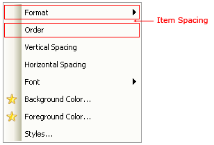
Configure group's item spacing and side bar image
ItemSpacing property defines the space between items in a group. This property can be set at design time in Control Builder or at run time through code.
Use SideImage to specify the side bar image as shown in the above screen shot. SideImage is commonly used as background for each item's LeftIcon.
Use LeftIconCellWidth and RightIconCellWidth are used to reserve space for left icon and right icon.
Configure group's orientation, offset and shadow
Orientation property supports displaying a group of items horizontally or vertically. Different groups can have different orientation settings. For example, you can use this property to create an "all-horizontal" menu:
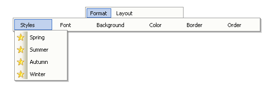
The above sample also uses OffsetX to move the horizontal group to the left, otherwise the "Styles" item would have aligned to the "Format" item.
For Menu and SlideMenu, you can use ShadowColor and ShadowDepth property to configure group shadow.
Configure group's expanding effect, delay and direction
By default, a group expands when mouse is positioned over the parent item. You can customize the expanding way using the following properties:-
ExpandDirection
For Menu and SlideMenu, use ExpandDirection to control the direction the sub menu expands. By default, the direction is BottomRight if parent item belongs to a vertical group and Bottom if it belongs to a horizontal group. Setting ExpandDirection overrides this default behavior. For example, if your menu is at the bottom of the page, you may want to set its ExpandDirection to Top. See ExpandDirection enumeration for more details. -
ExpandEffect
For Menu and SlideMenu, use ExpandEffect property to control the effect to be played when the sub menu expands. EO.Web Menu supports 60+ expand effects. The effect name begins with "Glide" and "Reveal" are supported across all browsers. Other effects are for IE only. -
ExpandOnClick
For Menu and SlideMenu, use ExpandOnClick property to control whether sub menu should expand on mouse over event or mouse click event. By default, sub menu expands on mouse over event. Setting this property to EnabledForTopLevelOnly forces the user to click the top level navigation items to expand the sub menu. See ExpandOnClickState enumeration for more details. -
ExpandDelay
For Menu and SlideMenu, use ExpandDelay property to specify the delay between triggering event happens and its sub menu starts to expand. By default, a sub menu expands when mouse moves over its parent item. You can set this value to control the sensitiveness of the menu to mouse movement.
Note: This property is ignored when user expands the sub menu by clicking the mouse or using keyboard, which cause sub menu expands immediately.
Configure group's collapsing effect and delay
By default, the following events trigger an expanded sub menu to collapse:- When mouse moves out of the menu, - OR -
- When another item is clicked;
-
CollapseEffect
For Menu and SlideMenu, use CollapseEffect to control the effect played when sub menu collapses. EO.Web Menu and SlideMenu support 60+ collapse effects. The effect name begins with "Glide" and "Reveal" are supported across all browsers. Other effects are for IE only.
When specified, EO.Web Menu automatically plays the "reverse effect" of the specified effect, not the specified effect when sub menu collapses. This allows you to easily set ExpandEffect and CollapseEffect to the same effect type without worrying whether they match or not.
-
CollapseDelay
For Menu and SlideMenu, CollapseDelay property specifies the delay between the triggering event happens and sub menu starts to collapse. The default value is 300 milliseconds. Set this value to delay the sub menu collapsing so that the menu is not too sensitive to mouse movement. -
KeepExpandedOnClick
For Menu and SlideMenu, use KeepExpandedOnClick to specify whether or not to keep the sub menu expanded when one of the menu items in the sub menu is clicked. By default, clicking any navigation items triggers the current expanded sub menu to close. Setting KeepExpandedOnClick to true keeps the sub menu stays open when any of its items is clicked. This allows end users to click on different items without navigating the menu from top level every time.