Table of Contents
- Getting Started
- EO.Pdf
- EO.Web
- Overview
- Installation & Deployement
- EO.Web ToolTip
- EO.Web Rating
- EO.Web Slider & RangeSlider
- EO.Web ListBox
- EO.Web ComboBox
- EO.Web Captcha
- EO.Web ASPX To PDF
- EO.Web Slide
- EO.Web Flyout
- EO.Web EditableLabel
- EO.Web ImageZoom
- EO.Web Floater
- EO.Web Downloader
- EO.Web ColorPicker
- EO.Web HTML Editor
- EO.Web File Explorer
- EO.Web SpellChecker
- EO.Web Grid
- EO.Web MaskedEdit
- EO.Web Splitter
- EO.Web Menu
- EO.Web Slide Menu
- EO.Web TabStrip
- EO.Web TreeView
- EO.Web Calendar
- EO.Web Callback
- EO.Web MultiPage
- EO.Web Dialog
- EO.Web AJAXUploader
- EO.Web ProgressBar - Free!
- EO.Web ToolBar - Free!
- EO.WebBrowser
- EO.Wpf
- Common Topics
- Reference
| EO.Web ProgressBar Visual Modal |
The following image depicts the visual modal for the progress bar:
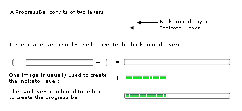
Configure the Background Layer
Use BackgroundImageLeft, BackgroundImage and BackgroundImage properties to configure a ProgressBar's left, center and right background images. Note it is not necessary to have BackgroundImage to the same width as the progress bar because the BackgroundImage is automatically repeated to fill the entire background.
Alternatively, you may wish to use a solid color border instead of background images. Use the standard WebControl BorderColor, BorderStyle and BorderWidth to implement a border.
Configure the Indicator Layer
Indicator layer can be an image or a solid color bar, the ProgressBar automatically resize/repeat the image or solid color bar to reflect the ProgressBar's Value property.
When using a color bar as an indicator, you can specify IndicatorColor properpty. ProgressBar will create the color bar to indicate the current status.
If you want to use an image as an indicator, you can specify IndicatorImage and RepeatIndicatorImage properties.