Table of Contents
- Getting Started
- EO.Pdf
- EO.Web
- Overview
- Installation & Deployement
- EO.Web ToolTip
- EO.Web Rating
- EO.Web Slider & RangeSlider
- EO.Web ListBox
- EO.Web ComboBox
- EO.Web Captcha
- EO.Web ASPX To PDF
- EO.Web Slide
- EO.Web Flyout
- EO.Web EditableLabel
- EO.Web ImageZoom
- EO.Web Floater
- EO.Web Downloader
- EO.Web ColorPicker
- EO.Web HTML Editor
- EO.Web File Explorer
- EO.Web SpellChecker
- EO.Web Grid
- EO.Web MaskedEdit
- EO.Web Splitter
- EO.Web Menu
- EO.Web Slide Menu
- EO.Web TabStrip
- EO.Web TreeView
- EO.Web Calendar
- EO.Web Callback
- EO.Web MultiPage
- EO.Web Dialog
- EO.Web AJAXUploader
- EO.Web ProgressBar - Free!
- EO.Web ToolBar - Free!
- EO.WebBrowser
- EO.Wpf
- Common Topics
- Reference
| Creating a Custom Slider |
Overview
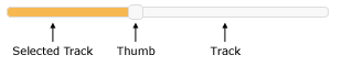
A basic slider consists of a track and a thumb. To create a custom slider, you must provide custom images for the following UI elements:
The following image demonstrates these portions of the slider.
Optionally, you can also customize tick mark images and increase/decrease button images.
The Track
Use Track property to configure the track portion of the slider. Follow these points when providing a custom track image:
-
Set Track.ImageUrl to the Url of your custom track image. The track image must include both ends of the track. For example, the following image shows the track image used by the above screenshot:

Note the round corners at both ends of the track image.
- Important: For horizontal slider, the width of the track image must be no less than the intended width of the slider control. For example, if the intended width of the slider control is 300 pixels, then the width of the track image must be at least 300 pixels. For vertical slider, this rule applies on the image height instead of image width;
- Important: For horizontal slider, you must also set Track.Height to the actual pixel height of your track image. For example, if your track image height is 5 pixels, then you must set Track.Height to 5. For vertical slider, this rules applies to Track.Width instead of Track.Height;
-
Optionally, you can specify a different image for the track when the track is in hover (when mouse is over the track), down (when left button is pressed) and disabled (when the slider is disabled) state with the following properties:
Property Remark Track.HoverImageUrl Image used when mouse is over the track. Track.DownImageUrl Image used when user presses left button down on the track. Track.DisabledImageUrl Image used when the slider is disabled. All these images must be of the same size.
The Selected Track
Use SelectedTrack property to configure the selected (highlighted) portion of the track. Follow the same rules for track image as above. The following image shows the selected track image used by the above screenshot:

The Thumb
Use Thumb property to configure the thumb portion of the slider. Follow these points when providing a custom thumb image:
-
Set Thumb.ImageUrl to the Url of your custom thumb image. The thumb image used by the above screenshot is
 .
.
- Important: You must also set both Thumb.Width and Thumb.Height to the actual pixel width and height of your thumb image;
-
Optionally, you can specify a different image for the thumb when the thumb is in hover (when mouse is over the thumb), down (when left button is pressed) and disabled (when the slider is disabled) state with the following properties:
Property Remark Thumb.HoverImageUrl Image used when mouse is over the thumb. Thumb.DownImageUrl Image used when user presses left button down on the thumb. Thumb.DisabledImageUrl Image used when the slider is disabled. All these images must be of the same size.