Table of Contents
- Getting Started
- EO.Pdf
- EO.Web
- EO.WebBrowser
- EO.Wpf
- Overview
- Installation & Deployement
- Skin & Theme
- Common Taskes and Services
- EO.Wpf Buttons
- EO.Wpf Calendar & DatePicker
- EO.Wpf ComboBox
- EO.Wpf DockView
- EO.Wpf Gauge
- EO.Wpf Gauge
- Using Scales
- Using Gauge Frames
- Creating a Gauge
- Understanding TickBar
- EO.Wpf ListBox
- EO.Wpf Menu
- EO.Wpf MaskedEdit
- EO.Wpf ProgressBar
- EO.Wpf Slider
- EO.Wpf SpinEdit
- EO.Wpf SplitView
- EO.Wpf TabControl
- EO.Wpf TreeView
- EO.Wpf Utility Controls
- EO.Wpf WindowChrome
- Sample Data Objects
- Common Topics
- Reference
| Using CircularGaugeFrame |
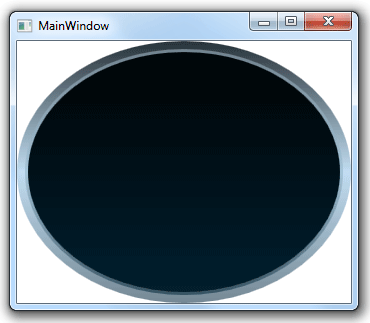
You can use CircularGaugeFrame to provide an artistic circular background for your gauge. The following code demonstrates how to use this class:
<Window x:Class="Test.MainWindow"
        xmlns="http://schemas.microsoft.com/winfx/2006/xaml/presentation"
        xmlns:x="http://schemas.microsoft.com/winfx/2006/xaml"
        xmlns:eo="http://schemas.essentialobjects.com/wpf/"
        Title="MainWindow" Height="300" Width="350">
    <Grid eo:ThemeManager.SkinName="Style1">
        <eo:CircularGaugeFrame></eo:CircularGaugeFrame>
    </Grid>
</Window>
Note that the code applies built-in skin "Style1" through ThemeManager.SkinName attached property. The above code generates the following result:
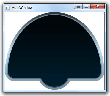
You can set the CircularGaugeFrame's Kind property to specify what type of circular frame it should create: Half, Quater, ThreeQuater or Circle. The following code has the Kind property set to Half:
<Window x:Class="Test.MainWindow"
        xmlns="http://schemas.microsoft.com/winfx/2006/xaml/presentation"
        xmlns:x="http://schemas.microsoft.com/winfx/2006/xaml"
        xmlns:eo="http://schemas.essentialobjects.com/wpf/"
        Title="MainWindow" Height="300" Width="350">
    <Grid eo:ThemeManager.SkinName="Style1">
        <eo:CircularGaugeFrame Kind="Half"></eo:CircularGaugeFrame>
    </Grid>
</Window>
The above code generates the following result:
explain Rotation property
CircularGaugeFrame supports a number of built-in skins: Style1, Style2, Style3 and Style4. The following code uses the "Style4" skin:
<Window x:Class="Test.MainWindow"
        xmlns="http://schemas.microsoft.com/winfx/2006/xaml/presentation"
        xmlns:x="http://schemas.microsoft.com/winfx/2006/xaml"
        xmlns:eo="http://schemas.essentialobjects.com/wpf/"
        Title="MainWindow" Height="300" Width="350">
    <Grid eo:ThemeManager.SkinName="Style4">
        <eo:CircularGaugeFrame></eo:CircularGaugeFrame>
        <eo:CircularScale></eo:CircularScale>
    </Grid>
</Window>
The above code produces the following result:
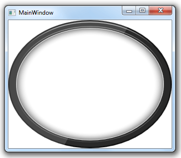
Note that the above code sets attached property eo:ThemeManager.skinName on the outside Grid control instead of on the CircularGaugeFrame itself. This is very common practice when creating a gauge because this can apply the same skin to all child controls (because SkinName attached property is inheritable). The above code applies "Winter" skin for both the LinearGaugeFrame and the CircularScale control inside the Grid.
Internally CircularGaugeFrame uses multiple gauge shape objects, which all derives from BaseGaugeShape class. If none of the built-in skin fits your need, you can use one of the shape class directly. See here for more information on how to use circular shape.