Table of Contents
- Getting Started
- EO.Pdf
- EO.Web
- EO.WebBrowser
- EO.Wpf
- Overview
- Installation & Deployement
- Skin & Theme
- Common Taskes and Services
- EO.Wpf Buttons
- EO.Wpf Calendar & DatePicker
- EO.Wpf ComboBox
- EO.Wpf DockView
- EO.Wpf Gauge
- EO.Wpf Gauge
- Using Scales
- Using Gauge Frames
- Creating a Gauge
- Understanding TickBar
- EO.Wpf ListBox
- EO.Wpf Menu
- EO.Wpf MaskedEdit
- EO.Wpf ProgressBar
- EO.Wpf Slider
- EO.Wpf SpinEdit
- EO.Wpf SplitView
- EO.Wpf TabControl
- EO.Wpf TreeView
- EO.Wpf Utility Controls
- EO.Wpf WindowChrome
- Sample Data Objects
- Common Topics
- Reference
| Using Circular Gauge Shapes |
EO.Wpf.Gauge framework provides several classes that derive from Shape class that you can use to construct a gauge frame. Unlike a CircularGuageFrame class, which can be used to quickly apply built-in skins, the shape class renders a shape and it is very often that you will need to use multiple nested shape class to create the desired frame.
Using QuarterGaugeShape
The QuarterGaugeShape class can be used to create a shape that is one fourth of a full circle:
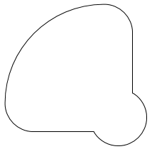
A QuarterGaugeShape consists of a large quarter circle and a small round "cap". By default the large circle always automatically fill the container. For this reason the size of the shape is often set on the container element, not on the shape element. For example, the following code sets the size on the containing Grid element:
<Grid Width="200" Height="200">
    <eo:QuarterGaugeShape Stroke="Black" CapRadius="40" CapOffset="20"></eo:QuarterGaugeShape>
</Grid>
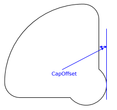
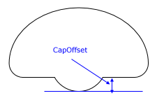
You can further use CapRadius to customize the size of the cap. Uses CapOffset to specify the distance between the edge and the big circle, as shown in the following image:
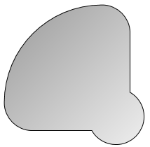
Because it derives from standard Shape class, you can use properties on the Shape class. For example, the following code creates a shape with a black border and a gray graident fill:
<Grid Width="200" Height="200" Margin="20">
    <eo:QuarterGaugeShape Stroke="Black" CapRadius="40" CapOffset="20">
        <eo:QuarterGaugeShape.Fill>
            <LinearGradientBrush StartPoint="0,0" EndPoint="1,1">
                <GradientStop Offset="0" Color="#999999"></GradientStop>
                <GradientStop Offset="1" Color="#eeeeee"></GradientStop>
            </LinearGradientBrush>
        </eo:QuarterGaugeShape.Fill>
    </eo:QuarterGaugeShape>
</Grid>
The above code produces the following result:
Using HalfGaugeShape
A HalfGaugeShape is very similar to a QuarterGaugeShape, except that the larger part is half a circle:
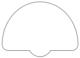
Similar to QuarterGaugeShape, you can use CapRadius to customize the size of the cap. Uses CapOffset to specify the distance between the edge and the big circle, as shown in the following image:
Using ThreeQuaterGaugeShape
A ThreeQuarterGaugeShape produce the following shape:
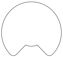
Like QuarterGaugeShape and HalfGaugeShape, you can use CapRadius to customize the size of the cap. However CapOffset is ignored for ThreeQuarterGaugeShape.
Rotating Shapes
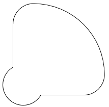
You can use Rotation property to rotate the shape. For example, by default, the cap for a QuarterGaugeShape is at the bottom right corner of the shape. The following code rotates it by 90 degrees:
<Grid Width="200" Height="200">
    <eo:QuarterGaugeShape Stroke="Black" CapRadius="40" CapOffset="20" Rotation="Rotate90"></eo:QuarterGaugeShape>
</Grid>
The above code produces the following result:
Nesting Multiple Shapes
It is very often necessary to nest multiple shapes together to create the desired effect. For example, the following XAML uses two nesting QuarterGaugeShape:
<Window x:Class="Test.MainWindow"
        xmlns="http://schemas.microsoft.com/winfx/2006/xaml/presentation"
        xmlns:x="http://schemas.microsoft.com/winfx/2006/xaml"
        xmlns:eo="http://schemas.essentialobjects.com/wpf/"
        Title="MainWindow" Height="300" Width="350">
    <Grid>
        <eo:QuarterGaugeShape Fill="LightGray"></eo:QuarterGaugeShape>
        <eo:QuarterGaugeShape Padding="20" Fill="White"></eo:QuarterGaugeShape>
    </Grid>
</Window>
The above code produces the following result:
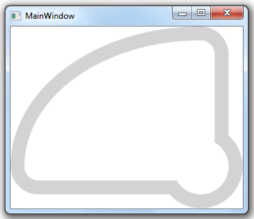
Note in order for the inner QuarterGaugeShape to align correctly with the outer QuarterGaugeShape, you must not reduce the size of the second QuarterGaugeShape control (so that both QuarterGaugeShapes are of the same size). Instead you should use Padding to reduce the area covered by the shape.