Table of Contents
- Getting Started
- EO.Pdf
- EO.Web
- EO.WebBrowser
- EO.Wpf
- Overview
- Installation & Deployement
- Skin & Theme
- Common Taskes and Services
- EO.Wpf Buttons
- EO.Wpf Calendar & DatePicker
- EO.Wpf ComboBox
- EO.Wpf DockView
- EO.Wpf Gauge
- EO.Wpf Gauge
- Using Scales
- Using Gauge Frames
- Creating a Gauge
- Understanding TickBar
- EO.Wpf ListBox
- EO.Wpf Menu
- EO.Wpf MaskedEdit
- EO.Wpf ProgressBar
- EO.Wpf Slider
- EO.Wpf SpinEdit
- EO.Wpf SplitView
- EO.Wpf TabControl
- EO.Wpf TreeView
- EO.Wpf Utility Controls
- EO.Wpf WindowChrome
- Sample Data Objects
- Common Topics
- Reference
| Creating a Gauge |
Under EO.Wpf Gauge framework, a Gauge is not an individual control. It is simply several related controls stacked together to produce a gauge like output. For example, a typical Gauge contains a frame and a scale, but some gauges may contain one frame and several scales, and some other gauges may contain one frame, several scales and several labels. This articular outlines the usual steps involved in creating a Gauge control:
Step 1: Place a Grid in the XAML
The first step of creating a Gauge is to place a Grid control in the XAML. This Grid will serve as the container for all other elements that makes up the gauge.
Optionally, you can set eo:ThemeManager.skinName attached property on this Grid to choose a built-in skin for all the frame control and scale control you will place inside the Grid. See here for more details about this property.
Step 2: Choose a Gauge Frame
EO.Wpf provides LinearGaugeFrame and CircularGaugeFrame class for you to create an artistic frame. Additionally, you can also use standard WPF Shape class or shape class provided by EO.Wpf to create gauge frames. See here and here for more details on how to uses these two classes. See here for more details on how to use shape classes provided by EO.Wpf.
Step 3: Add Scales
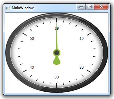
The next step is to add one or more scales. The following code demonstrates a Grid that contains a single frame and a single scale:
<Window x:Class="Test.MainWindow"
        xmlns="http://schemas.microsoft.com/winfx/2006/xaml/presentation"
        xmlns:x="http://schemas.microsoft.com/winfx/2006/xaml"
        xmlns:eo="http://schemas.essentialobjects.com/wpf/"
        Title="MainWindow" Height="300" Width="350">
    <Grid eo:ThemeManager.SkinName="Style4">
        <eo:CircularGaugeFrame></eo:CircularGaugeFrame>
        <eo:CircularScale Minimum="0" Maximum="60" StartAngle="270" EndAngle="270" ShowFirst="False">
            <eo:CircularScale.RingDefinitions>
                <eo:RingDefinition RadiusX="100" RadiusY="80"></eo:RingDefinition>
                <eo:RingDefinition RadiusX="120" RadiusY="100"></eo:RingDefinition>
            </eo:CircularScale.RingDefinitions>
            <eo:CircularScale.MajorTickOptions>
                <eo:MajorCircularTickOptions Ring="1"></eo:MajorCircularTickOptions>
            </eo:CircularScale.MajorTickOptions>
            <eo:CircularScale.MinorTickOptions>
                <eo:MinorCircularTickOptions Ring="1"></eo:MinorCircularTickOptions>
            </eo:CircularScale.MinorTickOptions>
            <eo:CircularScale.ValueIndicators>
                <eo:Needle Width="100"></eo:Needle>
            </eo:CircularScale.ValueIndicators>
        </eo:CircularScale>
    </Grid>
</Window>
The above code produces the following result:
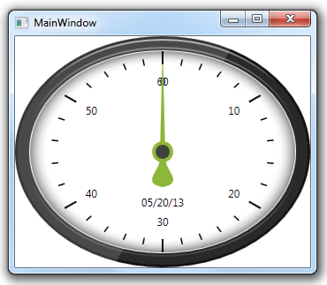
Step 4: Add Other Controls
You may want to add other elements into the Gauge. For example, the following code adds a date value "05/20/2013" into the Gauge:
<Window x:Class="Test.MainWindow"
        xmlns="http://schemas.microsoft.com/winfx/2006/xaml/presentation"
        xmlns:x="http://schemas.microsoft.com/winfx/2006/xaml"
        xmlns:eo="http://schemas.essentialobjects.com/wpf/"
        Title="MainWindow" Height="300" Width="350">
    <Grid eo:ThemeManager.SkinName="Style4">
        <eo:CircularGaugeFrame></eo:CircularGaugeFrame>
        <eo:CircularScale Minimum="0" Maximum="60" StartAngle="270" EndAngle="270" ShowFirst="False">
            <eo:CircularScale.RingDefinitions>
                <eo:RingDefinition RadiusX="100" RadiusY="80"></eo:RingDefinition>
                <eo:RingDefinition RadiusX="120" RadiusY="100"></eo:RingDefinition>
            </eo:CircularScale.RingDefinitions>
            <eo:CircularScale.MajorTickOptions>
                <eo:MajorCircularTickOptions Ring="1"></eo:MajorCircularTickOptions>
            </eo:CircularScale.MajorTickOptions>
            <eo:CircularScale.MinorTickOptions>
                <eo:MinorCircularTickOptions Ring="1"></eo:MinorCircularTickOptions>
            </eo:CircularScale.MinorTickOptions>
            <eo:CircularScale.ValueIndicators>
                <eo:Needle Width="100"></eo:Needle>
            </eo:CircularScale.ValueIndicators>
        </eo:CircularScale>
        <!--Additional Elements Added to the Gauge-->
        <TextBlock HorizontalAlignment="Center" Margin="0,180,0,0">05/20/13</TextBlock>
    </Grid>
</Window>
The above code produces the following result: