Table of Contents
- Getting Started
- EO.Pdf
- EO.Web
- EO.WebBrowser
- EO.Wpf
- Overview
- Installation & Deployement
- Skin & Theme
- Common Taskes and Services
- EO.Wpf Buttons
- EO.Wpf Calendar & DatePicker
- EO.Wpf ComboBox
- EO.Wpf DockView
- EO.Wpf Gauge
- EO.Wpf ListBox
- EO.Wpf Menu
- EO.Wpf MaskedEdit
- EO.Wpf ProgressBar
- EO.Wpf Slider
- EO.Wpf SpinEdit
- EO.Wpf SplitView
- EO.Wpf TabControl
- EO.Wpf TreeView
- EO.Wpf Utility Controls
- EO.Wpf WindowChrome
- Sample Data Objects
- Common Topics
- Reference
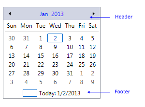
| Customizing Header & Footer |
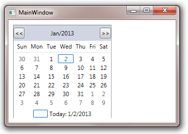
The header and footer section of an EO.Wpf Calendar control is fully customizable. The following image demonstrates the header and footer section of a Calendar control:
This section covers the following topics:
Customizing Header/Footer Style
Customizing Previous/Next Button Style
Show/Hide Header/Footer
By default, both header and footer are displayed. You can hide header or footer by setting ShowHeader and ShowFooter to false respectively.
Customizing Header/Footer Style
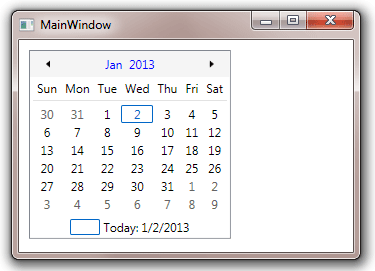
You can customize the style for the header and footer section with HeaderStyle and FooterStyle respectively. The following code demonstrates how to customize the Calendar's header style:
<Window x:Class="Test.MainWindow"
        xmlns="http://schemas.microsoft.com/winfx/2006/xaml/presentation"
        xmlns:x="http://schemas.microsoft.com/winfx/2006/xaml"
        xmlns:eo="http://schemas.essentialobjects.com/wpf/"
        Title="MainWindow" Height="250" Width="350">
    <StackPanel Margin="10">
        <eo:Calendar HorizontalAlignment="Left">
            <eo:Calendar.HeaderStyle>
                <Style TargetType="Border">
                    <Setter Property="Background" Value="WhiteSmoke"></Setter>
                    <Setter Property="Padding" Value="5"></Setter>
                </Style>
            </eo:Calendar.HeaderStyle>
        </eo:Calendar>
    </StackPanel>
</Window>
The above code produces the following result:
Customize Previous/Next Button Style
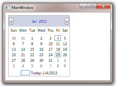
You can customize the previous and next button through PreviousButtonStyle and NextButtonStyle. The following sample demonstrates how to use these properties:
<Window x:Class="Test.MainWindow"
        xmlns="http://schemas.microsoft.com/winfx/2006/xaml/presentation"
        xmlns:x="http://schemas.microsoft.com/winfx/2006/xaml"
        xmlns:eo="http://schemas.essentialobjects.com/wpf/"
        Title="MainWindow" Height="260" Width="360">
    <StackPanel Margin="10">
        <eo:Calendar HorizontalAlignment="Left">
            <eo:Calendar.PreviousButtonStyle>
                <Style TargetType="eo:RepeatButton">
                    <Setter Property="Margin" Value="2"></Setter>
                    <Setter Property="Content" Value="<"></Setter>
                </Style>
            </eo:Calendar.PreviousButtonStyle>
            <eo:Calendar.NextButtonStyle>
                <Style TargetType="eo:RepeatButton">
                    <Setter Property="Margin" Value="2"></Setter>
                    <Setter Property="Content" Value=">"></Setter>
                </Style>
            </eo:Calendar.NextButtonStyle>
        </eo:Calendar>
    </StackPanel>
</Window>
The above code produces the following result:
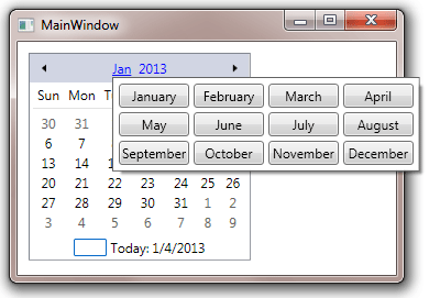
Customize Month Picker Style
By default the calendar header contains previous button, next button and a MonthPicker. User can click the month and year in the MonthPicker to display a drop down to switch to another month. The following image demonstrates this feature:
You can customize the MonthPicker style through MonthPickerStyle property. See using MonthPicker for more information about how to customize a MonthPicker.
Customizing Header/Footer Template
You can replace the entire default header/footer with a custom DataTemplate through HeaderTemplate and FooterTemplate respectively. You can place anything in the template. However it is customary to have a "Previous" and a "Next" button in the header to allow user to navigate to the previous and next month. The header section would also usually display the current month. The following sample demonstrates a simple custom header containing only these parts:
<Window x:Class="Test.MainWindow" xmlns="http://schemas.microsoft.com/winfx/2006/xaml/presentation" xmlns:x="http://schemas.microsoft.com/winfx/2006/xaml" xmlns:eo="http://schemas.essentialobjects.com/wpf/" Title="MainWindow" Height="250" Width="350"> <StackPanel Margin="10"> <eo:Calendar HorizontalAlignment="Left"> <eo:Calendar.HeaderTemplate> <DataTemplate> <DockPanel> <eo:RepeatButton DockPanel.Dock="Left" Command="eo:Calendar.PreviousMonth"><<</eo:RepeatButton> <eo:RepeatButton DockPanel.Dock="Right" Command="eo:Calendar.NextMonth">>></eo:RepeatButton> <ContentPresenter Content="{Binding RelativeSource={RelativeSource Mode=FindAncestor, AncestorType=eo:Calendar}, Path=FirstVisibleMonth}" ContentStringFormat="MMM/yyyy" HorizontalAlignment="Center" VerticalAlignment="Center"> </ContentPresenter> </DockPanel> </DataTemplate> </eo:Calendar.HeaderTemplate> </eo:Calendar> </StackPanel> </Window>
The above code produces the following result:
Key points in the above code:
- The previous button and the next button are bound to PreviousMonth command and NextMonth respectively. When the button is clicked, it triggers the corresponding command to scroll the calendar to the previous or next month;
- A ContentPresenter control is being used to display the current month;
Customizing footer template is very similar except that it usually does not contain the navigational buttons.