Table of Contents
- Getting Started
- EO.Pdf
- EO.Web
- EO.WebBrowser
- EO.Wpf
- Overview
- Installation & Deployement
- Skin & Theme
- Common Taskes and Services
- EO.Wpf Buttons
- EO.Wpf Calendar & DatePicker
- EO.Wpf ComboBox
- EO.Wpf DockView
- EO.Wpf Gauge
- EO.Wpf ListBox
- EO.Wpf Menu
- EO.Wpf MaskedEdit
- EO.Wpf ProgressBar
- EO.Wpf Slider
- EO.Wpf SpinEdit
- EO.Wpf SplitView
- EO.Wpf TabControl
- EO.Wpf TreeView
- EO.Wpf Utility Controls
- EO.Wpf WindowChrome
- Sample Data Objects
- Common Topics
- Reference
| Multi-Month View |
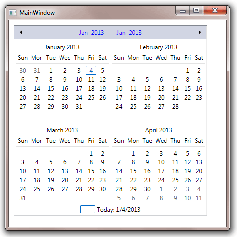
EO.Wpf Calendar supports multi-month view. To enable multi-month view, simply set MonthRows or MonthColumns to a value greater than 1. The following sample has both MonthRows and MonthColumns set to 2:
XAML
<Window x:Class="Test.MainWindow"
        xmlns="http://schemas.microsoft.com/winfx/2006/xaml/presentation"
        xmlns:x="http://schemas.microsoft.com/winfx/2006/xaml"
        xmlns:eo="http://schemas.essentialobjects.com/wpf/"
        Title="MainWindow" Height="450" Width="450">
    <StackPanel Margin="10">
        <eo:Calendar HorizontalAlignment="Left" MonthRows="2" MonthColumns="2">
        </eo:Calendar>
    </StackPanel>
</Window>
The above code produces the following result:
When multi-month view is enabled, property IsInMultiMonthView returns true.
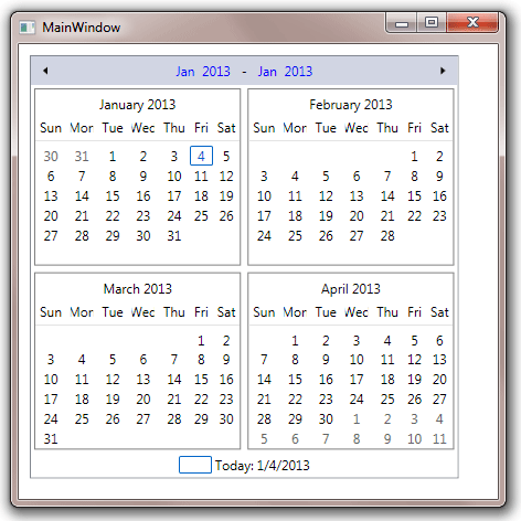
When a Calendar is in multi-month view, it contains multiple CalendarMonth elements. You can use MonthStyle to customize the style of the CalendarMonth elements. The following sample displays a gray border for each CalendarMonth:
XAML
<Window x:Class="Test.MainWindow"
        xmlns="http://schemas.microsoft.com/winfx/2006/xaml/presentation"
        xmlns:x="http://schemas.microsoft.com/winfx/2006/xaml"
        xmlns:eo="http://schemas.essentialobjects.com/wpf/"
        Title="MainWindow" Height="450" Width="450">
    <StackPanel Margin="10">
        <eo:Calendar HorizontalAlignment="Left" MonthRows="2" MonthColumns="2">
            <eo:Calendar.MonthStyle>
                <Style TargetType="eo:CalendarMonth">
                    <Setter Property="BorderBrush" Value="Gray"></Setter>
                    <Setter Property="BorderThickness" Value="1"></Setter>
                </Style>
            </eo:Calendar.MonthStyle>
        </eo:Calendar>
    </StackPanel>
</Window>
The above code produces the following result: