Table of Contents
- Getting Started
- EO.Pdf
- EO.Web
- EO.WebBrowser
- EO.Wpf
- Overview
- Installation & Deployement
- Skin & Theme
- Common Taskes and Services
- EO.Wpf Buttons
- EO.Wpf Calendar & DatePicker
- EO.Wpf ComboBox
- EO.Wpf DockView
- EO.Wpf Gauge
- EO.Wpf ListBox
- EO.Wpf Menu
- EO.Wpf MaskedEdit
- EO.Wpf ProgressBar
- EO.Wpf Slider
- EO.Wpf SpinEdit
- EO.Wpf SplitView
- EO.Wpf TabControl
- EO.Wpf TreeView
- EO.Wpf Utility Controls
- EO.Wpf WindowChrome
- Sample Data Objects
- Common Topics
- Reference
| Customizing Day Header |
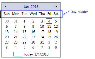
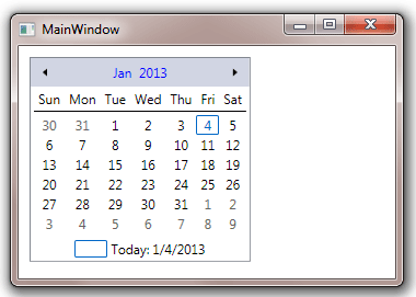
EO.Wpf Calendar provides a number of properties for you to customize day headers. The following image demonstrates the day header section of a Calendar:
This section covers the following topics:
Customizing Day Header Format
Use DayHeaderFormat property to customize day header format. The default value is "Short", which returns the abbreviated day names as defined in your current culture. For example, "Sun" for "Sunday" in English.
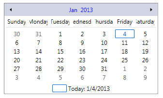
If day header text is too long (for example, when DayHeaderFormat is set to Full), then you may need to set DayColumnWidth to increase the default column width. For example, the following image demonstrates a Calendar with DayHeaderFormat set to Full, but the day header text are cut off because the default day column width is not wide enough:
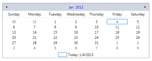
To correct this problem, you can set DayColumnWidth to a larger value. The following code sets it to 75:
<eo:Calendar DayHeaderFormat="Full" DayColumnWidth="70">
</eo:Calendar>
The above code produces the following result:
Customizing Day Header Style
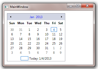
Use DayHeaderStyle to customize the text style for the day header. The following sample set the header text to bold, and also applies a left padding:
<Window x:Class="Test.MainWindow"
        xmlns="http://schemas.microsoft.com/winfx/2006/xaml/presentation"
        xmlns:x="http://schemas.microsoft.com/winfx/2006/xaml"
        xmlns:eo="http://schemas.essentialobjects.com/wpf/"
        Title="MainWindow" Height="250" Width="360">
    <StackPanel Margin="10">
        <eo:Calendar HorizontalAlignment="Left">
            <eo:Calendar.DayHeaderStyle>
                <Style TargetType="TextBlock">
                    <Setter Property="FontWeight" Value="Bold" />
                    <Setter Property="Padding" Value="5,0" />
                </Style>
            </eo:Calendar.DayHeaderStyle>
        </eo:Calendar>
    </StackPanel>
</Window>
The above code produces the following result:
Customizing Day Header Separator
Day header separator is the horizontal line below the day headers that separates the day headers and the day buttons. This line is implemented with a Rectangle. The following code demonstrates how to use this property:
<Window x:Class="Test.MainWindow"
        xmlns="http://schemas.microsoft.com/winfx/2006/xaml/presentation"
        xmlns:x="http://schemas.microsoft.com/winfx/2006/xaml"
        xmlns:eo="http://schemas.essentialobjects.com/wpf/"
        Title="MainWindow" Height="250" Width="360">
    <StackPanel Margin="10">
        <eo:Calendar HorizontalAlignment="Left">
            <eo:Calendar.DayHeaderSeparatorStyle>
                <Style TargetType="Rectangle">
                    <Setter Property="Margin" Value="0,3,0,3"></Setter>
                    <Setter Property="Height" Value="1"></Setter>
                    <Setter Property="Fill" Value="Black"></Setter>
                </Style>
            </eo:Calendar.DayHeaderSeparatorStyle>
        </eo:Calendar>
    </StackPanel>
</Window>
The above code produces the following result: