Table of Contents
- Getting Started
- EO.Pdf
- EO.Web
- EO.WebBrowser
- EO.Wpf
- Overview
- Installation & Deployement
- Skin & Theme
- Common Taskes and Services
- EO.Wpf Buttons
- EO.Wpf Calendar & DatePicker
- EO.Wpf ComboBox
- EO.Wpf DockView
- EO.Wpf Gauge
- EO.Wpf ListBox
- EO.Wpf Menu
- EO.Wpf MaskedEdit
- EO.Wpf ProgressBar
- EO.Wpf Slider
- EO.Wpf SpinEdit
- EO.Wpf SplitView
- EO.Wpf TabControl
- EO.Wpf TreeView
- EO.Wpf Utility Controls
- EO.Wpf WindowChrome
- Sample Data Objects
- Common Topics
- Reference
| Customizing Selectable Dates |
EO.Wpf Calendar provides a number of properties for you customize which dates are selectable and selection behaviors. The section covers the following topics:
Customizing Selectable Dates
EO.Wpf Calendar provides a number of properties to control which dates are selectable. The following table summarizes these properties:
| Property | Remarks |
|---|---|
| MinDate, MaxDate | Set the maximum and minium selectable dates. |
| DisabledDates | Contains a collection of DateRange object that explicitly defines disabled date ranges. |
| DisabledDaysOfWeek | Specifies which day(s) of the week should always be disabled. |
Setting Selectable Mode
EO.Wpf Calendar supports the following selection mode:
To change the selection mode, set the SelectionMode property.
| Member Name | Description |
|---|---|
| Single | A single date is selected at a time. |
| Multiple | Multiple dates can be selected without holding a modifier key. In this mode, if user clicks a date that has already been selected, it unselects that date. |
| Extended | Multiple consecutive dates can be selected while holding the SHIFT key. Multiple non-consecutive dates can be selected while holding the CONTROL key. |
Using Month, Week and Day Selector
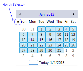
EO.Wpf Calendar supports month selector, week selector and day selector. When a month selector is clicked, it selects all days for that month. When a week selector is clicked, it selects all days for that week. When a day selector is clicked, it selects all days in the month for the same week days. For example, a "Sunday" selector would select all Sundays for that month.
A month selector can be displayed at the top left corner of the calendar. To display the month calendar, SelectionMode must be Multiple or Extended, and EnableMonthSelector must be set to True. The following image shows the month selector:
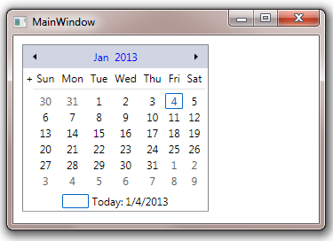
The month selector can be customized through MonthSelectorStyle, The target type of this style is BareButton. The following sample demonstrates how to use this property:
<Window x:Class="Test.MainWindow"
        xmlns="http://schemas.microsoft.com/winfx/2006/xaml/presentation"
        xmlns:x="http://schemas.microsoft.com/winfx/2006/xaml"
        xmlns:eo="http://schemas.essentialobjects.com/wpf/"
        Title="MainWindow" Height="250" Width="360">
    <StackPanel Margin="10">
        <eo:Calendar HorizontalAlignment="Left" SelectionMode="Multiple" EnableMonthSelector="True">
            <eo:Calendar.MonthSelectorStyle>
                <Style TargetType="eo:BareButton">
                    <Setter Property="Content" Value="+"></Setter>
                </Style>
            </eo:Calendar.MonthSelectorStyle>
        </eo:Calendar>
    </StackPanel>
</Window>
The above code produces the following result:
Week selector can be enabled by setting both ShowWeekNumber and EnableWeekSelector to True. The following image shows the week numbers (functioning as week selectors when EnableWeekSelector is set to True):
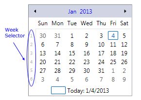
Each week number is a BareButton. The text of the button can be customized by WeekNumberFormat, and the style of the button can be customized through WeekButtonStyle. Also when week numbers are displayed, it also displays a "week number separator between the week numbers and calendar days. The following image highlights the week number separators: The week number separator is a Rectangle and can be styled through WeekNumberSeparatorStyle property.
In addition to month selector and week selector, day headers can also function as day selector. EnableDaySelector?