Table of Contents
- Getting Started
- EO.Pdf
- EO.Web
- EO.WebBrowser
- EO.Wpf
- Overview
- Installation & Deployement
- Skin & Theme
- Common Taskes and Services
- EO.Wpf Buttons
- EO.Wpf Calendar & DatePicker
- EO.Wpf ComboBox
- EO.Wpf DockView
- EO.Wpf Gauge
- EO.Wpf Gauge
- Using Scales
- Using Gauge Frames
- Creating a Gauge
- Understanding TickBar
- EO.Wpf ListBox
- EO.Wpf Menu
- EO.Wpf MaskedEdit
- EO.Wpf ProgressBar
- EO.Wpf Slider
- EO.Wpf SpinEdit
- EO.Wpf SplitView
- EO.Wpf TabControl
- EO.Wpf TreeView
- EO.Wpf Utility Controls
- EO.Wpf WindowChrome
- Sample Data Objects
- Common Topics
- Reference
| Using Progress Indicator |
A ProgressIndicator is another type of ValueIndicator. However it is used to indicate a value range rather than a single value. The following image demonstrates a LinearScale with a single ProgressIndicator.
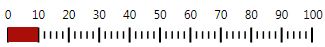
For a ProgressIndicator, you must set both AnchorValue, which indicates the start value, and Value, which indicates end value. In the above image, AnchorValue is set to 0 and Value is set to 10.
A ProgressIndicator is positioned on a scale the same way as a marker. It also supports animation the same way as a marker.
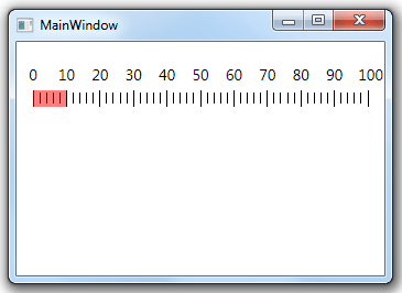
Use IndicatorStyle to customize the style of the indicator portion of the control. The target type of this style is Rectangle. The following sample demonstrates how to use this property:
<Window x:Class="Test.MainWindow"
        xmlns="http://schemas.microsoft.com/winfx/2006/xaml/presentation"
        xmlns:x="http://schemas.microsoft.com/winfx/2006/xaml"
        xmlns:eo="http://schemas.essentialobjects.com/wpf/"
        Title="MainWindow" Height="300" Width="350">
    <StackPanel Margin="15">
        <eo:LinearScale>
            <eo:LinearScale.ValueIndicators>
                <eo:ProgressIndicator AnchorValue="0" Value="10">
                    <eo:ProgressIndicator.IndicatorStyle>
                        <Style TargetType="Rectangle">
                            <Setter Property="Fill" Value="#80ff0000"></Setter>
                        </Style>
                    </eo:ProgressIndicator.IndicatorStyle>
                </eo:ProgressIndicator>
            </eo:LinearScale.ValueIndicators>
        </eo:LinearScale>
    </StackPanel>
</Window>
The above code produces the following result: