Table of Contents
- Getting Started
- EO.Pdf
- EO.Web
- EO.WebBrowser
- EO.Wpf
- Overview
- Installation & Deployement
- Skin & Theme
- Common Taskes and Services
- EO.Wpf Buttons
- EO.Wpf Calendar & DatePicker
- EO.Wpf ComboBox
- EO.Wpf DockView
- EO.Wpf Gauge
- EO.Wpf Gauge
- Using Scales
- Using Gauge Frames
- Creating a Gauge
- Understanding TickBar
- EO.Wpf ListBox
- EO.Wpf Menu
- EO.Wpf MaskedEdit
- EO.Wpf ProgressBar
- EO.Wpf Slider
- EO.Wpf SpinEdit
- EO.Wpf SplitView
- EO.Wpf TabControl
- EO.Wpf TreeView
- EO.Wpf Utility Controls
- EO.Wpf WindowChrome
- Sample Data Objects
- Common Topics
- Reference
| Overview |
A "TickBar" is one of the main components used to construct a gauge. However usually it is not necessary for you to use a tick bar control directly because the scale control automatically creates tick bars and is much easier to use.
A TickBar arranges major and minor "ticks" at given intervals. Each "tick" is usually a Label or a Shape object. The following image contains two tick bars: one with "Label" (text numbers) ticks and one with "Shape" (lines) ticks.
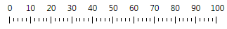
EO.Wpf provides two types of TickBar: LinearTickBar RollingTickBar. While these controls can be used independently, it is usually not necessary ---- the corresponding scale control ( LinearScale and RollingScale) are usually more convenient because a scale control usually assembles multiple tick bar controls together. For example, the above image is the result of a LinearScale that contains two LinearTickBar. Nevertheless, it is important to understand the basic concepts of tick bars in order to use the scale controls effectively.
This section covers the following topics: