Table of Contents
- Getting Started
- EO.Pdf
- EO.Web
- EO.WebBrowser
- EO.Wpf
- Overview
- Installation & Deployement
- Skin & Theme
- Common Taskes and Services
- EO.Wpf Buttons
- EO.Wpf Calendar & DatePicker
- EO.Wpf ComboBox
- EO.Wpf DockView
- EO.Wpf Gauge
- EO.Wpf ListBox
- EO.Wpf Menu
- EO.Wpf MaskedEdit
- EO.Wpf ProgressBar
- EO.Wpf Slider
- EO.Wpf SpinEdit
- EO.Wpf SplitView
- EO.Wpf TabControl
- EO.Wpf TreeView
- EO.Wpf Utility Controls
- EO.Wpf WindowChrome
- Sample Data Objects
- Common Topics
- Reference
| Customizing Splitter |
Customizing Splitter
EO.Wpf
Basic Customization
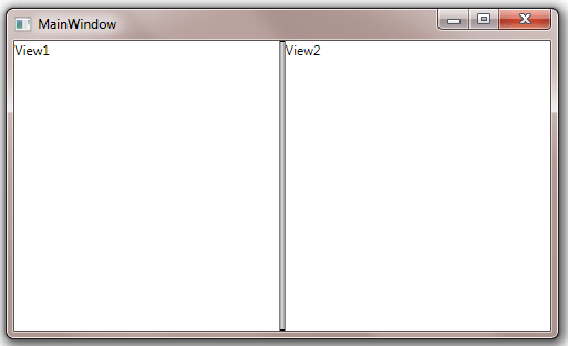
For simple Splitter, you can use SplitterBorderStyle and SplitterBackground to customize the appearance of the splitter bar. The following code demonstrates these two properties:
<Window x:Class="Test.MainWindow"
        xmlns="http://schemas.microsoft.com/winfx/2006/xaml/presentation"
        xmlns:x="http://schemas.microsoft.com/winfx/2006/xaml"
        xmlns:eo="http://schemas.essentialobjects.com/wpf/"
        Title="MainWindow" Height="300" Width="500">
    <eo:SplitView SplitterBackground="LightGray">
        <eo:SplitView.SplitterBorderStyle>
            <Style TargetType="Border">
                <Setter Property="BorderBrush" Value="Black"></Setter>
                <Setter Property="BorderThickness" Value="1"></Setter>
            </Style>
        </eo:SplitView.SplitterBorderStyle>
        <eo:SplitView.View1>
            <TextBlock>View1</TextBlock>
        </eo:SplitView.View1>
        <eo:SplitView.View2>
            <TextBlock>View2</TextBlock>
        </eo:SplitView.View2>
    </eo:SplitView>
</Window>
The above code produces the following result:
If the SplitView is in advanced mode, you can also set View1Icon, View1Title, View2Icon and View2Title to customize View1 and View2's icon and title.
Customizing Splitter Template
You can also customize SplitterTemplate to replace the splitter contents altogether. For a simple Splitter, your custom template must includes UIElement's with the following Name:
| Part Name | Remark |
|---|---|
| PART_DragIndicatorPlaceHolder | This is the UIElement that defines the boundary for the "drag indicator". See here for more information about drag indicator. |
| PART_Thumb | This is the UIElement that defines the boundary for the draggable area. Not all area of the splitter must be draggable. For example, in advanced mode, only the middle section of the splitter is draggable. |
The default SplitterTemplate for simple mode is very simple:
<DataTemplate>
    <Border Style="{Binding SplitterBorderStyle}">
        <Grid Background="{Binding SplitterBackground}">
            <!-- PART_DragIndicatorPlaceHolder is used to display the gray drag bar  -->
            <Rectangle x:Name="PART_DragIndicatorPlaceHolder"></Rectangle>
            <!-- PART_Thumb is the area that can be dragged, can be much bigger than PART_DragIndicatorPlaceHolder in advanced mode  -->
            <Rectangle x:Name="PART_Thumb" Fill="Transparent"></Rectangle>
        </Grid>
    </Border>
    <DataTemplate.Triggers>
        <DataTrigger Binding="{Binding Orientation}" Value="Horizontal">
            <Setter TargetName="PART_Thumb" Property="Cursor" Value="SizeWE"></Setter>
        </DataTrigger>
        <DataTrigger Binding="{Binding Orientation}" Value="Vertical">
            <Setter TargetName="PART_Thumb" Property="Cursor" Value="SizeNS"></Setter>
        </DataTrigger>
    </DataTemplate.Triggers>
</DataTemplate>
Note that the code also sets PART_Thumb's cursor based on the orientation of the SplitView.
The SplitterTemplate for advanced mode splitter is much more complicated. In addition to the elements required by simple mode SplitView, it can include the following elements:
| Part Name | Remark |
|---|---|
| PART_View1Button | This is a ButtonBase that functions as the tab button for View1. By default, this is a BareButton that uses TabItemBorder to create a tab button. |
| PART_View2Button | This is a ButtonBase that functions as the tab button for View2. By default, this is a BareButton that uses TabItemBorder to create a tab button. |
| PART_SwapPanes |
This is a ButtonBase that will swap the two views when clicked. By default, this is an image button that displays one of the following two images based on the orientation of the SplitView:
|
| PART_SplitH |
This is a ButtonBase
that will switch the SplitView's Orientation
to Horizontal. By default, this is an BitmapButton
that displays  . .
|
| PART_SplitV |
This is a ButtonBase
that will switch the SplitView's Orientation
to Vertical. By default, this is an BitmapButton
that displays  . .
|
| PART_CollapseL |
This is a ButtonBase
that will collapse the SplitView to the left when clicked.
By default, this is an BitmapButton
that displays  . .
|
| PART_CollapseT |
This is a ButtonBase
that will collapse the SplitView to the top when clicked.
By default, this is an BitmapButton
that displays  . .
|
| PART_CollapseR |
This is a ButtonBase
that will collapse the SplitView to the right when clicked.
By default, this is an BitmapButton
that displays  . .
|
| PART_CollapseB |
This is a ButtonBase
that will collapse the SplitView to the bottom when clicked.
By default, this is an BitmapButton
that displays  . .
|
 . This image is used when the splitter is horizontal;
 . This image is used when the splitter is vertical;
Below is the full source code of the default SplitterTemplate when the SplitView is in advanced mode:
<DataTemplate>
    <Grid>
        <Border Style="{Binding SplitterBorderStyle}">
            <Grid Background="{Binding SplitterBackground}">
                <Rectangle x:Name="PART_DragIndicatorPlaceHolder" Width="4" HorizontalAlignment="Center"></Rectangle>
                <Border Padding="0,2,0,1">
                    <DockPanel>
                        <my:BareButton x:Name="PART_View1Button" DockPanel.Dock="Top" Margin="0,3,0,3" ContentTemplate="{Binding View1TabButtonTemplate}" HorizontalAlignment="Left" Background="White" Panel.ZIndex="2">
                            <my:BareButton.BorderStyle>
                                <Style TargetType="Border">
                                    <!-- This is needed so that the background doesn't get applied to the whole BareButton -->
                                </Style>
                            </my:BareButton.BorderStyle>
                        </my:BareButton>
                        <my:BitmapButton x:Name="PART_SwapPanes" DockPanel.Dock="Top" HorizontalAlignment="Center" ToolTip="{DynamicResource EOSTR_SwapPanes}">
                            <my:BitmapButton.Style>
                                <Style TargetType="{x:Type my:BitmapButton}">
                                    <Setter Property="Source" Value="pack://application:,,,/EO.Wpf;component/Images/SplitView/SwapHorz.png"></Setter>
                                    <Style.Triggers>
                                        <Trigger Property="IsMouseOver" Value="True">
                                            <Setter Property="Source" Value="pack://application:,,,/EO.Wpf;component/Images/SplitView/SwapHorzHover.png"></Setter>
                                        </Trigger>
                                    </Style.Triggers>
                                </Style>
                            </my:BitmapButton.Style>
                        </my:BitmapButton>
                        <my:BareButton x:Name="PART_View2Button" DockPanel.Dock="Top" Margin="0,3,-1,0" ContentTemplate="{Binding View2TabButtonTemplate}" HorizontalAlignment="Right" Background="{StaticResource TabButtonBackground}" Panel.ZIndex="1">
                            <my:BareButton.BorderStyle>
                                <Style TargetType="Border">
                                    <!-- This is needed so that the background doesn't get applied to the whole BareButton -->
                                </Style>
                            </my:BareButton.BorderStyle>
                        </my:BareButton>
                        <StackPanel DockPanel.Dock="Bottom" HorizontalAlignment="Center">
                            <my:BitmapButton x:Name="PART_SplitH" Style="{StaticResource SplitButtons}" ToolTip="{DynamicResource EOSTR_VerticalSplit}" Source="pack://application:,,,/EO.Wpf;component/Images/SplitView/SplitH.png" IsChecked="True"></my:BitmapButton>
                            <my:BitmapButton x:Name="PART_SplitV" Style="{StaticResource SplitButtons}" ToolTip="{DynamicResource EOSTR_HorizontalSplit}"  Source="pack://application:,,,/EO.Wpf;component/Images/SplitView/SplitV.png"></my:BitmapButton>
                            <my:BitmapButton x:Name="PART_CollapseL" Style="{StaticResource SplitButtons}" ToolTip="{DynamicResource EOSTR_ExpandRightPane}" Source="pack://application:,,,/EO.Wpf;component/Images/SplitView/CollapseL.png"></my:BitmapButton>
                            <my:BitmapButton x:Name="PART_CollapseR" Style="{StaticResource SplitButtons}" ToolTip="{DynamicResource EOSTR_ExpandLeftPane}" Source="pack://application:,,,/EO.Wpf;component/Images/SplitView/CollapseR.png"></my:BitmapButton>
                        </StackPanel>
                        <Border x:Name="PART_Thumb" Background="Transparent" Cursor="SizeWE">
                            <prim:Grip Cursor="SizeWE" HorizontalAlignment="Center" VerticalAlignment="Center" Width="6" Height="50" GripStyle="Vertical3DLines"></prim:Grip>
                        </Border>
                    </DockPanel>
                </Border>
            </Grid>
        </Border>
    </Grid>
    <DataTemplate.Triggers>
        <MultiDataTrigger>
            <MultiDataTrigger.Conditions>
                <Condition Binding="{Binding RelativeSource={RelativeSource AncestorType={x:Type my:SplitView}}, Path=SwapView}" Value="False" />
                <Condition Binding="{Binding RelativeSource={RelativeSource AncestorType={x:Type my:SplitView}}, Path=ActiveView}" Value="View2" />
            </MultiDataTrigger.Conditions>
            <Setter TargetName="PART_View1Button" Property="Background" Value="{StaticResource TabButtonBackground}"></Setter>
            <Setter TargetName="PART_View2Button" Property="Background" Value="White"></Setter>
            <Setter TargetName="PART_View1Button" Property="Panel.ZIndex" Value="1"></Setter>
            <Setter TargetName="PART_View2Button" Property="Panel.ZIndex" Value="2"></Setter>
        </MultiDataTrigger>
        <MultiDataTrigger>
            <MultiDataTrigger.Conditions>
                <Condition Binding="{Binding RelativeSource={RelativeSource AncestorType={x:Type my:SplitView}}, Path=SwapView}" Value="True" />
                <Condition Binding="{Binding RelativeSource={RelativeSource AncestorType={x:Type my:SplitView}}, Path=ActiveView}" Value="View1" />
            </MultiDataTrigger.Conditions>
            <Setter TargetName="PART_View1Button" Property="Background" Value="{StaticResource TabButtonBackground}"></Setter>
            <Setter TargetName="PART_View2Button" Property="Background" Value="White"></Setter>
            <Setter TargetName="PART_View1Button" Property="Panel.ZIndex" Value="1"></Setter>
            <Setter TargetName="PART_View2Button" Property="Panel.ZIndex" Value="2"></Setter>
        </MultiDataTrigger>
        <DataTrigger Binding="{Binding RelativeSource={RelativeSource AncestorType={x:Type my:SplitView}}, Path=CollapseState}" Value="TopLeft">
            <Setter TargetName="PART_View1Button" Property="HorizontalAlignment" Value="Right"></Setter>
            <Setter TargetName="PART_SwapPanes" Property="Visibility" Value="Collapsed"></Setter>
            <Setter TargetName="PART_View1Button" Property="Margin" Value="0,0,-1,0"></Setter>
            <Setter TargetName="PART_View2Button" Property="Margin" Value="0,-10,-1,0"></Setter>
            <Setter TargetName="PART_CollapseL" Property="Visibility" Value="Collapsed"></Setter>
            <Setter TargetName="PART_SplitH" Property="IsChecked" Value="False"></Setter>
        </DataTrigger>
        <DataTrigger Binding="{Binding RelativeSource={RelativeSource AncestorType={x:Type my:SplitView}}, Path=CollapseState}" Value="BottomRight">
            <Setter TargetName="PART_SwapPanes" Property="Visibility" Value="Collapsed"></Setter>
            <Setter TargetName="PART_View2Button" Property="HorizontalAlignment" Value="Left"></Setter>
            <Setter TargetName="PART_View2Button" Property="Margin" Value="0,-10,0,0"></Setter>
            <Setter TargetName="PART_CollapseR" Property="Visibility" Value="Collapsed"></Setter>
            <Setter TargetName="PART_SplitH" Property="IsChecked" Value="False"></Setter>
        </DataTrigger>
    </DataTemplate.Triggers>
</DataTemplate>
Customizing Drag Indicator
When user drags the splitter, a "drag indicator" moves along with the mouse to provide user visual feedback about the intended new position for the splitter. You can customize the drag indicator through DragIndicatorTemplate property. The default value for this template is:
<DataTemplate>
    <Rectangle Fill="Black" Opacity="0.6">
    </Rectangle>
</DataTemplate>