Table of Contents
- Getting Started
- EO.Pdf
- EO.Web
- Overview
- Installation & Deployement
- EO.Web ToolTip
- EO.Web Rating
- EO.Web Slider & RangeSlider
- EO.Web ListBox
- EO.Web ComboBox
- EO.Web Captcha
- EO.Web ASPX To PDF
- EO.Web Slide
- EO.Web Flyout
- EO.Web EditableLabel
- EO.Web ImageZoom
- EO.Web Floater
- EO.Web Downloader
- EO.Web ColorPicker
- EO.Web HTML Editor
- EO.Web File Explorer
- EO.Web SpellChecker
- EO.Web Grid
- EO.Web MaskedEdit
- EO.Web Splitter
- EO.Web Menu
- EO.Web Slide Menu
- EO.Web TabStrip
- EO.Web TabStrip
- TabStrip Overview
- Quick Start Guide
- Using EO.Web TabStrip
- Navigation Items And Groups
- Navigation Item
- Navigation Item Group
- Custom Item
- Look, Skin and Theme
- Style and Appearance
- Data Binding
- Handling Event
- Cross Frame Menu
- Understanding built-in skins
- EO.Web TreeView
- EO.Web Calendar
- EO.Web Callback
- EO.Web MultiPage
- EO.Web Dialog
- EO.Web AJAXUploader
- EO.Web ProgressBar - Free!
- EO.Web ToolBar - Free!
- EO.WebBrowser
- EO.Wpf
- Common Topics
- Reference
| Navigation Item Group |
Apply to
Overview
A navigation group is a collection of items that have the same parent item.
Menu and SlideMenu use MenuGroup object,
TabStrip uses TabItemGroup object,
TreeView uses TreeNodeGroup.
The top level group is called TopGroup and can be accessed via
the control's TopGroup property.
The following image illustrates the region of TopGroup and MenuGroup in a
Menu: 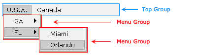
The section covers the following topics:
- Configure Navigation Item Group at Design Time
- Configure Navigation Item Group at Run Time
- Group & Data Binding
Configure Navigation Item Group at Design Time
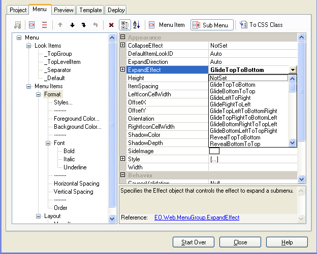
All EO.Web navigation controls have a control builder to support edit-preview
function at design time. By default, property grid shows the item's properties.
To configure an item's sub group's properties, you can click the Sub Menu /
Sub Group  button on toolbar.
Here's an image of Menu Builder that allows you to set ExpandEffect property for a sub menu:
Configure Navigation Item Group at Run Time
You can access group at run time by using MenuItem.SubMenu property for Menu, TabItem.SubGroup property for TabStrip and TreeNode.SubGroup for TreeView. Here is an example to set a MenuItem's ItemSpacing property to 4 pixels:[C#]
myMenuItem.SubMenu.ItemSpacing = 4;[Visual Basic]
myMenuItem.SubMenu.ItemSpacing = 4
Group & Data Binding
Both the control and the group can be bound to a data source. If the items generated by data binding have the same properties, specify those properties in TemplateItem tag.
CustomItem tag can be embedded inside TemplateItem tag to generate items with nesting controls. Here is an example to define a template item in MenuGroup , each template item contains a text box:
<!-- Control Definition -->
<eo:Menu id="menu1" runat="server" Shortcut="Ctrl+A" Width="280px">
  <TopGroup Orientation="Horizontal">
    <TemplateItem>
        <CustomItem>
          <asp:CheckBox Text='<%#((DataRowView)Container.DataItem)["Country"]%>'
                           Runat=server ID="Checkbox1" NAME="Checkbox1">
          </asp:CheckBox>
        </CustomItem>
        <SubMenu>
          <TemplateItem>
            <CustomItem>
                <asp:TextBox Text='<%#((DataRowView)Container.DataItem)["Country"] + " " + ((DataRowView)Container.DataItem)["State"]%>'
                                Runat=server ID="Textbox1" NAME="Textbox1">
                </asp:TextBox>
            </CustomItem>
          </TemplateItem>
        </SubMenu>
     </TemplateItem>
    </TopGroup>
</eo:Menu>
See data binding topic for more details.