Table of Contents
- Getting Started
- EO.Pdf
- EO.Web
- Overview
- Installation & Deployement
- EO.Web ToolTip
- EO.Web Rating
- EO.Web Slider & RangeSlider
- EO.Web ListBox
- EO.Web ComboBox
- EO.Web Captcha
- EO.Web ASPX To PDF
- EO.Web Slide
- EO.Web Flyout
- EO.Web EditableLabel
- EO.Web ImageZoom
- EO.Web Floater
- EO.Web Downloader
- EO.Web ColorPicker
- EO.Web HTML Editor
- EO.Web File Explorer
- EO.Web SpellChecker
- EO.Web Grid
- EO.Web MaskedEdit
- EO.Web Splitter
- EO.Web Menu
- EO.Web Slide Menu
- EO.Web TabStrip
- EO.Web TabStrip
- TabStrip Overview
- Quick Start Guide
- Using EO.Web TabStrip
- Navigation Items And Groups
- Navigation Item
- Navigation Item Group
- Custom Item
- Look, Skin and Theme
- Style and Appearance
- Data Binding
- Handling Event
- Cross Frame Menu
- Understanding built-in skins
- EO.Web TreeView
- EO.Web Calendar
- EO.Web Callback
- EO.Web MultiPage
- EO.Web Dialog
- EO.Web AJAXUploader
- EO.Web ProgressBar - Free!
- EO.Web ToolBar - Free!
- EO.WebBrowser
- EO.Wpf
- Common Topics
- Reference
| Navigation Item and Navigation Item Group |
Apply to
Overview
An EO.Web navigation control is made up of a hierarchy of navigation items represented by NavigationItem object, which controls the item's appearance and behavior.
Item
Menu and SlideMenu use MenuItem object, TabStrip uses TabItem object.
Both are inherited from BaseMenuItem object:
System.Object
EO.Web.NavigationItem
EO.Web.BaseMenuItem
EO.Web.MenuItem
EO.Web.TabItem
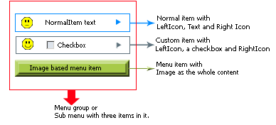
- A normal item with LeftIcon, Text and RightIcon - OR -
- A custom item with LeftIcon, several ASP.NET web controls and RightIcon - OR -
- An all-image item
In addition, you can configure different styles for an item in different states:
- NormalStyle - The style when item in normal state
- HoverStyle - The style when mouse is positioned over the item
- ExpandedStyle - The style when item's sub menu is expanded.
- SelectedStyle - The style when item's Selected property is true
- SelectedExpandedStyle - The style when item's Selected property is true and sub menu is expanded.
- SelectedHoverStyle - The style when item's Selected property is true and mouse is positioned over the item.
- DisabledStyle - The style when item's Disabled property is true
Please refer to Item Styles in Styles and Appearance section for details.
Navigation Item Group
Each item contains child items displayed as a navigation group when the item is expanded. A navigation group is represented by NavigationItemGroup object. You can specify properties that apply to the entire group, for example, group expanding direction, effects and orientation.
Menu and SlideMenu use MenuGruop object, TabStrip uses TabItemGroup
object.
System.Object
EO.Web.NavigationItemGroup
EO.Web.BaseMenuItemGroup
EO.Web.MenuGroup
EO.Web.TabItemGroup
For more details on navigation group, please refer to
Navigation Group.
For how to set the appearance for a navigation group, please refer to
Group Appearance Settings.
For how to use databinding on a navigation group, please refer to
Data Binding for details.