Table of Contents
- Getting Started
- EO.Pdf
- EO.Web
- Overview
- Installation & Deployement
- EO.Web ToolTip
- EO.Web Rating
- EO.Web Slider & RangeSlider
- EO.Web ListBox
- EO.Web ComboBox
- EO.Web Captcha
- EO.Web ASPX To PDF
- EO.Web Slide
- EO.Web Flyout
- EO.Web EditableLabel
- EO.Web ImageZoom
- EO.Web Floater
- EO.Web Downloader
- EO.Web ColorPicker
- EO.Web HTML Editor
- EO.Web File Explorer
- EO.Web SpellChecker
- EO.Web Grid
- EO.Web MaskedEdit
- EO.Web Splitter
- EO.Web Menu
- EO.Web Slide Menu
- EO.Web TabStrip
- EO.Web TabStrip
- TabStrip Overview
- Quick Start Guide
- Using EO.Web TabStrip
- Understanding built-in skins
- EO.Web TreeView
- EO.Web Calendar
- EO.Web Callback
- EO.Web MultiPage
- EO.Web Dialog
- EO.Web AJAXUploader
- EO.Web ProgressBar - Free!
- EO.Web ToolBar - Free!
- EO.WebBrowser
- EO.Wpf
- Common Topics
- Reference
| Using TabStrip |
Overview
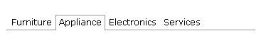
A TabStrip control is made up of a hierarchical structure of tab items. It inherits from BaseNavigator and shares the same concept of Menu control. Below is a picture of the built-in Simple_Gray tabstrip:
The basic concept of MenuItem and MenuGroup also applies to TabStrip. In order to design the appearance setting, you need to understand the difference between an item and a group so that you can decide proper CSS style settings on item and group.
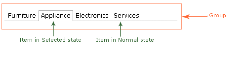
Tab Group
Shown as above picture, a tab group contains several tab items. TabStrip control can also have hierarchical structure like a Menu. For example, the following shows a TabStrip with two levels: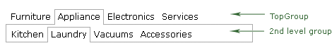
Different levels may have different "look" thus may need to apply different CSS style. In the above sample, TopGroup does not have the left and right border as the 2nd level group.
Navigation Group topic contains more details on how to configure a navigation item group and use databinding on a group. Those powerful functions also apply to a tab group.
Tab Item
Similar to a MenuItem, you can create three kinds of tab items:- An image only tab item
-
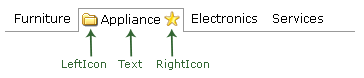
A tab item with LeftIcon, Text and RightIcon. For example:
- A tab item with embedded ASP.NET controls
Tab Item States
Refer to Item Styles, Image and Icons, Look for more details.
Using TabStrip and MultiPage
To associate a TabStrip with MultiPage to create a tab control, simply specify the MultiPageID property for the TabStrip. By default, tab item automatically associates with the page view.
For example, setting TabStrip1.MultiPageID to "MultiPage1" tells the TabStrip to switch PageViews on MultiPage1. When user clicks on the first tab item, the first PageView of the MultiPage appears.
To explicitly associate a tab item with a PageView, set PageViewID to the ID of the PageView.
Scrolling features
Unlike Menu and SlideMenu, a TabStrip does not have pop-up sub menus. Hence, automatically scrolling feature which only applies to a popup submenu is not applied to TabStrip. TabStrip only supports forced-scrolling feature. You must set the following two properties to enable forced-scrolling feature:
- Set the TabStrip's EnableScrolling property Forced scrolling - if enabled, submenu will automatically scroll if the submenu to true.
- Set the TabStrip's Width property to a fixed value. When the actual size of the TabStrip exceeds this value, the scroller will appear.