Table of Contents
- Getting Started
- EO.Pdf
- EO.Web
- EO.WebBrowser
- EO.Wpf
- Overview
- Installation & Deployement
- Skin & Theme
- Common Taskes and Services
- EO.Wpf Buttons
- EO.Wpf Calendar & DatePicker
- EO.Wpf ComboBox
- EO.Wpf DockView
- EO.Wpf Gauge
- EO.Wpf ListBox
- EO.Wpf Menu
- EO.Wpf MaskedEdit
- EO.Wpf ProgressBar
- EO.Wpf Slider
- EO.Wpf SpinEdit
- EO.Wpf SplitView
- EO.Wpf TabControl
- EO.Wpf TreeView
- EO.Wpf Utility Controls
- EO.Wpf WindowChrome
- Sample Data Objects
- Common Topics
- Reference
| Drop Down Header and Footer |
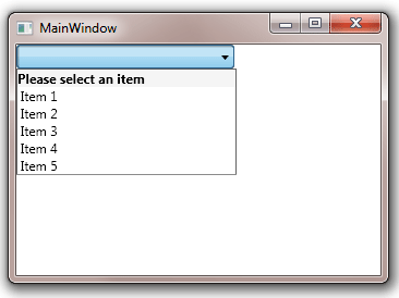
EO.Wpf ComboBox can display a header and a footer in the drop down. Neither the header nor the footer is considered an item or selectable. The following code demonstrates how to use this feature:
XAML
<Window x:Class="Test.MainWindow"
        xmlns="http://schemas.microsoft.com/winfx/2006/xaml/presentation"
        xmlns:x="http://schemas.microsoft.com/winfx/2006/xaml"
        xmlns:eo="http://schemas.essentialobjects.com/wpf/"
        xmlns:g="clr-namespace:System.Globalization;assembly=mscorlib"
        Title="MainWindow" Height="250" Width="350">
    <StackPanel>
        <eo:ComboBox Width="200" HorizontalAlignment="Left" ShowHeader="true">
            <eo:ComboBox.HeaderTemplate>
                <DataTemplate>
                    <TextBlock Background="WhiteSmoke" FontWeight="Bold">Please select an item</TextBlock>
                </DataTemplate>
            </eo:ComboBox.HeaderTemplate>
            <eo:ComboBoxItem>Item 1</eo:ComboBoxItem>
            <eo:ComboBoxItem>Item 2</eo:ComboBoxItem>
            <eo:ComboBoxItem>Item 3</eo:ComboBoxItem>
            <eo:ComboBoxItem>Item 4</eo:ComboBoxItem>
            <eo:ComboBoxItem>Item 5</eo:ComboBoxItem>
        </eo:ComboBox>
    </StackPanel>
</Window>
The above code produces the following result:
The header and footer can be used to display helpful information, or even contain interative controls such as "shortcuts" for most frequently used items. EO.Wpf ComboBox provides a default HeaderTemplate and FooterTemplate when multi-selection is enabled (when ShowCheckBoxes is set to true). However it does not provide any default template in single selection mode.