Table of Contents
- Getting Started
- EO.Pdf
- EO.Web
- EO.WebBrowser
- EO.Wpf
- Overview
- Installation & Deployement
- Skin & Theme
- Common Taskes and Services
- EO.Wpf Buttons
- EO.Wpf Calendar & DatePicker
- EO.Wpf ComboBox
- EO.Wpf DockView
- EO.Wpf Gauge
- EO.Wpf ListBox
- EO.Wpf Menu
- EO.Wpf MaskedEdit
- EO.Wpf ProgressBar
- EO.Wpf Slider
- EO.Wpf SpinEdit
- EO.Wpf SplitView
- EO.Wpf TabControl
- EO.Wpf TreeView
- EO.Wpf Utility Controls
- EO.Wpf WindowChrome
- Sample Data Objects
- Common Topics
- Reference
| Multi-Selection |
EO.Wpf ComboBox supports multi-selection. This section covers the following topics:
Enabling Multi-Selection
To enable multi-selection, set the ComboBox's ShowCheckBoxes to true. When this property is true, EO.Wpf ComboBox displays a check box in front of each item. User will then be able to check multiple items. The following code demonstrates how to use this feature:
<Window x:Class="Test.MainWindow"
        xmlns="http://schemas.microsoft.com/winfx/2006/xaml/presentation"
        xmlns:x="http://schemas.microsoft.com/winfx/2006/xaml"
        xmlns:eo="http://schemas.essentialobjects.com/wpf/"
        Title="MainWindow" Height="250" Width="350">
    <StackPanel>
        <eo:ComboBox Width="200" HorizontalAlignment="Left" ShowCheckBoxes="True">
            <eo:ComboBoxItem>Item 1</eo:ComboBoxItem>
            <eo:ComboBoxItem>Item 2</eo:ComboBoxItem>
            <eo:ComboBoxItem>Item 3</eo:ComboBoxItem>
            <eo:ComboBoxItem>Item 4</eo:ComboBoxItem>
            <eo:ComboBoxItem>Item 5</eo:ComboBoxItem>
        </eo:ComboBox>
    </StackPanel>
</Window>
The above code produces the following result:
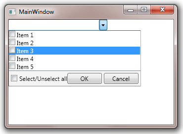
If user selects one or more items then click "OK" button, it closes the drop down and display the selected items in the selection box:
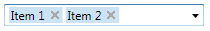
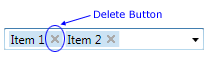
From there user will be able to remove the selected item by clicking the "X" button added to each item:
Customizing Selection Box Item Template
The template for each item is defined through SelectionBoxItemTemplate. You can customize this template to customize how each selected item is displayed in the selection box. For example, the following XAML defines a different style for the selected items:
<Window x:Class="Test.MainWindow"
        xmlns="http://schemas.microsoft.com/winfx/2006/xaml/presentation"
        xmlns:x="http://schemas.microsoft.com/winfx/2006/xaml"
        xmlns:eo="http://schemas.essentialobjects.com/wpf/"
        Title="MainWindow" Height="250" Width="350">
    <StackPanel>
        <eo:ComboBox Width="200" HorizontalAlignment="Left" ShowCheckBoxes="True">
            <!--Custom SelectionBoxItemTemplate-->
            <eo:ComboBox.SelectionBoxItemTemplate>
                <DataTemplate>
                    <Border BorderBrush="LightGray" BorderThickness="1" Padding="1">
                        <Grid>
                            <Grid.ColumnDefinitions>
                                <ColumnDefinition />
                                <ColumnDefinition />
                            </Grid.ColumnDefinitions>
                            <ContentPresenter Grid.Column="0" Margin="2,0,10,0" Content="{Binding}" />
                            <eo:BareButton x:Name="Part_DeleteButton" Grid.Column="1" Background="DarkGray">X</eo:BareButton>
                        </Grid>
                    </Border>
                </DataTemplate>
            </eo:ComboBox.SelectionBoxItemTemplate>
            <!--ComboBox Items-->
            <eo:ComboBoxItem>Item 1</eo:ComboBoxItem>
            <eo:ComboBoxItem>Item 2</eo:ComboBoxItem>
            <eo:ComboBoxItem>Item 3</eo:ComboBoxItem>
            <eo:ComboBoxItem>Item 4</eo:ComboBoxItem>
            <eo:ComboBoxItem>Item 5</eo:ComboBoxItem>
        </eo:ComboBox>
    </StackPanel>
</Window>
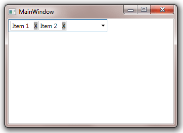
The above code produces the following result:
The custom SelectionBoxItemTemplate must contain:
- A ContentPresenter that is used to display the item;
- A ButtonBase control with name PART_DeleteButton. Clicking this button deletes the item from the selected item list;
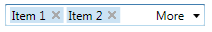
Customizing More Items Button
If not all selected items can be displayed in the selection box, the ComboBox displays a "More Items" button immediately prior to the drop down button, as shown in this screenshot:
You can customize the appearance of this button through MoreItemsButtonTemplate property. The following sample demonstrates how to use this property:
<Window x:Class="Test.MainWindow"
        xmlns="http://schemas.microsoft.com/winfx/2006/xaml/presentation"
        xmlns:x="http://schemas.microsoft.com/winfx/2006/xaml"
        xmlns:eo="http://schemas.essentialobjects.com/wpf/"
        Title="MainWindow" Height="250" Width="350">
    <StackPanel>
        <eo:ComboBox Width="200" HorizontalAlignment="Left" ShowCheckBoxes="True" ShowHeader="Visible">
            <!--Custom HeaderTemplate-->
            <eo:ComboBox.MoreItemsButtonTemplate>
                <DataTemplate>
                    <TextBlock>...</TextBlock>
                </DataTemplate>
            </eo:ComboBox.MoreItemsButtonTemplate>
            <!--ComboBox Items-->
            <eo:ComboBoxItem>Item 1</eo:ComboBoxItem>
            <eo:ComboBoxItem>Item 2</eo:ComboBoxItem>
            <eo:ComboBoxItem>Item 3</eo:ComboBoxItem>
            <eo:ComboBoxItem>Item 4</eo:ComboBoxItem>
            <eo:ComboBoxItem>Item 5</eo:ComboBoxItem>
        </eo:ComboBox>
    </StackPanel>
</Window>
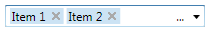
Run the above code, select three items and the custom "More Items" button will be displayed:
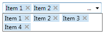
Clicking the "more items" button displays all selected items in a drop down, user can then unselect items from this drop down:
Customizing Drop Down Header/Footer
By default, when ShowCheckBoxes is true, the ComboBox displays a footer that contains several controls through which you can use to select/unselect all items, accept or cancel the change. You can customize the footer or header through HeaderTemplate and FooterTemplate. You can include any UI elements inside your HeaderTemplate and FooterTemplate, but controls with the following names have predefined behaviors:
| Control Name | Remark |
|---|---|
| PART_SelectAllCheckBox | Must be a CheckBox control. When this checkbox is checked, it automatically checks all items in the drop down. When it is unchecked, it automatically unchecks all items in the drop down. |
| PART_UnselectAllButton | Must be a ButtonBase control. When this button is clicked, it automatically unchecks all items (has the same effect as unchecking PART_SelectAllCheckBox) |
| PART_OKButton | Must be a ButtonBase control. When this button is clicked, it closes the drop down and accepts all checked items in the drop down as selected items. |
| PART_CancelButton | Must be a ButtonBase control. When this button is clicked, it closes the drop down without changing selected items. |
The following XAML demonstrates how to use these properties:
<Window x:Class="Test.MainWindow"
        xmlns="http://schemas.microsoft.com/winfx/2006/xaml/presentation"
        xmlns:x="http://schemas.microsoft.com/winfx/2006/xaml"
        xmlns:eo="http://schemas.essentialobjects.com/wpf/"
        Title="MainWindow" Height="250" Width="350">
    <StackPanel>
        <eo:ComboBox Width="200" HorizontalAlignment="Left" ShowCheckBoxes="True" ShowHeader="Visible">
             <!--Custom HeaderTemplate-->
            <eo:ComboBox.HeaderTemplate>
                <DataTemplate>
                    <TextBlock TextWrapping="Wrap">Please select one or more items from the list below.</TextBlock>
                </DataTemplate>
            </eo:ComboBox.HeaderTemplate>
            <!--Custom FooterTemplate-->
            <eo:ComboBox.FooterTemplate>
                <DataTemplate>
                    <StackPanel Orientation="Horizontal">
                        <eo:LinkButton Margin="2" x:Name="PART_OKButton">OK</eo:LinkButton>
                        <eo:LinkButton Margin="2" x:Name="PART_CancelButton">Cancel</eo:LinkButton>
                    </StackPanel>
                </DataTemplate>
            </eo:ComboBox.FooterTemplate>
            <!--ComboBox Items-->
            <eo:ComboBoxItem>Item 1</eo:ComboBoxItem>
            <eo:ComboBoxItem>Item 2</eo:ComboBoxItem>
            <eo:ComboBoxItem>Item 3</eo:ComboBoxItem>
            <eo:ComboBoxItem>Item 4</eo:ComboBoxItem>
            <eo:ComboBoxItem>Item 5</eo:ComboBoxItem>
        </eo:ComboBox>
    </StackPanel>
</Window>
The above code provides the following result:
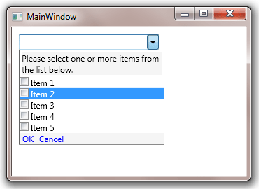
Note ShowHeader must be set to true because by default the ComboBox does not display the drop down header.