Table of Contents
- Getting Started
- EO.Pdf
- EO.Web
- EO.WebBrowser
- EO.Wpf
- Overview
- Installation & Deployement
- Skin & Theme
- Common Taskes and Services
- EO.Wpf Buttons
- EO.Wpf Calendar & DatePicker
- EO.Wpf ComboBox
- EO.Wpf DockView
- EO.Wpf Gauge
- EO.Wpf Gauge
- Using Scales
- Using Gauge Frames
- Creating a Gauge
- Understanding TickBar
- EO.Wpf ListBox
- EO.Wpf Menu
- EO.Wpf MaskedEdit
- EO.Wpf ProgressBar
- EO.Wpf Slider
- EO.Wpf SpinEdit
- EO.Wpf SplitView
- EO.Wpf TabControl
- EO.Wpf TreeView
- EO.Wpf Utility Controls
- EO.Wpf WindowChrome
- Sample Data Objects
- Common Topics
- Reference
| Using CircularScale |
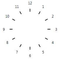
A CircularScale arranges ticks and labels in a circular manner. The following image demonstrates a CircularScale with labels and ticks:
This section covers the following topics:
Uderstanding Rings
A CircularScale arranges ticks and labels on a set of concentric rings. Usually the first step of customizing a CircularScale is to define these rings.
Use OriginX and OriginY to define the center position in x and y axis respectively. The default value is (50%, 50%), which represents the center of the control. The following code defines two rings:
<Window x:Class="Test.MainWindow"
        xmlns="http://schemas.microsoft.com/winfx/2006/xaml/presentation"
        xmlns:x="http://schemas.microsoft.com/winfx/2006/xaml"
        xmlns:eo="http://schemas.essentialobjects.com/wpf/"
        Title="MainWindow" Height="250" Width="350">
    <Grid>
        <eo:CircularScale ShowRings="True"
            ShowMajorLabels="False" ShowMajorTicks="False" ShowMinorTicks="False">
            <eo:CircularScale.RingDefinitions>
                <eo:RingDefinition RadiusX="50" RadiusY="50" Width="20" Height="20" />
                <eo:RingDefinition Width="20" Height="20" />
            </eo:CircularScale.RingDefinitions>
        </eo:CircularScale>
    </Grid>
</Window>
The above code produces the following result:
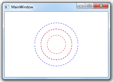
The above code turned off all labels and ticks, but set ShowRings to true so that the CircularScale uses dotted lines to show the boundary of the rings. The primary purpose of the ShowRings property is to debug layout problems. It should not be set to true in final production code. This property is set to true for sample code in this page so that it can clearly demonstrates the ring positions.
The above code defined two rings: The inner ring has a radius of 50 on both x and y direction and a thickness of 20 on both x and y direction. The outer ring's radius is not explicitly defined; in this case it takes the inner ring's outer radius, which is 70 on both directions. The outer ring also has a thickness of 20 on both directions.
Customizing Ticks
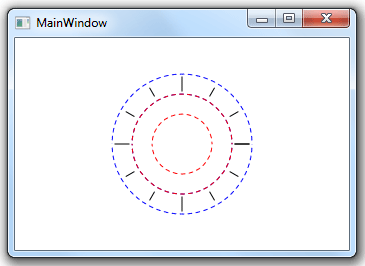
Once the rings are defined, you can customize the ticks. The following code displays 12 positions, with 4 as major ticks and the rest as minor ticks:
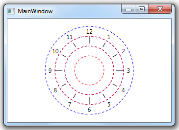
<Window x:Class="Test.MainWindow"
        xmlns="http://schemas.microsoft.com/winfx/2006/xaml/presentation"
        xmlns:x="http://schemas.microsoft.com/winfx/2006/xaml"
        xmlns:eo="http://schemas.essentialobjects.com/wpf/"
        Title="MainWindow" Height="250" Width="350">
    <Grid>
        <eo:CircularScale Minimum="0" Maximum="12" MajorInterval="3" MinorInterval="1"
            ShowRings="True" ShowMinorLabels="False" ShowMajorLabels="False" StartAngle="0" EndAngle="360">
            <eo:CircularScale.RingDefinitions>
                <eo:RingDefinition RadiusX="50" RadiusY="50" Width="20" Height="20" />
                <eo:RingDefinition Width="20" Height="20" />
            </eo:CircularScale.RingDefinitions>
        </eo:CircularScale>
    </Grid>
</Window>
The above code set Minimum, Maximum, MajorInterval and MinorInterval to define all the major and minor ticks. You can find a detailed explanation of major ticks and minor ticks can be found here. It also set StartAngle and EndAngle so that the values will be arranged the same way as a clock. The code produces the following result:
You can further customize the major ticks and minor ticks with MajorTickOptions and MinorTickOptions. The following code changes the RingAlignment of the major ticks to "Outwards":
<Window x:Class="Test.MainWindow"
        xmlns="http://schemas.microsoft.com/winfx/2006/xaml/presentation"
        xmlns:x="http://schemas.microsoft.com/winfx/2006/xaml"
        xmlns:eo="http://schemas.essentialobjects.com/wpf/"
        Title="MainWindow" Height="250" Width="350">
    <Grid>
        <eo:CircularScale Minimum="0" Maximum="12" MajorInterval="3" MinorInterval="1"
            ShowRings="True" ShowMinorLabels="False" ShowMajorLabels="False" StartAngle="0" EndAngle="360">
            <eo:CircularScale.RingDefinitions>
                <eo:RingDefinition RadiusX="50" RadiusY="50" Width="20" Height="20" />
                <eo:RingDefinition Width="20" Height="20" />
            </eo:CircularScale.RingDefinitions>

            <eo:CircularScale.MajorTickOptions>
                <eo:MajorCircularTickOptions Ring="1" RingAlignment="Outward">
                </eo:MajorCircularTickOptions>
            </eo:CircularScale.MajorTickOptions>
        </eo:CircularScale>
    </Grid>
</Window>
The above code produces the following result:
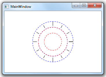
Note the major ticks are now aligned to the outer boundary of the ring.
You can further customize the major ticks and minor ticks through a number of other properties on MajorTickOptions or MajorTickOptions, such as Style and Template. See here for more information on how to use these properties.
Customizing Labels
Labels can be customized in a way similar to ticks. The following code displays both major labels and minor labels on ring 2:
<Window x:Class="Test.MainWindow"
        xmlns="http://schemas.microsoft.com/winfx/2006/xaml/presentation"
        xmlns:x="http://schemas.microsoft.com/winfx/2006/xaml"
        xmlns:eo="http://schemas.essentialobjects.com/wpf/"
        Title="MainWindow" Height="250" Width="350">
    <Grid>
        <eo:CircularScale Minimum="0" Maximum="12" MajorInterval="3" MinorInterval="1"
            ShowRings="True" ShowMinorLabels="True" StartAngle="270" EndAngle="270" ShowFirst="False">
            <eo:CircularScale.RingDefinitions>
                <eo:RingDefinition RadiusX="50" RadiusY="50" Width="20" Height="20" />
                <eo:RingDefinition Width="20" Height="20" />
                <eo:RingDefinition Width="20" Height="20" />
            </eo:CircularScale.RingDefinitions>

            <eo:CircularScale.MajorTickOptions>
                <eo:MajorCircularTickOptions Ring="1" RingAlignment="Outward">
                </eo:MajorCircularTickOptions>
            </eo:CircularScale.MajorTickOptions>

            <eo:CircularScale.MajorLabelOptions>
                <eo:MajorCircularLabelOptions Ring="2">
                </eo:MajorCircularLabelOptions>
            </eo:CircularScale.MajorLabelOptions>

            <eo:CircularScale.MinorLabelOptions>
                <eo:MinorCircularLabelOptions Ring="2">
                </eo:MinorCircularLabelOptions>
            </eo:CircularScale.MinorLabelOptions>
        </eo:CircularScale>
    </Grid>
</Window>
The above code set ShowMinorLabels to true to display minor labels (ShowMajorLabels is true by default). It also uses MajorLabelOptions and MinorLabelOptions to specify that both major labels and minor labels should be displayed on ring 2. The code produces the following result:
Like ticks, you can further customize the major labels and minor labels through a number of other properties on on MajorLabelOptions or MajorLabelOptions, such as Style and Template. See here for more information on how to use these properties.
Customizing Ranges
The CircularScale can highlight one or more ranges on a ring. To use this feature, simply define one or more Range objects through the CircularScale's Ranges collection. The following code demonstrates how to use this feature:
<Window x:Class="Test.MainWindow"
        xmlns="http://schemas.microsoft.com/winfx/2006/xaml/presentation"
        xmlns:x="http://schemas.microsoft.com/winfx/2006/xaml"
        xmlns:eo="http://schemas.essentialobjects.com/wpf/"
        Title="MainWindow" Height="250" Width="350">
    <Grid>
        <eo:CircularScale Minimum="0" Maximum="12" MajorInterval="3" MinorInterval="1"
            ShowRings="True" ShowMinorLabels="True" StartAngle="270" EndAngle="270" ShowFirst="False">
            <eo:CircularScale.RingDefinitions>
                <eo:RingDefinition RadiusX="50" RadiusY="50" Width="20" Height="20" />
                <eo:RingDefinition Width="20" Height="20" />
                <eo:RingDefinition Width="20" Height="20" />
            </eo:CircularScale.RingDefinitions>

            <eo:CircularScale.MajorTickOptions>
                <eo:MajorCircularTickOptions Ring="1" RingAlignment="Outward">
                </eo:MajorCircularTickOptions>
            </eo:CircularScale.MajorTickOptions>

            <eo:CircularScale.MajorLabelOptions>
                <eo:MajorCircularLabelOptions Ring="2">
                </eo:MajorCircularLabelOptions>
            </eo:CircularScale.MajorLabelOptions>

            <eo:CircularScale.MinorLabelOptions>
                <eo:MinorCircularLabelOptions Ring="2">
                </eo:MinorCircularLabelOptions>
            </eo:CircularScale.MinorLabelOptions>

            <eo:CircularScale.Ranges>
                <eo:Range StartValue="0" EndValue="9" Fill="LightBlue"></eo:Range>
                <eo:Range StartValue="9" EndValue="12" Fill="Yellow"></eo:Range>
            </eo:CircularScale.Ranges>
        </eo:CircularScale>
    </Grid>
</Window>
The above code produces the following result:
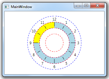
By default all ranges are placed on ring 0. You can use RangeBarRing to set the target ring for the ranges.
Customizing Line
The CircularScale can display a circular line on the ring. The following code demonstrates this feature:
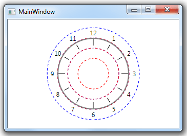
<Window x:Class="Test.MainWindow"
        xmlns="http://schemas.microsoft.com/winfx/2006/xaml/presentation"
        xmlns:x="http://schemas.microsoft.com/winfx/2006/xaml"
        xmlns:eo="http://schemas.essentialobjects.com/wpf/"
        Title="MainWindow" Height="250" Width="350">
    <Grid>
        <eo:CircularScale Minimum="0" Maximum="12" MajorInterval="3" MinorInterval="1"
            ShowLine="True" ShowRings="True" ShowMinorLabels="True" StartAngle="270" EndAngle="270" ShowFirst="False">
            <eo:CircularScale.RingDefinitions>
                <eo:RingDefinition RadiusX="50" RadiusY="50" Width="20" Height="20" />
                <eo:RingDefinition Width="20" Height="20" />
                <eo:RingDefinition Width="20" Height="20" />
            </eo:CircularScale.RingDefinitions>

            <eo:CircularScale.MajorTickOptions>
                <eo:MajorCircularTickOptions Ring="1" RingAlignment="Outward">
                </eo:MajorCircularTickOptions>
            </eo:CircularScale.MajorTickOptions>

            <eo:CircularScale.MajorLabelOptions>
                <eo:MajorCircularLabelOptions Ring="2">
                </eo:MajorCircularLabelOptions>
            </eo:CircularScale.MajorLabelOptions>

            <eo:CircularScale.MinorLabelOptions>
                <eo:MinorCircularLabelOptions Ring="2">
                </eo:MinorCircularLabelOptions>
            </eo:CircularScale.MinorLabelOptions>

            <eo:CircularScale.LineOptions>
                <eo:CircularLineOptions Ring="1"  RingAlignment="Outward" Fill="Gray">
                </eo:CircularLineOptions>
            </eo:CircularScale.LineOptions>
        </eo:CircularScale>
    </Grid>
</Window>
The above code set ShowLine to true and also use LineOptions to set the line color as gray, and align the line to the outer edge of ring 1. The code produces the following result:
Partial CircularScale
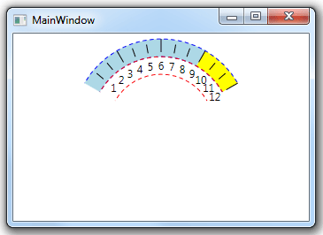
A CircularScale do not have to be a full circle. You can use StartAngle and EndAngle to customize the start angle and end angle of the arc. For example, the following code shows an arc from 30 degree to 150 degrees:
<Window x:Class="Test.MainWindow"
        xmlns="http://schemas.microsoft.com/winfx/2006/xaml/presentation"
        xmlns:x="http://schemas.microsoft.com/winfx/2006/xaml"
        xmlns:eo="http://schemas.essentialobjects.com/wpf/"
        Title="MainWindow" Height="250" Width="350">
    <Grid>
        <eo:CircularScale Minimum="0" Maximum="12"
            MajorInterval="3" MinorInterval="1"
            ShowRings="True" ShowMinorLabels="True"
            StartAngle="210" EndAngle="330" ShowFirst="False">
            <eo:CircularScale.RingDefinitions>
                <eo:RingDefinition RadiusX="80" RadiusY="80" Width="20" Height="20" />
                <eo:RingDefinition Width="20" Height="20" />
            </eo:CircularScale.RingDefinitions>

            <eo:CircularScale.MajorTickOptions>
                <eo:MajorCircularTickOptions Ring="1" RingAlignment="Outward">
                </eo:MajorCircularTickOptions>
            </eo:CircularScale.MajorTickOptions>

            <eo:CircularScale.MajorLabelOptions>
                <eo:MajorCircularLabelOptions Ring="0">
                </eo:MajorCircularLabelOptions>
            </eo:CircularScale.MajorLabelOptions>

            <eo:CircularScale.MinorLabelOptions>
                <eo:MinorCircularLabelOptions Ring="0">
                </eo:MinorCircularLabelOptions>
            </eo:CircularScale.MinorLabelOptions>

            <eo:CircularScale.Ranges>
                <eo:Range StartValue="0" EndValue="9" Fill="LightBlue"></eo:Range>
                <eo:Range StartValue="9" EndValue="12" Fill="Yellow"></eo:Range>
            </eo:CircularScale.Ranges>
        </eo:CircularScale>
    </Grid>
</Window>
The above code produces the following result:
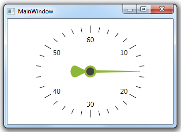
Adding Needle
You can add one more more Needle controls into the CircularScale's ValueIndicators property to add a Needle to the scale. The following XAML demonstrates a single CircularScale with a single Needle:
<Window x:Class="Test.MainWindow"
        xmlns="http://schemas.microsoft.com/winfx/2006/xaml/presentation"
        xmlns:x="http://schemas.microsoft.com/winfx/2006/xaml"
        xmlns:eo="http://schemas.essentialobjects.com/wpf/"
        Title="MainWindow" Height="300" Width="350">
    <Grid>
        <eo:CircularScale Minimum="0" Maximum="60" StartAngle="270" EndAngle="270" ShowFirst="False">
            <eo:CircularScale.RingDefinitions>
                <eo:RingDefinition RadiusX="100" RadiusY="80"></eo:RingDefinition>
                <eo:RingDefinition RadiusX="120" RadiusY="100"></eo:RingDefinition>
            </eo:CircularScale.RingDefinitions>
            <eo:CircularScale.MajorTickOptions>
                <eo:MajorCircularTickOptions Ring="1"></eo:MajorCircularTickOptions>
            </eo:CircularScale.MajorTickOptions>
            <eo:CircularScale.MinorTickOptions>
                <eo:MinorCircularTickOptions Ring="1"></eo:MinorCircularTickOptions>
            </eo:CircularScale.MinorTickOptions>
            <eo:CircularScale.ValueIndicators>
                <eo:Needle Value="15" Width="100" />
            </eo:CircularScale.ValueIndicators>
        </eo:CircularScale>
    </Grid>
</Window>
The above code produces the following result:
It is possible to use more than one Needle with one scale, and it is also possible to use custom Needles. See here for more information on how to customize a Needle.