Table of Contents
- Getting Started
- EO.Pdf
- EO.Web
- EO.WebBrowser
- EO.Wpf
- Overview
- Installation & Deployement
- Skin & Theme
- Common Taskes and Services
- EO.Wpf Buttons
- EO.Wpf Calendar & DatePicker
- EO.Wpf ComboBox
- EO.Wpf DockView
- EO.Wpf Gauge
- EO.Wpf Gauge
- Using Scales
- Using Gauge Frames
- Creating a Gauge
- Understanding TickBar
- EO.Wpf ListBox
- EO.Wpf Menu
- EO.Wpf MaskedEdit
- EO.Wpf ProgressBar
- EO.Wpf Slider
- EO.Wpf SpinEdit
- EO.Wpf SplitView
- EO.Wpf TabControl
- EO.Wpf TreeView
- EO.Wpf Utility Controls
- EO.Wpf WindowChrome
- Sample Data Objects
- Common Topics
- Reference
| Using LinearScale |
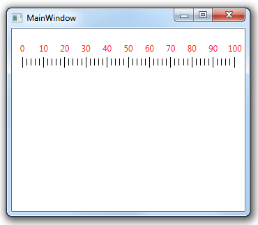
A LinearScale arranges all the ticks, labels and value indicators on one or more straight lines, either horizontal or vertical. The following image demonstrates a horizontal LinearScale:

This section covers the following topics:
Getting Started
To use the LinearScale control, simply place it in your Window and set the following properties:
- Minimum. Set the minimum value of the scale. The default value is 0;
- Maximum. Set the maximum value of the scale. The default value is 100;
- MajorInterval. Set the major interval of the scale. The default value is 10. MajorInterval affects where a major tick and major label should be placed;
- MinorInterval. Set the minor interval of the scale. The default value is 2. MinorInterval affects where a minor tick and minor label should be placed;
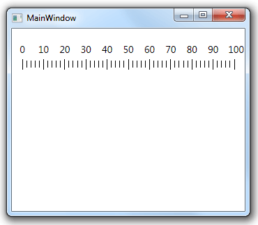
By default, a LinearScale displays major ticks, minor ticks and major labels. The following code includes a single LinearScale without changing any of the default property values:
<Window x:Class="Test.MainWindow"
        xmlns="http://schemas.microsoft.com/winfx/2006/xaml/presentation"
        xmlns:x="http://schemas.microsoft.com/winfx/2006/xaml"
        xmlns:eo="http://schemas.essentialobjects.com/wpf/"
        Title="MainWindow" Height="250" Width="350">
    <StackPanel Margin="15">
        <eo:LinearScale Minimum="0" Maximum="100"></eo:LinearScale>
    </StackPanel>
</Window>
The above code produces the following result:
A more detailed explanation of major ticks and minor ticks can be found here.
Customizing Ticks
Use ShowMajorTicks and ShowMinorTicks to specify whether the scale should display major and minor ticks. By default both properties are true.
Use MajorTickOptions and MinorTickOptions to specify the options for the major and minor ticks respectively. With both option properties you can specify:
- The Type of the tick. EO.Wpf supports a number of built-in tick shape types. The default shape is Rectangle;
-
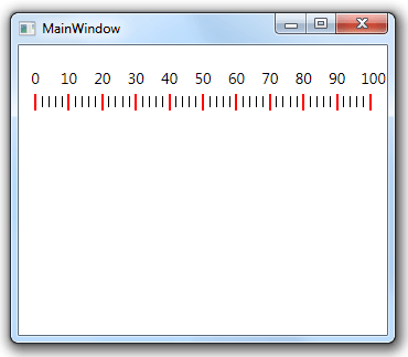
A style for the tick element. The target type is always a Shape class for the ticks. The following code demonstrates how to use this property:
XAML<Window x:Class="Test.MainWindow" xmlns="http://schemas.microsoft.com/winfx/2006/xaml/presentation" xmlns:x="http://schemas.microsoft.com/winfx/2006/xaml" xmlns:eo="http://schemas.essentialobjects.com/wpf/" Title="MainWindow" Height="250" Width="350"> <StackPanel Margin="10"> <eo:LinearScale Minimum="0" Maximum="100"> <eo:LinearScale.MajorTickOptions> <eo:MajorLinearTickOptions> <eo:MajorLinearTickOptions.Style> <Style TargetType="Shape"> <Setter Property="Width" Value="2"></Setter> <Setter Property="Fill" Value="Red"></Setter> <Setter Property="Height" Value="15"></Setter> </Style> </eo:MajorLinearTickOptions.Style> </eo:MajorLinearTickOptions> </eo:LinearScale.MajorTickOptions> </eo:LinearScale> </StackPanel> </Window>
The above code sets the major tick's size and fill color. It produces the following result:
-
If you wish to have more complicated ticks, you can provide a custom template through Options.Template property. The following code demonstrates how to use this property:
XAML<Window x:Class="Test.MainWindow" xmlns="http://schemas.microsoft.com/winfx/2006/xaml/presentation" xmlns:x="http://schemas.microsoft.com/winfx/2006/xaml" xmlns:eo="http://schemas.essentialobjects.com/wpf/" Title="MainWindow" Height="250" Width="350"> <StackPanel Margin="15"> <eo:LinearScale> <eo:LinearScale.MajorTickOptions> <eo:MajorLinearTickOptions> <eo:MajorLinearTickOptions.Template> <DataTemplate> <Rectangle Width="2" Height="15" Fill="Red"></Rectangle> </DataTemplate> </eo:MajorLinearTickOptions.Template> </eo:MajorLinearTickOptions> </eo:LinearScale.MajorTickOptions> </eo:LinearScale> </StackPanel> </Window>
The above code produces the same result as the previous example.
Customizing Labels
Use ShowMajorLabels and ShowMinorLabels to specify whether the scale should display major and minor labels. By default only ShowMajorLabels is true.
Use MajorLabelOptions and MinorLabelOptions to specify the options for the major and minor labels respectively. With both option properties you can specify:
-
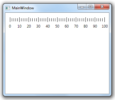
The Placement of the label. The following code displays the label at the bottom of the scale instead of at the top:
XAML<Window x:Class="Test.MainWindow" xmlns="http://schemas.microsoft.com/winfx/2006/xaml/presentation" xmlns:x="http://schemas.microsoft.com/winfx/2006/xaml" xmlns:eo="http://schemas.essentialobjects.com/wpf/" Title="MainWindow" Height="250" Width="350"> <StackPanel Margin="15"> <eo:LinearScale Minimum="0" Maximum="100"> <eo:LinearScale.MajorLabelOptions> <eo:MajorLinearLabelOptions Placement="BottomRight"></eo:MajorLinearLabelOptions> </eo:LinearScale.MajorLabelOptions> </eo:LinearScale> </StackPanel> </Window>
The above code produces the following result:
-
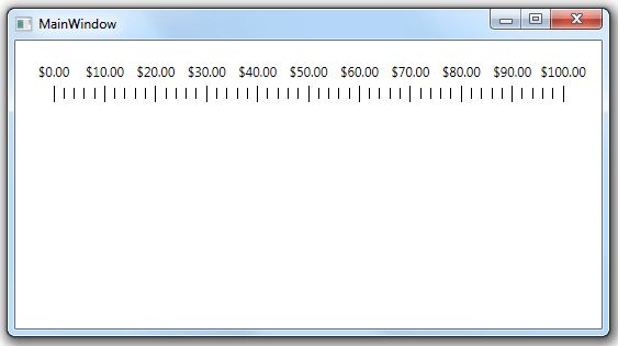
The StringFormat of the label. The following code formats all label text as currency:
XAML<Window x:Class="Test.MainWindow" xmlns="http://schemas.microsoft.com/winfx/2006/xaml/presentation" xmlns:x="http://schemas.microsoft.com/winfx/2006/xaml" xmlns:eo="http://schemas.essentialobjects.com/wpf/" Title="MainWindow" Height="250" Width="550"> <StackPanel Margin="20,0,20,0"> <eo:LinearScale Minimum="0" Maximum="100"> <eo:LinearScale.MajorLabelOptions> <eo:MajorLinearLabelOptions StringFormat="{}{0:c}"></eo:MajorLinearLabelOptions> </eo:LinearScale.MajorLabelOptions> </eo:LinearScale> </StackPanel> </Window>
The above code produces the following result:
-
Similar to the tick options, you can also use Options.Template property to provide a custom template, or use Options.Style property to provide a custom style for the label. The target type for the label styles is Label. The following sample changes the major label text to red:
XAML<Window x:Class="Test.MainWindow" xmlns="http://schemas.microsoft.com/winfx/2006/xaml/presentation" xmlns:x="http://schemas.microsoft.com/winfx/2006/xaml" xmlns:eo="http://schemas.essentialobjects.com/wpf/" Title="MainWindow" Height="250" Width="350"> <StackPanel Margin="15"> <eo:LinearScale Minimum="0" Maximum="100"> <eo:LinearScale.MajorLabelOptions> <eo:MajorLinearLabelOptions> <eo:MajorLinearLabelOptions.Style> <Style TargetType="Label"> <Setter Property="Foreground" Value="Red"></Setter> </Style> </eo:MajorLinearLabelOptions.Style> </eo:MajorLinearLabelOptions> </eo:LinearScale.MajorLabelOptions> </eo:LinearScale> </StackPanel> </Window>
The above code produces the following result:
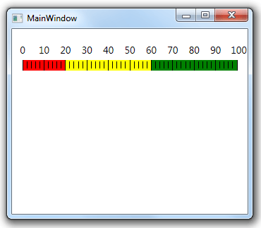
Customizing RangeBars
A LinearScale can contain one or more range bars. The following code contains three range bars in different colors:
<Window x:Class="Test.MainWindow"
        xmlns="http://schemas.microsoft.com/winfx/2006/xaml/presentation"
        xmlns:x="http://schemas.microsoft.com/winfx/2006/xaml"
        xmlns:eo="http://schemas.essentialobjects.com/wpf/"
        Title="MainWindow" Height="250" Width="350">
    <StackPanel Margin="15">
        <eo:LinearScale Minimum="0" Maximum="100">
            <eo:LinearScale.Ranges>
                <eo:Range StartValue="0" EndValue="20" Fill="Red"></eo:Range>
                <eo:Range StartValue="20" EndValue="60" Fill="Yellow"></eo:Range>
                <eo:Range StartValue="60" EndValue="100" Fill="Green"></eo:Range>
            </eo:LinearScale.Ranges>
        </eo:LinearScale>
    </StackPanel>
</Window>
The above code produces the following result:
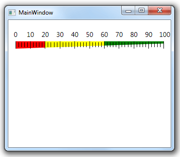
The range bar in the above sample has the same height on both end. You can set LinearRangeBarOptions.StartSize and LinearRangeBarOptions.EndSize to make one end to be narrower than the other end. The following code demonstrated this feature:
<Window x:Class="Test.MainWindow"
        xmlns="http://schemas.microsoft.com/winfx/2006/xaml/presentation"
        xmlns:x="http://schemas.microsoft.com/winfx/2006/xaml"
        xmlns:eo="http://schemas.essentialobjects.com/wpf/"
        Title="MainWindow" Height="250" Width="350">
    <StackPanel Margin="15">
        <eo:LinearScale Minimum="0" Maximum="100">
            <eo:LinearScale.Ranges>
                <eo:Range StartValue="0" EndValue="20" Fill="Red"></eo:Range>
                <eo:Range StartValue="20" EndValue="60" Fill="Yellow"></eo:Range>
                <eo:Range StartValue="60" EndValue="100" Fill="Green"></eo:Range>
            </eo:LinearScale.Ranges>
            <eo:LinearScale.RangeBarOptions>
                <eo:LinearRangeBarOptions StartSize="1" EndSize="0.3">
                </eo:LinearRangeBarOptions>
            </eo:LinearScale.RangeBarOptions>
        </eo:LinearScale>
    </StackPanel>
</Window>
The above code produces the following result:
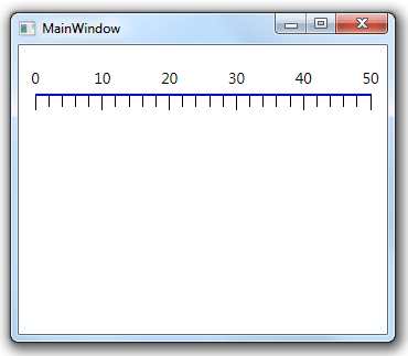
Displaying a Line for the Scale
A LinearScale can display a line along with the scale. The following sample demonstrates this feature:
<Window x:Class="Test.MainWindow"
        xmlns="http://schemas.microsoft.com/winfx/2006/xaml/presentation"
        xmlns:x="http://schemas.microsoft.com/winfx/2006/xaml"
        xmlns:eo="http://schemas.essentialobjects.com/wpf/"
        Title="MainWindow" Height="250" Width="350">
    <StackPanel Margin="10">
        <eo:LinearScale Minimum="0" Maximum="50" ShowLine="true" LineVerticalAlignment="Top">
            <eo:LinearScale.LineStyle>
                <Style TargetType="Rectangle">
                    <!-- change the height of the line -->
                    <Setter Property="Height" Value="2" />

                    <!-- change the color of the line -->
                    <Setter Property="Fill" Value="Blue" />
                </Style>
            </eo:LinearScale.LineStyle>
        </eo:LinearScale>
    </StackPanel>
</Window>
The above code set ShowLine to true in order to display the line. It also customizes LineStyle. It produces the following result: