Table of Contents
- Getting Started
- EO.Pdf
- EO.Web
- EO.WebBrowser
- EO.Wpf
- Overview
- Installation & Deployement
- Skin & Theme
- Common Taskes and Services
- EO.Wpf Buttons
- EO.Wpf Calendar & DatePicker
- EO.Wpf ComboBox
- EO.Wpf DockView
- EO.Wpf Gauge
- EO.Wpf Gauge
- Using Scales
- Using Gauge Frames
- Creating a Gauge
- Understanding TickBar
- EO.Wpf ListBox
- EO.Wpf Menu
- EO.Wpf MaskedEdit
- EO.Wpf ProgressBar
- EO.Wpf Slider
- EO.Wpf SpinEdit
- EO.Wpf SplitView
- EO.Wpf TabControl
- EO.Wpf TreeView
- EO.Wpf Utility Controls
- EO.Wpf WindowChrome
- Sample Data Objects
- Common Topics
- Reference
| Using Markers |
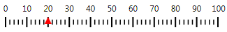
Markers are ValueIndicators that you can place on the scales to mark a specific value. The following image demonstrates a linear scale with a triangle marker at value 20:
To create a marker, simply place a Marker control inside the scale's ValueIndicators collection, as demonstrated in the samples in this section. The rest of this section covers the following topics:
Customize Marker Appearance
Like any other WPF control, a Marker is template based. You can customize the appearance of the marker through its Template property. The following XAML demonstrates how to use this property to create the red triangle marker shown in the above image:
<eo:LinearScale>
    <eo:LinearScale.ValueIndicators>
        <eo:Marker Value="20">
            <eo:Marker.Template>
                <ControlTemplate TargetType="eo:Marker">
                    <Path Data="M 5,0 L 10,10 L 0,10 Z" Fill="Red"></Path>
                </ControlTemplate>
            </eo:Marker.Template>
        </eo:Marker>
    </eo:LinearScale.ValueIndicators>
</eo:LinearScale>
If there are multiple markers having the same appearance, you can create a Style and then apply the Style to multiple markers.
Position Marker for Linear Scale
All the Markers are placed inside a marker bar. By default, the marker bar for a LinearScale or a RollingScale is aligned to the tick bar of the scale, that is, the top of the marker bar is aligned to the top of the tick marks. You can adjust the position by setting MarkerBarVerticalOffset. The default value is 0. For horizontal scales, setting this property to a negative value moves the marker bar up and setting it to a negative number moves the marker bar down. For vertical scales, use MarkerBarHorizontalOffset instead.
The height or width of the marker bar can be specified by property MarkerBarSize. The default value is 10. For a horizontal scale, MarkerBarSize represents the height of the marker bar; for a vertical scale, MarkerBarSize represents the width of the marker bar. If the marker bar is taller/wider than the markers, you can use HorizontalAlignment or VerticalAlignment on each Marker to align the marker within the marker bar.
Position Marker for Circular Scale
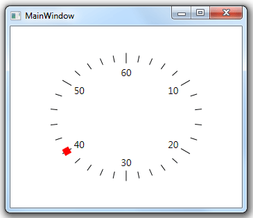
Elements of a CircularScale are arranged with a RadialPanel. In order to properly position a Marker on a CircularScale, you can first defines the rings (see here for more information about rings in a CircularScale) for the CircularScale, then use attached property RadialPanel.Ring to specify on which ring the marker should be placed. The following example demonstrates this feature:
<Window x:Class="Test.MainWindow"
        xmlns="http://schemas.microsoft.com/winfx/2006/xaml/presentation"
        xmlns:x="http://schemas.microsoft.com/winfx/2006/xaml"
        xmlns:eo="http://schemas.essentialobjects.com/wpf/"
        Title="MainWindow" Height="300" Width="350">
    <Grid>
        <eo:CircularScale Minimum="0" Maximum="60" StartAngle="270" EndAngle="270" ShowFirst="False">
            <eo:CircularScale.RingDefinitions>
                <eo:RingDefinition RadiusX="100" RadiusY="80"></eo:RingDefinition>
                <eo:RingDefinition RadiusX="120" RadiusY="100"></eo:RingDefinition>
            </eo:CircularScale.RingDefinitions>
            <eo:CircularScale.MajorTickOptions>
                <eo:MajorCircularTickOptions Ring="1"></eo:MajorCircularTickOptions>
            </eo:CircularScale.MajorTickOptions>
            <eo:CircularScale.MinorTickOptions>
                <eo:MinorCircularTickOptions Ring="1"></eo:MinorCircularTickOptions>
            </eo:CircularScale.MinorTickOptions>
            <eo:CircularScale.ValueIndicators>
                <eo:Marker Value="40" EnableAnimation="True" eo:RadialPanel.Ring="1">
                    <eo:Marker.Template>
                        <ControlTemplate TargetType="eo:Marker">
                            <Rectangle Width="10" Height="10" Fill="Red"></Rectangle>
                        </ControlTemplate>
                    </eo:Marker.Template>
                </eo:Marker>
            </eo:CircularScale.ValueIndicators>
        </eo:CircularScale>
    </Grid>
</Window>
The above code produces the following result:
You can also use other RadialPanel attached properties on the Marker control. Please see here for more information about these properties.
Marker Animation
You can set EnableAnimation to true to enable marker animation. When marker animation is enabled, setting the marker's Value to a new value will automatically play an animation from the old position to the new position.