Table of Contents
- Getting Started
- EO.Pdf
- EO.Web
- EO.WebBrowser
- EO.Wpf
- Overview
- Installation & Deployement
- Skin & Theme
- Common Taskes and Services
- EO.Wpf Buttons
- EO.Wpf Calendar & DatePicker
- EO.Wpf ComboBox
- EO.Wpf DockView
- EO.Wpf Gauge
- EO.Wpf ListBox
- EO.Wpf Menu
- EO.Wpf MaskedEdit
- EO.Wpf ProgressBar
- EO.Wpf Slider
- EO.Wpf SpinEdit
- EO.Wpf SplitView
- EO.Wpf TabControl
- EO.Wpf TreeView
- EO.Wpf Utility Controls
- EO.Wpf WindowChrome
- Sample Data Objects
- Common Topics
- Reference
| New Tab & Close Tab Button |
EO.Wpf TabControl allows user to dynamically add or remove tab items. This section covers the following topics:
Eanble New Tab and Close Tab Button
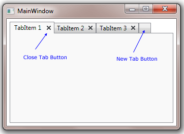
To enable new tab or close tab button, simply set the TabControl's ShowNewTabButton or ShowCloseTabButton to true. The following code demonstrates these features:
<Window x:Class="Test.MainWindow"
        xmlns="http://schemas.microsoft.com/winfx/2006/xaml/presentation"
        xmlns:x="http://schemas.microsoft.com/winfx/2006/xaml"
        xmlns:eo="http://schemas.essentialobjects.com/wpf/"
        Title="MainWindow" Height="250" Width="350">
    <Border Padding="6">
        <eo:TabControl ShowNewTabButton="True" ShowCloseTabButton="True">
            <eo:TabItem Header="TabItem 1"></eo:TabItem>
            <eo:TabItem Header="TabItem 2"></eo:TabItem>
            <eo:TabItem Header="TabItem 3"></eo:TabItem>
        </eo:TabControl>
    </Border>
</Window>
The following image indicates the close tab and new tab buttons:
Handle New Tab and Close Tab Button Event
When the new tab button is clicked, either NewItemAdded event or NewItemRequested event is raised, depending on whether the TabControl is populated from a data source (whether the TabControl's ItemsSource is set). If the TabControl is not populated from a data source, then the following actions occur:
- A new item is created and added into the TabControl;
- NewItemAdded event is raised. Inside this event handler, you can access the newly created TabItem object through the event argument's Item property.
If the TabControl is populated from a data source, then clicking the new tab button does not automatically create a new item. Instead it raises NewItemRequested event. Inside that event handler you should add a new item into your data source. If the data source supports notification, then the TabControl will automatically create a new tab item based on the newly added data item.
Customizing New Tab and Close Tab Button Style
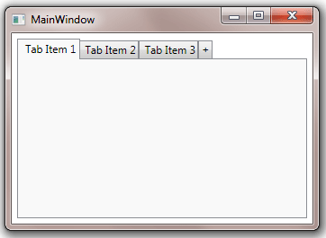
You can use NewTabButtonStyle and CloseTabButtonStyle to customize the style of the new tab button and close button respectively. The target types for both properties are BareButton. The following code demonstrates how to customize NewTabButtonStyle:
<Window x:Class="Test.MainWindow"
        xmlns="http://schemas.microsoft.com/winfx/2006/xaml/presentation"
        xmlns:x="http://schemas.microsoft.com/winfx/2006/xaml"
        xmlns:eo="http://schemas.essentialobjects.com/wpf/"
        Title="MainWindow" Height="250" Width="350">
    <Border Padding="6">
        <eo:TabControl ShowNewTabButton="True">
            <eo:TabControl.NewTabButtonStyle>
                <Style TargetType="eo:BareButton">
                    <Setter Property="Template">
                        <Setter.Value>
                            <ControlTemplate>
                                <Border BorderBrush="#8C8E94" BorderThickness="1,1,1,0" Padding="3,0">
                                    <Border.Background>
                                        <LinearGradientBrush StartPoint="0,0" EndPoint="0,1">
                                            <LinearGradientBrush.GradientStops>
                                                <GradientStop Offset="0" Color="#F3F3F3" />
                                                <GradientStop Offset="0.5" Color="#EBEBEB" />
                                                <GradientStop Offset="0.5" Color="#DDDDDD" />
                                                <GradientStop Offset="1" Color="#CDCDCD" />
                                            </LinearGradientBrush.GradientStops>
                                        </LinearGradientBrush>
                                    </Border.Background>
                                    <TextBlock>+</TextBlock>
                                </Border>
                            </ControlTemplate>
                        </Setter.Value>
                    </Setter>
                </Style>
            </eo:TabControl.NewTabButtonStyle>
            <eo:TabItem Header="Tab Item 1"></eo:TabItem>
            <eo:TabItem Header="Tab Item 2"></eo:TabItem>
            <eo:TabItem Header="Tab Item 3"></eo:TabItem>
        </eo:TabControl>
    </Border>
</Window>
The above code produces the following result:
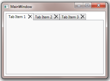
The following code demonstrates how to customize the close tab button:
<Window x:Class="Test.MainWindow"
        xmlns="http://schemas.microsoft.com/winfx/2006/xaml/presentation"
        xmlns:x="http://schemas.microsoft.com/winfx/2006/xaml"
        xmlns:eo="http://schemas.essentialobjects.com/wpf/"
        Title="MainWindow" Height="250" Width="350">
    <Border Padding="6">
        <eo:TabControl ShowCloseTabButton="True">
            <eo:TabControl.CloseTabButtonStyle>
                <Style TargetType="eo:BareButton">
                    <Setter Property="Template">
                        <Setter.Value>
                            <ControlTemplate>
                                <eo:Bitmap VerticalAlignment="Center" Source="pack://application:,,,/Images/delete.png"></eo:Bitmap>
                            </ControlTemplate>
                        </Setter.Value>
                    </Setter>
                </Style>
            </eo:TabControl.CloseTabButtonStyle>
            <eo:TabItem Header="Tab Item 1"></eo:TabItem>
            <eo:TabItem Header="Tab Item 2"></eo:TabItem>
            <eo:TabItem Header="Tab Item 3"></eo:TabItem>
        </eo:TabControl>
    </Border>
</Window>
The above code produces the following result: