Table of Contents
- Getting Started
- EO.Pdf
- EO.Web
- EO.WebBrowser
- EO.Wpf
- Overview
- Installation & Deployement
- Skin & Theme
- Common Taskes and Services
- EO.Wpf Buttons
- EO.Wpf Calendar & DatePicker
- EO.Wpf ComboBox
- EO.Wpf DockView
- EO.Wpf Gauge
- EO.Wpf ListBox
- EO.Wpf Menu
- EO.Wpf MaskedEdit
- EO.Wpf ProgressBar
- EO.Wpf Slider
- EO.Wpf SpinEdit
- EO.Wpf SplitView
- EO.Wpf TabControl
- EO.Wpf TreeView
- EO.Wpf Utility Controls
- EO.Wpf WindowChrome
- Sample Data Objects
- Common Topics
- Reference
| Overflow Options |
EO.Wpf TabControl supports a number of "overflow" options. An "overflow" occurs when not all tab item headers can fit into a single row. The default behavior for this situation is to wrap the tab items into multiple rows. The following code contains a static TabControl that can not be fit into the same row:
<Window x:Class="Test.MainWindow"
        xmlns="http://schemas.microsoft.com/winfx/2006/xaml/presentation"
        xmlns:x="http://schemas.microsoft.com/winfx/2006/xaml"
        xmlns:eo="http://schemas.essentialobjects.com/wpf/"
        Title="MainWindow" Height="250" Width="350">
    <Border Padding="6">
        <eo:TabControl TabItemOverflowStrategy="....">
            <eo:TabItem Header="TabItem 1"></eo:TabItem>
            <eo:TabItem Header="TabItem 2"></eo:TabItem>
            <eo:TabItem Header="TabItem 3"></eo:TabItem>
            <eo:TabItem Header="TabItem 4"></eo:TabItem>
            <eo:TabItem Header="TabItem 5"></eo:TabItem>
            <eo:TabItem Header="TabItem 6"></eo:TabItem>
            <eo:TabItem Header="TabItem 7"></eo:TabItem>
        </eo:TabControl>
    </Border>
</Window>
Depending on the value of the TabItemOverflowStrategy property, the above code (note you must fill in the actual TabItemOverflowStrategy value) produces different results.
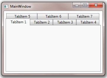
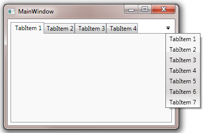
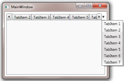
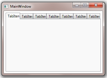
| TabItemOverflowStrategy | Result |
|---|---|
| Wrap |
This is the default value. |
| Clip |
This option hides all items that can not fit into a single row. However a drop down menu will be displayed through which user will be able to select all the tab items. |
| Scroll |
This option displays a scroll button on both ends of the tab header row. User can use the scroll button to scroll the tab headers towards left or right. A drop down menu can also be displayed through which user will be able to select any item from the menu. |
| Shrink |
In shrink mode, each tab item header is only partially displayed. |