Table of Contents
- Getting Started
- EO.Pdf
- EO.Web
- EO.WebBrowser
- EO.Wpf
- Overview
- Installation & Deployement
- Skin & Theme
- Common Taskes and Services
- EO.Wpf Buttons
- EO.Wpf Calendar & DatePicker
- EO.Wpf ComboBox
- EO.Wpf DockView
- EO.Wpf Gauge
- EO.Wpf ListBox
- EO.Wpf Menu
- EO.Wpf MaskedEdit
- EO.Wpf ProgressBar
- EO.Wpf Slider
- EO.Wpf SpinEdit
- EO.Wpf SplitView
- EO.Wpf TabControl
- EO.Wpf TreeView
- EO.Wpf Utility Controls
- EO.Wpf WindowChrome
- Sample Data Objects
- Common Topics
- Reference
| Customizing Tab Item Template |
You can customize the appearance of a TabItem through ItemContainerStyle property. The following example demonstrates how the built-in Chrome skin is implemented. The built-in Chrome skin implements a TabControl that's similar to Google Chrome Browser's tab interface.
XAML
<Style x:Key="Chrome_TabItemFocusVisual">
    <Setter Property="Control.Template">
        <Setter.Value>
            <ControlTemplate>
                <Rectangle Margin="3,3,3,1"
           StrokeThickness="1"
           Stroke="Black"
           StrokeDashArray="1 2"
           SnapsToDevicePixels="true"/>
            </ControlTemplate>
        </Setter.Value>
    </Setter>
</Style>

<LinearGradientBrush x:Key="Chrome_TabItemHotBackground"
     StartPoint="0,0"
     EndPoint="0,1">
    <LinearGradientBrush.GradientStops>
        <GradientStop Color="#EAF6FD"
      Offset="0.15"/>
        <GradientStop Color="#D9F0FC"
      Offset=".5"/>
        <GradientStop Color="#BEE6FD"
      Offset=".5"/>
        <GradientStop Color="#A7D9F5"
      Offset="1"/>
    </LinearGradientBrush.GradientStops>
</LinearGradientBrush>

<SolidColorBrush x:Key="Chrome_TabItemSelectedBackground" Color="#F9F9F9"/>

<SolidColorBrush x:Key="Chrome_TabItemDisabledBackground" Color="#F4F4F4"/>

<SolidColorBrush x:Key="Chrome_TabItemHotBorderBrush" Color="#3C7FB1"/>

<SolidColorBrush x:Key="Chrome_TabItemDisabledBorderBrush" Color="#FFC9C7BA"/>

<SolidColorBrush x:Key="Chrome_TabControlNormalBorderBrush" Color="#8C8E94"/>

<LinearGradientBrush x:Key="Chrome_ButtonNormalBackground" StartPoint="0,0" EndPoint="0,1">
    <LinearGradientBrush.GradientStops>
        <GradientStop Offset="0" Color="#F3F3F3" />
        <GradientStop Offset="0.5" Color="#EBEBEB" />
        <GradientStop Offset="0.5" Color="#DDDDDD" />
        <GradientStop Offset="1" Color="#CDCDCD" />
    </LinearGradientBrush.GradientStops>
</LinearGradientBrush>

<!-- ================= -->
<!-- = TabItem style = -->
<!-- ================= -->

<Style x:Key="Chrome_TabItemStyle" TargetType="{x:Type eo:TabItem}">
    <Setter Property="FocusVisualStyle" Value="{StaticResource Chrome_TabItemFocusVisual}"/>
    <Setter Property="Foreground" Value="Black"/>
    <Setter Property="Padding" Value="0"/>
    <Setter Property="BorderBrush" Value="{StaticResource Chrome_TabControlNormalBorderBrush}"/>
    <Setter Property="Background" Value="{StaticResource Chrome_ButtonNormalBackground}"/>
    <Setter Property="HorizontalContentAlignment" Value="Stretch"/>
    <Setter Property="VerticalContentAlignment" Value="Stretch"/>
    <Setter Property="HeaderTemplate" Value="{Binding RelativeSource={RelativeSource FindAncestor, AncestorType=eo:TabControl},
                                      Path=HeaderTemplate}" />
    <Setter Property="Template">
        <Setter.Value>
            <ControlTemplate TargetType="{x:Type eo:TabItem}">
                <Grid SnapsToDevicePixels="true">
                    <eo:TabItemBorder x:Name="Bd"
                              BorderBrush="{TemplateBinding BorderBrush}"
                              Padding="{TemplateBinding Padding}"
                              Background="{TemplateBinding Background}"
                              BorderThickness="1,1,1,0"
                              CornerRadius="3"
                              LeftSlopeAngle="70"
                              RightSlopeAngle="110">
                            <eo:TemplatePresenter x:Name="PART_Presenter"
                                          ContentSource="Header"
                                          SnapsToDevicePixels="{TemplateBinding SnapsToDevicePixels}"
                                          HorizontalAlignment="{Binding Path=HorizontalContentAlignment,RelativeSource={RelativeSource AncestorType={x:Type ItemsControl}}}"
                                          VerticalAlignment="{Binding Path=VerticalContentAlignment,RelativeSource={RelativeSource AncestorType={x:Type ItemsControl}}}"
                                          RecognizesAccessKey="True" />
                    </eo:TabItemBorder>
                </Grid>
                <ControlTemplate.Triggers>
                    <Trigger Property="IsMouseOver" Value="true">
                        <Setter TargetName="Bd" Property="Background" Value="{StaticResource Chrome_TabItemHotBackground}"/>
                    </Trigger>
                    <Trigger Property="IsSelected" Value="true">
                        <Setter Property="Panel.ZIndex" Value="1"/>
                        <Setter TargetName="Bd" Property="Background" Value="{StaticResource Chrome_TabItemSelectedBackground}"/>
                    </Trigger>
                    <MultiTrigger>
                        <MultiTrigger.Conditions>
                            <Condition Property="IsSelected" Value="false"/>
                            <Condition Property="IsMouseOver" Value="true"/>
                        </MultiTrigger.Conditions>
                        <Setter TargetName="Bd" Property="BorderBrush" Value="{StaticResource Chrome_TabItemHotBorderBrush}"/>
                    </MultiTrigger>
                    <MultiTrigger>
                        <MultiTrigger.Conditions>
                            <Condition Property="IsSelected" Value="true"/>
                            <Condition Property="TabStripPlacement" Value="Top"/>
                        </MultiTrigger.Conditions>
                        <Setter Property="Margin" Value="0,0,0,-1"/>
                    </MultiTrigger>
                </ControlTemplate.Triggers>
            </ControlTemplate>
        </Setter.Value>
    </Setter>
</Style>
The above code defines a named style Chrome_ItemStyle TabItem. Once this style is defined, you can use the following code to use the above style:
XAML
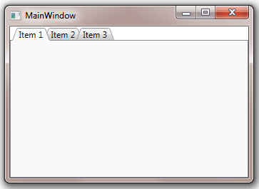
<Window x:Class="Test.MainWindow"
        xmlns="http://schemas.microsoft.com/winfx/2006/xaml/presentation"
        xmlns:x="http://schemas.microsoft.com/winfx/2006/xaml"
        xmlns:eo="http://schemas.essentialobjects.com/wpf/"
        Title="MainWindow" Height="250" Width="350">
    <Window.Resources>
        ....resources defined in the above code....
    </Window.Resources>
    <eo:TabControl ItemContainerStyle="{StaticResource Chrome_TabItemStyle}" OverlapDepth="10">
        <eo:TabItem Header="Item 1"></eo:TabItem>
        <eo:TabItem Header="Item 2"></eo:TabItem>
        <eo:TabItem Header="Item 3"></eo:TabItem>
    </eo:TabControl>
</Window>
The above code produces the following result:
Key points of interest in the above code:
- By defining a custom style for TabItem and reference the style through the TabControl's ItemContainerStyle property, the code completely replaces the default TabItem style and its Template;
- Inside the TabItem's Template, it uses TabItemBorder to create a custom border;
- It uses various triggers to adjust the TabItemBorder's Background and Margin to highlight the TabItem when it's selected;