Table of Contents
- Getting Started
- EO.Pdf
- EO.Web
- EO.WebBrowser
- EO.Wpf
- Overview
- Installation & Deployement
- Skin & Theme
- Common Taskes and Services
- EO.Wpf Buttons
- EO.Wpf Calendar & DatePicker
- EO.Wpf ComboBox
- EO.Wpf DockView
- EO.Wpf Gauge
- EO.Wpf ListBox
- EO.Wpf Menu
- EO.Wpf MaskedEdit
- EO.Wpf ProgressBar
- EO.Wpf Slider
- EO.Wpf SpinEdit
- EO.Wpf SplitView
- EO.Wpf TabControl
- EO.Wpf TreeView
- EO.Wpf Utility Controls
- EO.Wpf WindowChrome
- Sample Data Objects
- Common Topics
- Reference
| Scrolling Tab |
Overview
EO.Wpf supports scrolling tabs. When scrolling is enabled, if there is not enough room to display all tab headers, a scroller will be displayed to allow user to scroll the tab headers.
Enable Scrolling
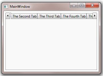
To enable scrolling, simply set the TabControl's TabItemOverflowStrategy to Scroll. The following XAML demonstrates this feature:
XAML
<Window x:Class="Test.MainWindow"
        xmlns="http://schemas.microsoft.com/winfx/2006/xaml/presentation"
        xmlns:x="http://schemas.microsoft.com/winfx/2006/xaml"
        xmlns:eo="http://schemas.essentialobjects.com/wpf/"
        xmlns:sys="clr-namespace:System;assembly=mscorlib"
        Title="MainWindow" Height="250" Width="350">
    <Border Padding="6">
        <eo:TabControl TabItemOverflowStrategy="Scroll">
            <eo:TabItem Header="The First Tab"></eo:TabItem>
            <eo:TabItem Header="The Second Tab"></eo:TabItem>
            <eo:TabItem Header="The Third Tab"></eo:TabItem>
            <eo:TabItem Header="The Fourth Tab"></eo:TabItem>
        </eo:TabControl>
    </Border>
</Window>
The above code produces the following result:
Customzing Scroller Style
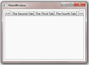
You can use TopLeftScrollButtonStyle and BottomRightScrollButtonStyle to customize the top/left scroll button and the right/bottom scroll buttons. The following sample demonstrates this feature:
XAML
<Window x:Class="Test.MainWindow"
        xmlns="http://schemas.microsoft.com/winfx/2006/xaml/presentation"
        xmlns:x="http://schemas.microsoft.com/winfx/2006/xaml"
        xmlns:eo="http://schemas.essentialobjects.com/wpf/"
        Title="MainWindow" Height="250" Width="350">
    <Border Padding="6">
        <eo:TabControl
            TabItemOverflowStrategy="Scroll" HorizontalAlignment="Left" DropDownMenuMode="None">
            <eo:TabControl.TopLeftScrollButtonStyle>
                <Style TargetType="eo:RepeatButton">
                    <Setter Property="ContentTemplate">
                        <Setter.Value>
                            <DataTemplate>
                                <TextBlock><<</TextBlock>
                            </DataTemplate>
                        </Setter.Value>
                    </Setter>
                </Style>
            </eo:TabControl.TopLeftScrollButtonStyle>
            <eo:TabControl.BottomRightScrollButtonStyle>
                <Style TargetType="eo:RepeatButton">
                    <Setter Property="ContentTemplate">
                        <Setter.Value>
                            <DataTemplate>
                                <TextBlock>>></TextBlock>
                            </DataTemplate>
                        </Setter.Value>
                    </Setter>
                </Style>
            </eo:TabControl.BottomRightScrollButtonStyle>
            <eo:TabItem Header="The First Tab"></eo:TabItem>
            <eo:TabItem Header="The Second Tab"></eo:TabItem>
            <eo:TabItem Header="The Third Tab"></eo:TabItem>
            <eo:TabItem Header="The Fourth Tab"></eo:TabItem>
            <eo:TabItem Header="The Fifth Tab"></eo:TabItem>
        </eo:TabControl>
    </Border>
</Window>
The above code produces the following result: