Table of Contents
- Getting Started
- EO.Pdf
- EO.Web
- Overview
- Installation & Deployement
- EO.Web ToolTip
- EO.Web Rating
- EO.Web Slider & RangeSlider
- EO.Web ListBox
- EO.Web ComboBox
- EO.Web Captcha
- EO.Web ASPX To PDF
- EO.Web Slide
- EO.Web Flyout
- EO.Web EditableLabel
- EO.Web ImageZoom
- EO.Web Floater
- EO.Web Downloader
- EO.Web ColorPicker
- EO.Web HTML Editor
- EO.Web File Explorer
- EO.Web SpellChecker
- EO.Web Grid
- EO.Web MaskedEdit
- EO.Web Splitter
- EO.Web Menu
- EO.Web Slide Menu
- EO.Web TabStrip
- EO.Web TreeView
- EO.Web TreeView
- Overview
- Using EO.Web TreeView
- TreeNode and TreeNodeGroup
- Look, Skin and Theme
- Style and Appearance
- Data Binding
- Handling Event
- EO.Web Calendar
- EO.Web Callback
- EO.Web MultiPage
- EO.Web Dialog
- EO.Web AJAXUploader
- EO.Web ProgressBar - Free!
- EO.Web ToolBar - Free!
- EO.WebBrowser
- EO.Wpf
- Common Topics
- Reference
| TreeNode |
Apply to
Overview
An EO.Web TreeView is made up of a hierarchy of tree nodes represented by TreeNode object, which controls tree node's appearance and behavior. TreeNode is highly customizable:

- Normal TreeNode with HTML Text
- Custom TreeNode with ASP.NET controls
Normal TreeNode with HTML Text
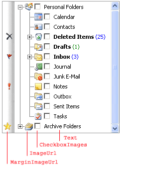
A normal TreeNode can contain MarginImage, Image, CheckBox and Text:
A TreeNode has the following states: Normal, Hover, Expanded, Selected, SelectedHover, SelectedExpanded and Disabled. See item states topic for detail.
You can also specify different styles for each state. For example, NormalStyle, HoverStyle, SelectedStyle. It's not neccessary to provide styles settings for every states. For example, if ExpandedStyle is not specified, HoverStyle is used.
 Tip: Always
try to use look item
to specify styles.
Tip: Always
try to use look item
to specify styles.
Custom TreeNode with ASP.NET controls
CustomItem is used to host one or more ASP.NET web controls, such as Calendar, ColorPicker. You can put HTML tags inside a CustomItem tag. To associate a CustomItem with a TreeNode, specify the TreeNode's CustomItemID property to the ID of the CustomItem. The content of the CustomItem is displayed as the content of the TreeNode.
You can also bind data source to a CustomItem and include the custom item as part of the template item that is used to generate data binding items. See Data Binding for details.
Note: When CustomItem is used, Text property is ignored.
For details on how to use CustomItem, please refer to Custom Item Overview topic.
Properties specific for TreeNode
The following table shows the properties that are specific to TreeView:| Content | Remarks |
|---|---|
| CollapsedImageUrl and ExpandedImageUrl | Represent URLs of images when tree node is collapsed or expanded. |
| ImageUrl | Specifies the URL of an image associated with this TreeNode and display next to the TreeNode's text. |
| MarginImageUrl | Specifies the URL of an image associated with this TreeNode and display at the left margin of the TreeView. |
| PopulateOnDemand | Populates a group of TreeNodes only when the parent node is expanded. The request to generate the group of TreeNodes are sent via AJAX callback. |
| ShowCheckBox | Display a Checkbox on this TreeNode. Checkbox image can be specified in TreeView's CheckBoxImages. |
EO.Web Navigation controls provide a set of client side JavaScript API to access the control. See client side script interface for API reference.